15 Dreamy Grey Living Room Color Schemes Ideas
Grey gets a bad rap sometimes, doesn’t it? People think it’s boring, lifeless, or too reminiscent of rainy days. But here’s the thing – I’ve been obsessing over grey living rooms for years now, and let me tell you, grey is the ultimate chameleon of the color world. It plays nice with literally every other color, and when you nail the right combination, your living room transforms into something straight out of a design magazine.
You know what’s funny? I used to hate grey. My first apartment had these awful grey walls that made everything feel like a prison cell. Then I discovered it wasn’t grey that was the problem – it was how I was using it. Once I learned to pair it properly, grey became my secret weapon for creating spaces that feel both sophisticated and cozy.
So grab your coffee (or wine, I don’t judge), and let’s chat about these 15 incredible grey color schemes that’ll make your living room the envy of everyone who steps through your door.
Cozy Grey and Warm Beige Living Room Scheme
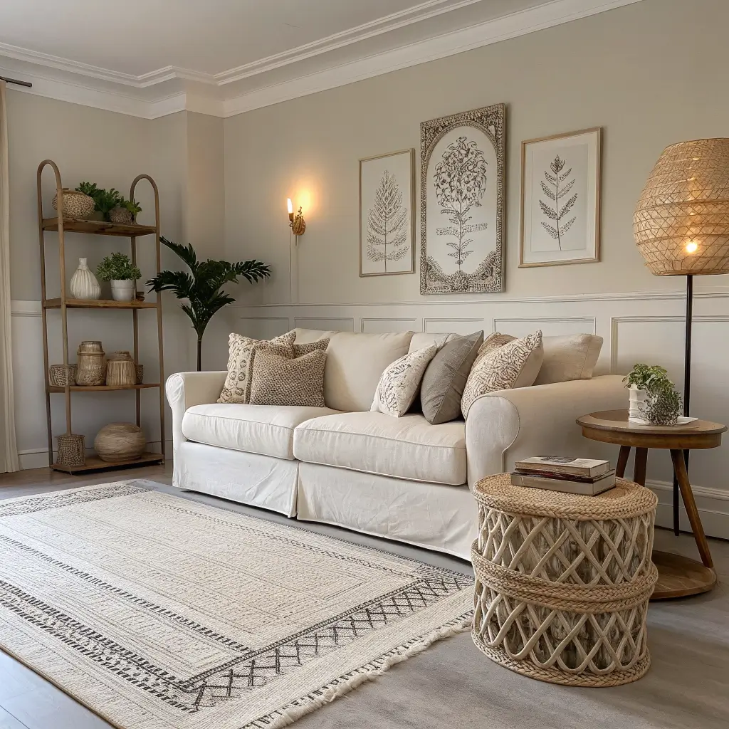
This combo is like that perfect sweater you reach for on a chilly Sunday morning – comfortable, reliable, and always looks good. Grey and beige together create what I call the “hygge effect” – that Danish concept of coziness that makes you want to curl up with a book and never leave.
What makes this pairing work so brilliantly? Grey brings sophistication and structure, while beige softens everything with its warmth. I’ve used this scheme in my own living room, and guests always comment on how inviting it feels. The trick is choosing the right shades – go for a soft dove grey paired with a creamy, warm beige rather than cooler tones.
Want to nail this look? Layer different textures like a chunky knit throw in beige over a grey sofa, add some natural wood elements, and throw in a few cream-colored cushions. The result feels expensive without trying too hard. Trust me, this combination never goes out of style – it’s basically the little black dress of interior design.
Making It Work in Your Space
Start with grey walls (I love Benjamin Moore’s Stonington Gray) and bring in beige through your larger furniture pieces. The 60-30-10 rule works perfectly here – 60% grey, 30% beige, and 10% accent colors like soft whites or natural wood tones. Don’t forget lighting – warm bulbs will enhance the cozy factor tenfold.
Modern Grey and White Contrast Palette
Now we’re talking about drama without the melodrama. Grey and white together? It’s clean, it’s crisp, and it screams “I have my life together” (even if you don’t). This scheme works especially well if you’re going for that minimalist vibe but don’t want your space to feel cold or uninviting.
The beauty of this combination lies in its versatility. You can go high contrast with charcoal grey and bright white, or keep things subtle with light grey and off-white. Either way, you’re creating a space that feels fresh and modern. I’ve noticed this scheme photographs beautifully too – perfect for those Instagram-worthy living room shots we all secretly want.
Here’s a pro tip: use different shades of grey throughout the room to add depth. Maybe your sofa is charcoal, your rug is light grey, and you’ve got some medium grey throw pillows. The white acts as a visual breather, keeping everything from feeling too heavy.
Key Elements for Success
- Crisp white trim and moldings against grey walls
- Mix matte and glossy finishes for visual interest
- Add metallic accents in chrome or silver
- Keep clutter to a minimum (this scheme loves breathing room)
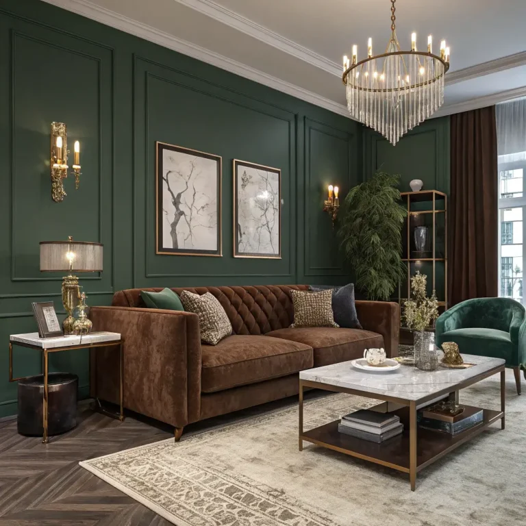
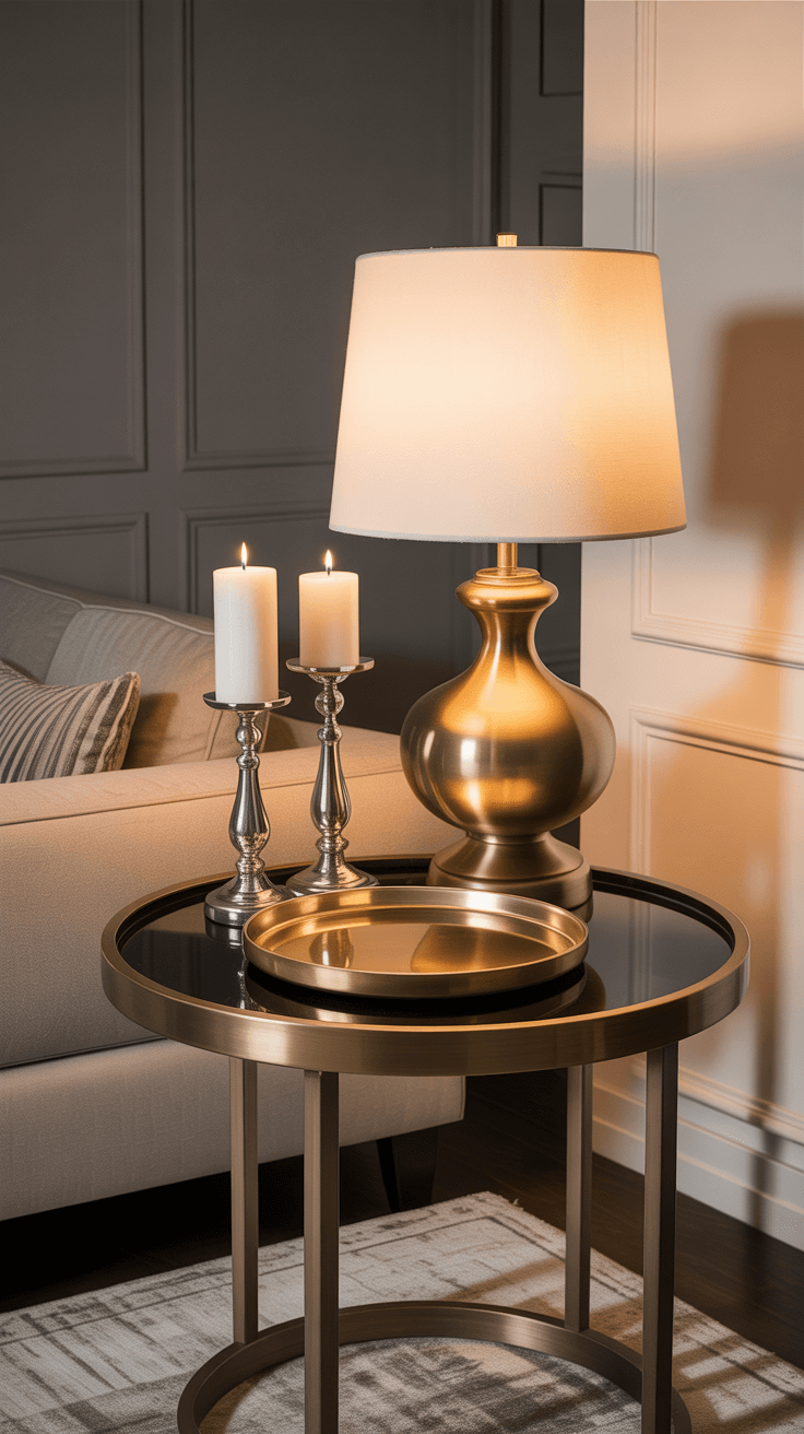
Elegant Grey and Gold Accent Living Room
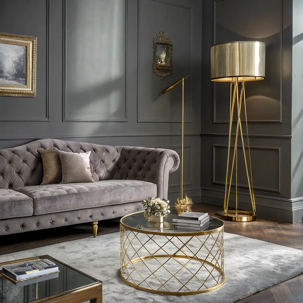
Ready to feel fancy? Grey and gold together create an atmosphere that whispers luxury rather than shouting it. This combination makes me think of boutique hotels and high-end apartments – sophisticated without being stuffy.
Gold accents against a grey backdrop create instant elegance. Think gold-framed mirrors, brass table legs, or gilded picture frames. The key here is restraint – you want touches of gold, not a Vegas casino vibe. I learned this the hard way when I went overboard with gold accessories and my living room looked like King Midas had a field day.
What shades work best? Medium to dark greys pair beautifully with both warm brass tones and cooler champagne golds. Light greys work too, but you’ll want to use rose gold or copper-toned metals for more impact.
Soft Grey and Blush Pink Color Combo
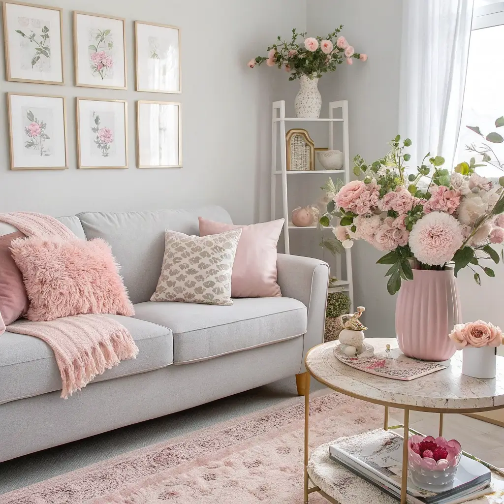
Who says pink is just for nurseries? Grey and blush pink together create the most sophisticated, grown-up palette that still maintains a soft, romantic feel. This combo has been having a major moment, and honestly, it deserves all the hype.
I’ll admit, I was skeptical at first. Pink in my living room? But then I tried it – a grey sofa with blush pink cushions, a soft pink throw, and suddenly my space felt like it belonged in a Scandinavian design blog. The grey grounds the pink, preventing it from feeling too sweet or feminine.
The best part about this scheme? It works year-round. In winter, it feels cozy and warming. Come spring, it feels fresh and floral. Choose muted, dusty pinks rather than bright bubblegum shades – think ballet slipper rather than hot pink.
Perfecting the Balance
Keep the ratio roughly 70% grey to 30% pink for the most sophisticated look. Add in white or cream elements to keep things from feeling too heavy, and consider incorporating natural textures like linen or raw wood to add earthiness.
Charcoal Grey and Mustard Pop Scheme
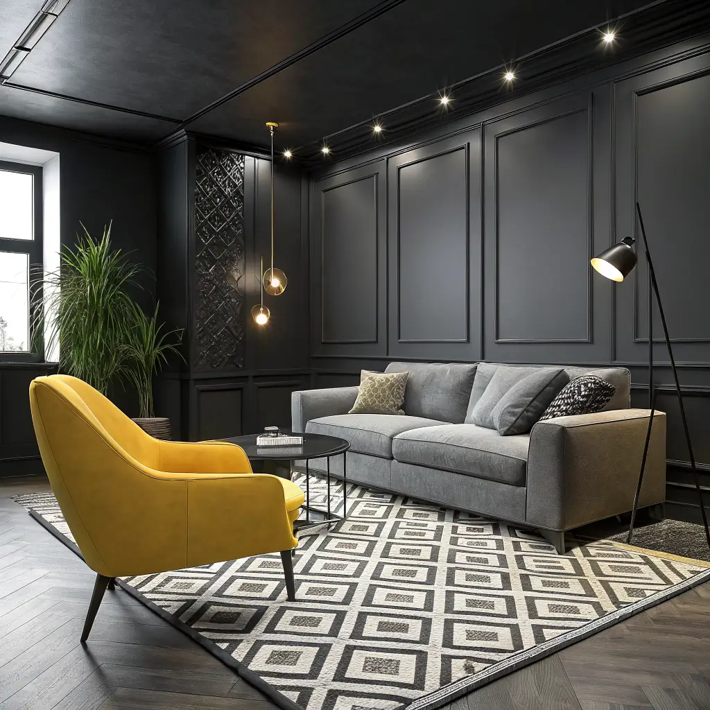
Now here’s where things get fun! Charcoal grey and mustard yellow might sound like an odd couple, but trust me on this one – they’re basically the design world’s version of a power couple. The deep, moody grey makes that mustard pop like nothing else.
This combination brings energy without overwhelming the space. I’ve seen this work beautifully in everything from industrial lofts to traditional homes. The mustard adds just enough warmth and personality to prevent the charcoal from feeling too serious.
Want to try this but feeling nervous? Start small. Maybe just a mustard throw pillow or two on your charcoal sofa. Once you see how amazing they look together, you’ll be hunting for more mustard pieces. FYI, vintage shops often have great mustard-colored accessories that add character 🙂
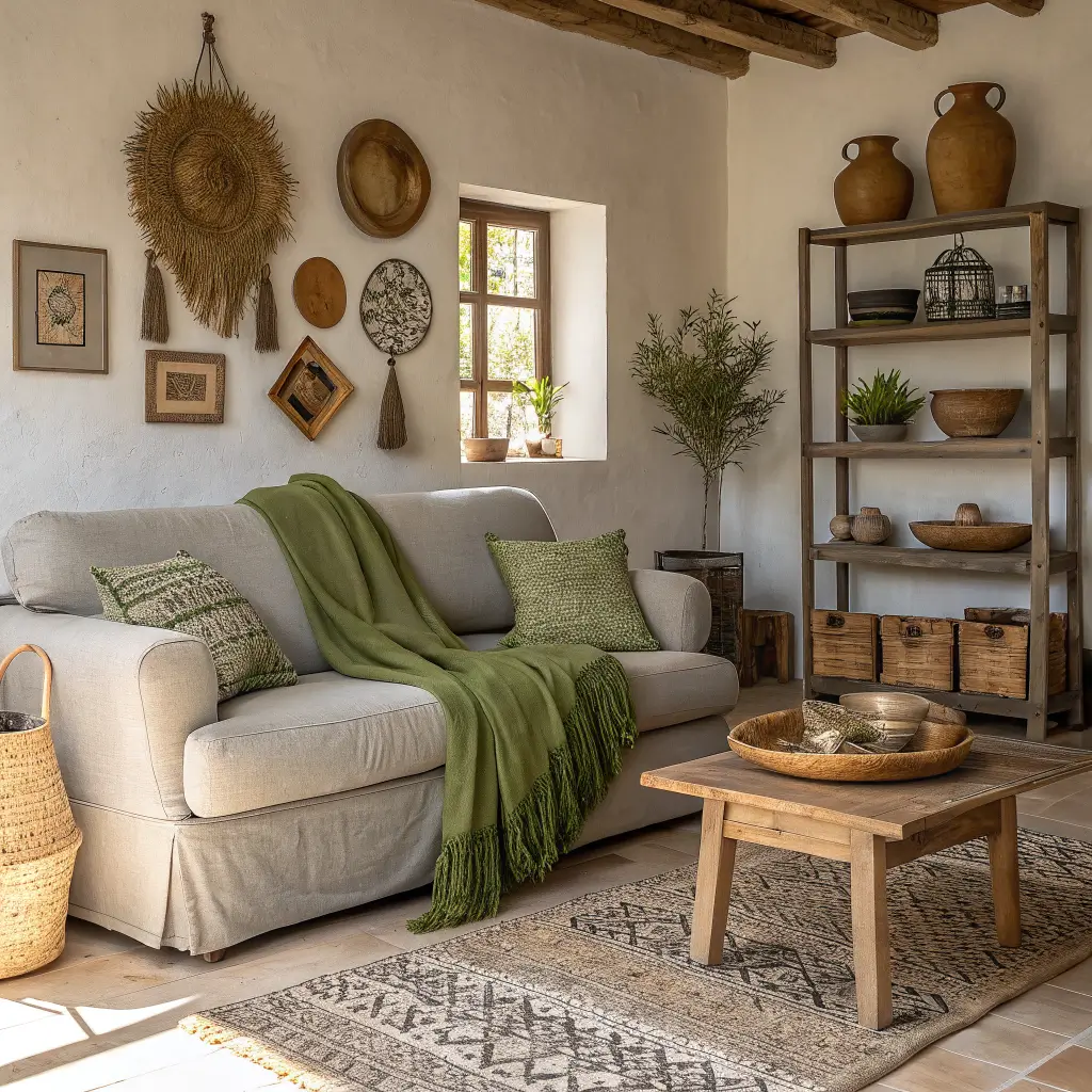
Light Grey and Sage Green Harmony
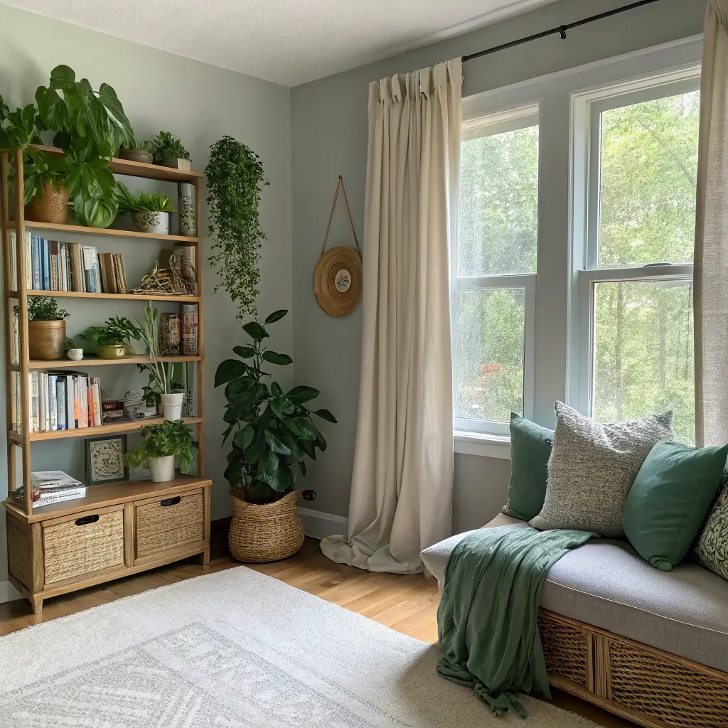
Can we talk about how sage green is having its moment? Paired with light grey, it creates this incredibly calming, nature-inspired palette that makes your living room feel like a peaceful retreat. This combo literally lowers my blood pressure just looking at it.
The beauty of sage green is its versatility – it’s neither too warm nor too cool, making it the perfect partner for grey. I’ve used this scheme in a friend’s living room makeover, and the transformation was incredible. The space went from bland to “botanical chic” instantly.
Layer different shades of green – maybe some eucalyptus, a touch of olive, alongside your sage – to create depth. Add plenty of plants (real or faux, no judgment here), and you’ve got yourself a living room that feels like an expensive spa.
Nature-Inspired Touches
- Incorporate natural wood furniture
- Add botanical prints or nature photography
- Use linen and cotton fabrics for that organic feel
- Consider a jute or sisal rug to ground the space
Also Read: 10 Smart Shelves Above Bed Ideas for Small Bedrooms
Grey and Navy Blue Sophisticated Palette
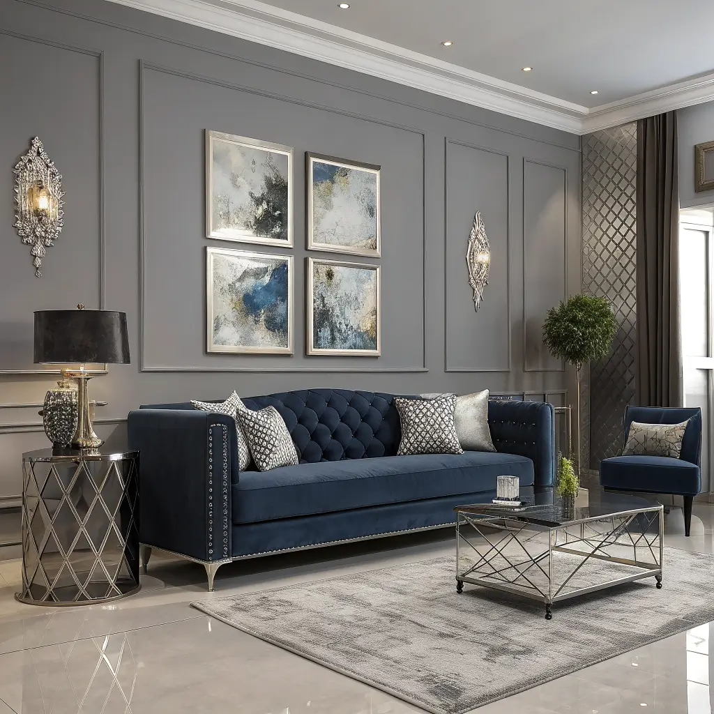
Grey and navy together? That’s what I call timeless sophistication with a nautical twist. This combination never looks dated and works equally well in coastal homes or city apartments. It’s basically the color equivalent of a well-tailored suit.
I love how navy adds depth without the harshness of black. Against grey, it creates this rich, layered look that feels both masculine and inviting. The trick is balancing the two – too much navy can feel heavy, while too much grey might seem washed out.
Here’s what works: use grey as your base and bring in navy through accent pieces. A navy velvet armchair against grey walls? Chef’s kiss. Navy curtains framing grey-painted windows? Absolutely stunning.
Greige and Cream Neutral Living Room
Okay, let’s address the elephant in the room – what exactly is greige? It’s the perfect marriage of grey and beige, and paired with cream, it creates the ultimate neutral paradise. This scheme is for those who want warmth without committing to bold colors.
I’ve noticed greige works magic in rooms with challenging lighting. Too much natural light? Greige won’t wash out. Not enough light? It won’t feel cave-like. Add cream into the mix, and you’ve got a palette that’s impossible to mess up.
The best part? This combo acts as the perfect backdrop for changing seasonal decor. Want to add burgundy for fall? Perfect. Pastels for spring? Go for it. The greige and cream foundation supports everything.
Texture Is Everything
Since you’re working with neutrals, texture becomes crucial:
- Mix smooth and rough surfaces
- Layer different fabric weights
- Include metallic accents for sparkle
- Add visual interest through patterns in similar tones
Cool Grey and Teal Accent Design
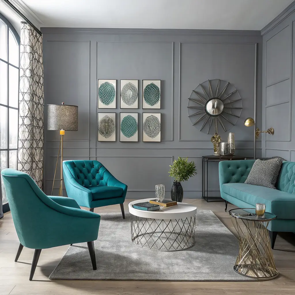
Want to make a statement without going overboard? Cool grey with teal accents creates this amazing contemporary vibe that feels fresh and energetic. It’s like your living room went on a tropical vacation and came back refreshed.
The contrast between cool grey and vibrant teal creates visual excitement. I’ve found this combo works particularly well in spaces that need an energy boost – maybe your living room doesn’t get tons of natural light, or you just want something that makes you smile when you walk in.
Start with cool grey walls and major furniture pieces, then punch it up with teal. A teal ottoman, some artwork with teal elements, or even just some throw pillows can transform the entire feel of the room.
Also Read: 15 Stylish Shoe Shelves Ideas for a Clutter-Free Home
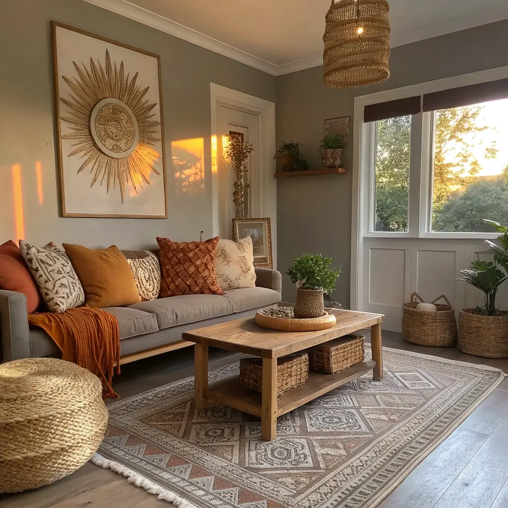
Dark Grey and Rust Warm Tone Combo
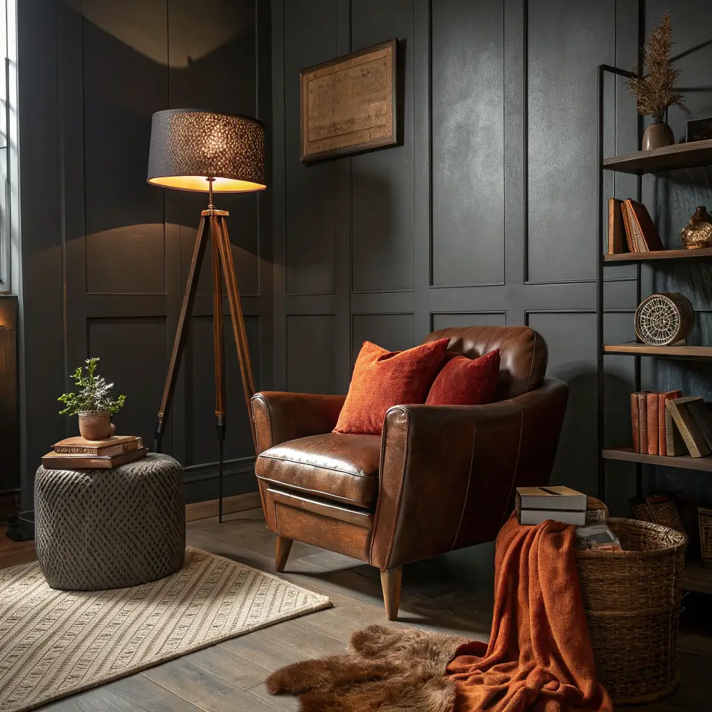
This pairing is having a serious moment, and IMO, it’s about time! Dark grey and rust together create this moody, sophisticated atmosphere that feels both modern and timeless. It’s like autumn decided to move into your living room permanently.
Rust brings warmth to dark grey’s coolness in the most beautiful way. I recently helped a friend design her living room with this scheme, and the result was stunning – cozy enough for Netflix marathons but sophisticated enough for dinner parties.
The key is choosing the right shade of rust – think terracotta pots or fall leaves rather than actual rusty metal. Velvet fabrics in rust tones look particularly luxurious against dark grey backgrounds.
Balancing Dark and Light
When working with darker palettes:
- Ensure plenty of lighting sources
- Include lighter elements to prevent heaviness
- Use mirrors to reflect light
- Keep window treatments minimal for maximum natural light
Grey and Olive Green Earthy Palette
Ever notice how olive green makes everything feel more expensive? Combined with grey, it creates this understated, earthy elegance that whispers rather than shouts. This combo makes me think of Italian villas and sophisticated European interiors.
What I love about olive green is its complexity – it’s not quite green, not quite brown, but something wonderfully in between. Against grey, it brings warmth without being too bold. The result feels grounded and natural.
I’ve been slowly incorporating this palette into my own space, and every addition makes the room feel more pulled-together. Start with grey as your foundation and layer in olive through textiles and accessories. A leather ottoman in olive? Gorgeous. Olive linen curtains? Divine.
Silver Grey and Lavender Calm Scheme
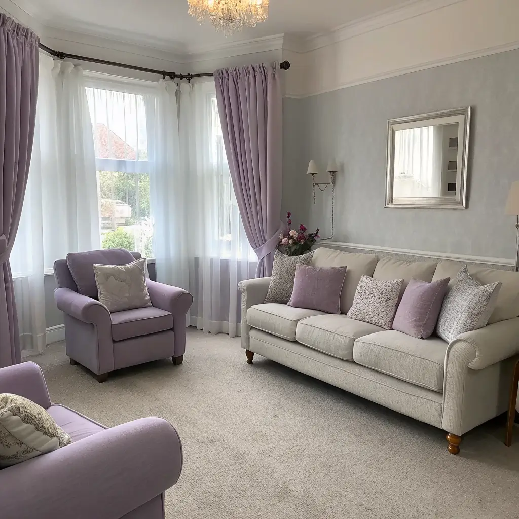
Ready for something unexpected? Silver grey and lavender together create the most serene, spa-like atmosphere that’ll make your living room feel like a relaxation sanctuary. It’s not a combination you see often, which makes it even more special.
The cool tones of silver grey perfectly complement lavender’s subtle warmth. This isn’t your grandmother’s lavender – we’re talking sophisticated, muted tones that add just a hint of color. Think French lavender fields at dusk, not Easter decorations.
The trick is keeping lavender as an accent rather than a main player. Too much and your living room might feel like a bedroom. But just the right amount? Pure sophistication.
Creating the Perfect Balance
- Use lavender in small doses – pillows, artwork, fresh flowers
- Choose muted, greyish lavenders over bright purples
- Include plenty of white to keep things fresh
- Add natural wood tones to ground the palette
Also Read: 10 Eye-Catching Live Edge Shelves Ideas for Every Room
Grey and Black Minimalist Contrast Style
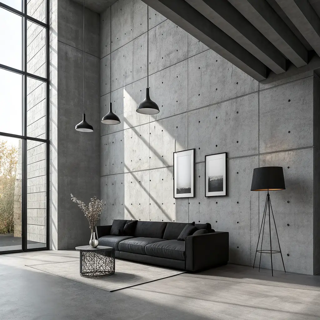
Sometimes you just want to keep things simple, right? Grey and black together create the ultimate minimalist statement – it’s bold, it’s confident, and it definitely makes an impression. This isn’t for the faint of heart, but when done right? Absolutely stunning.
The key to making this work is playing with different shades and textures. Matte black against glossy grey, charcoal against light grey – these contrasts create visual interest without needing color. I’ve seen this work beautifully in modern lofts where the architecture itself becomes part of the design.
Want to soften the look slightly? Add white as a third element to break up the grey-black dominance. A white rug, some white artwork, or even just white throw pillows can make all the difference.
Ash Grey and Terracotta Cozy Palette
This combination feels like it was pulled straight from the Mediterranean :/ Ash grey’s coolness perfectly balances terracotta’s earthy warmth, creating a space that feels both sophisticated and welcoming. It’s basically the design equivalent of a warm hug.
I discovered this combo by accident when I placed a terracotta pot on my grey console table. The contrast was so striking, I immediately started planning how to incorporate more of it. The result? A living room that feels grounded and intentional.
Terracotta can range from peachy-pinks to deep burnt orange, so choose your shade based on how bold you want to go. Lighter terracottas feel more subtle and feminine, while deeper shades add drama and warmth.
Grey and Wood Tone Natural Living Room
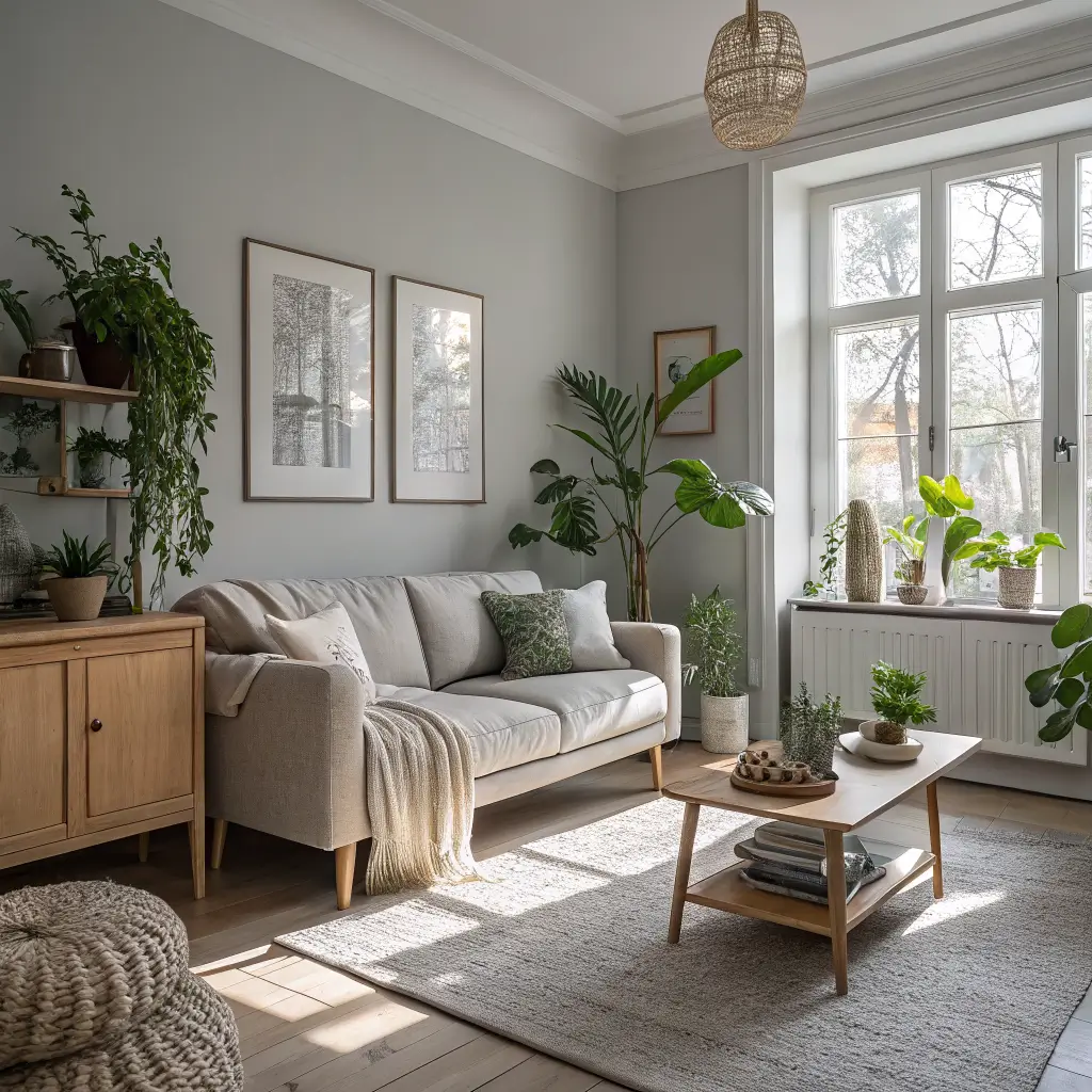
Last but definitely not least, let’s talk about the combo that never fails – grey and natural wood tones. This pairing brings together the best of both worlds: modern sophistication meets organic warmth. It’s foolproof, timeless, and works in literally any style home.
What makes this combination so special? Wood adds life and warmth to grey’s coolness, creating perfect balance. I’ve used this scheme countless times, and it never disappoints. Whether you prefer light oak, rich walnut, or rustic pine, there’s a wood tone that’ll work perfectly with your chosen grey.
Mix different wood tones for added interest – maybe a walnut coffee table with oak shelving. The grey acts as a neutral backdrop that lets the natural beauty of the wood shine through.
Wood and Grey Success Tips
- Use wood for major pieces like coffee tables or media consoles
- Incorporate wood through architectural elements like beams or trim
- Mix smooth and rough wood textures
- Don’t forget about wood accessories like bowls or frames
Wrapping It All Up
So there you have it – fifteen absolutely dreamy grey color schemes that prove grey is anything but boring. Each combination brings its own personality and vibe, from the cozy warmth of grey and beige to the bold sophistication of grey and black.
The beauty of starting with grey? You can easily switch up your accent colors as your taste evolves or seasons change. That navy you’re loving now might become rust next fall, and your grey foundation will support it all beautifully.
Remember, the best color scheme is the one that makes YOU happy. Sure, trends are fun, but at the end of the day, you’re the one living in the space. Pick the combination that speaks to you, makes you smile, and creates the atmosphere you want to come home to.
Now, which one are you itching to try first? I’m betting you’ve already started mentally redecorating your living room. Go ahead, embrace the grey – your dream living room is waiting!