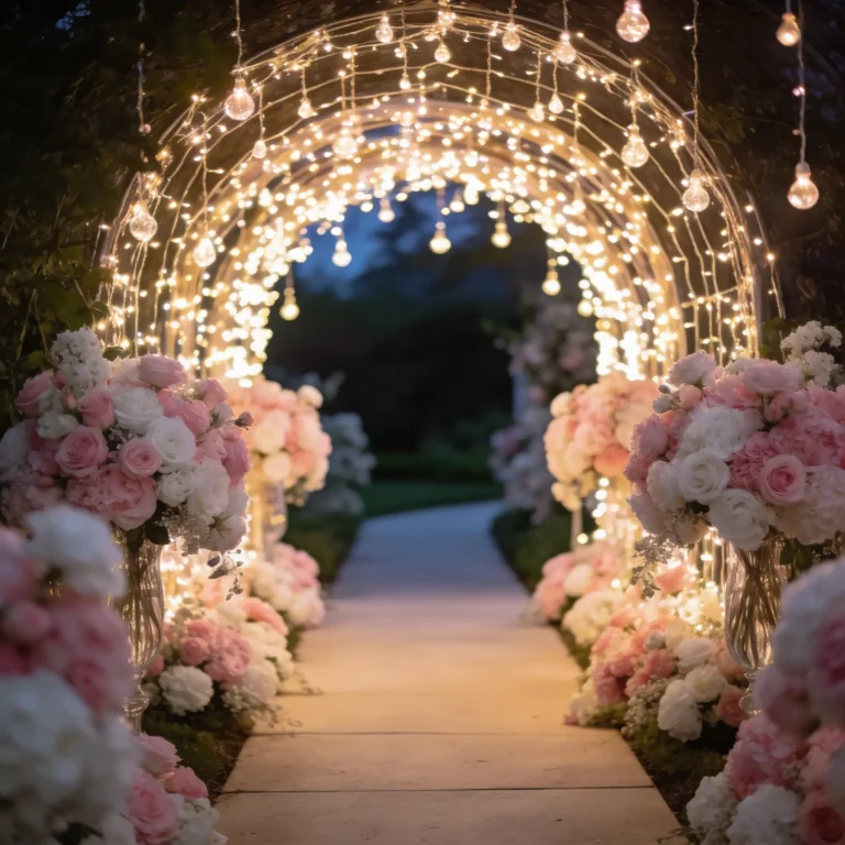
10 Gorgeous Jewel Tone Wedding Decor Ideas to Inspire You
Picture this: you’re scrolling through Pinterest at 2 AM (we’ve all been there), desperately searching for wedding inspiration that doesn’t look like every other beige-and-white affair you’ve seen this year.
Sound familiar? Well, buckle up because I’m about to introduce you to the world of jewel tone wedding decor – where rich emeralds meet sultry sapphires, and your wedding becomes the kind of event people still talk about years later.
I’ll be honest with you – when I first heard about jewel tone weddings, I thought they might be a bit too bold for my taste. But after seeing how these deep, luxurious colors transform a space from “nice” to “absolutely breathtaking,” I’m completely sold.
These aren’t your grandmother’s pastels (though we love grandma), and they’re definitely not the millennial pink that dominated weddings for what felt like forever.
Ready to discover how to create a wedding that’s as precious as the gems themselves? Let’s explore ten stunning jewel tone decor ideas that’ll have your guests wondering if they accidentally wandered into a royal palace.
Emerald Green and Gold Table Settings
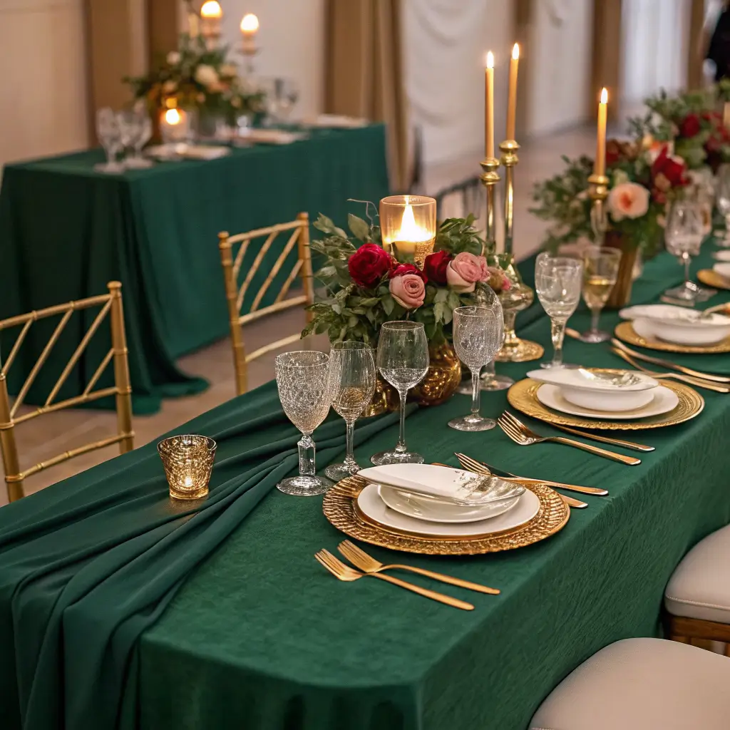
Let’s start with what I consider the crown jewel of table settings – emerald green paired with gold accents. This combination screams luxury without being obnoxious about it, and trust me, your Instagram photos will thank you later.
The magic happens when you layer different textures and shades of green. Start with deep emerald charger plates as your foundation, then add gold-rimmed dinner plates on top. The contrast is absolutely stunning, and it creates this rich, layered look that photographs beautifully in any lighting.
Here’s where it gets fun – gold flatware is your best friend here. None of that basic silver stuff (sorry, silver lovers). The warm tones of gold complement the cool emerald perfectly, creating a balance that feels both elegant and inviting. Add some emerald green napkins with gold napkin rings, and you’ve got yourself a table setting that would make even the pickiest mother-in-law approve.
Don’t forget about the glassware! Clear crystal glasses work perfectly, but if you really want to commit to the theme, consider gold-rimmed wine glasses. They catch the light beautifully and add that extra touch of sophistication that makes guests feel like they’re dining somewhere special.
The best part about this color combination? It works in any season. Spring wedding? The green feels fresh and vibrant. Fall celebration? The gold adds warmth that complements autumn perfectly. Winter affair? The richness of both colors creates a cozy, luxurious atmosphere that fights off any seasonal blues.
Sapphire Blue Floral Centerpieces
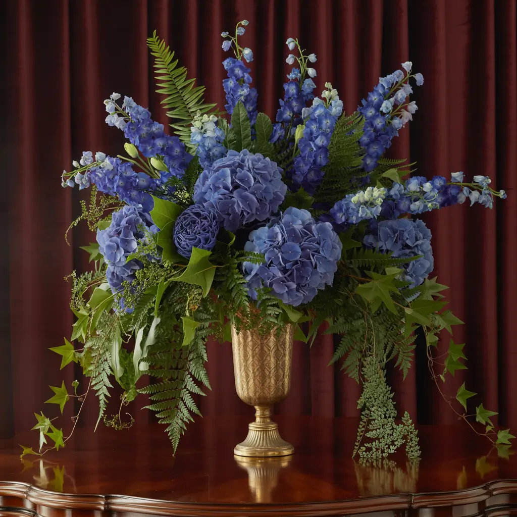
Now, let’s talk about sapphire blue florals – because who says flowers have to be pink and white? This is where you can really let your creativity shine, and honestly, blue flowers are having such a moment right now.
The trick with sapphire blue centerpieces is mixing different shades and textures. Deep blue delphiniums create height and drama, while navy blue hydrangeas add fullness and that lush, romantic feel. Throw in some dusty miller for a silvery contrast, and you’ve got centerpieces that look like they belong in a high-end floral magazine.
But here’s a pro tip I learned the hard way – don’t go all blue, all the time. Add some white or cream accents to prevent the arrangements from looking too dark or overwhelming. White roses or peonies mixed in with your blue blooms create this beautiful contrast that keeps everything balanced and elegant.
Want to take it up a notch? Consider adding some metallic elements to your floral arrangements. Silver or gold branches, metallic leaves, or even some sparkly accents can elevate your centerpieces from pretty to absolutely show-stopping. Just don’t go overboard – we want elegant, not craft store explosion.
The height variation is crucial here. Mix tall arrangements with shorter, more compact ones to create visual interest across your reception space. Your guests will appreciate being able to see each other across the table, and you’ll love how dynamic and intentional everything looks in photos.
Ruby Red Velvet Chair Covers
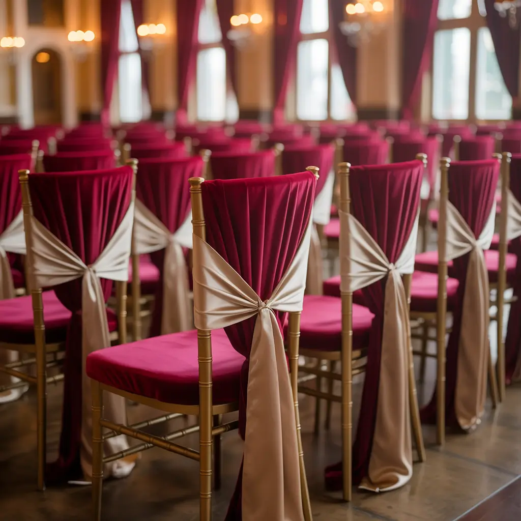
Okay, can we talk about how ruby red velvet chair covers are basically the easiest way to add instant drama to any venue? I’m talking about that rich, deep red that makes everything feel luxurious and slightly mysterious – like you’re hosting a dinner party in a castle.
Velvet is having such a moment right now, and for good reason. The texture adds depth and richness that you just can’t get with regular fabric. When light hits velvet, it creates this beautiful play of shadows and highlights that photographs incredibly well. Plus, your guests will actually enjoy sitting in chairs that feel as good as they look.
The beauty of ruby red is its versatility. Pair it with gold accents for a regal, traditional feel, or go bold with emerald green elements for a jewel tone explosion that’s surprisingly sophisticated. Even neutral colors like cream or ivory look more expensive when paired with that rich ruby backdrop.
Here’s something most people don’t think about – chair covers can completely transform a basic venue. Got stuck with those standard banquet hall chairs that scream “wedding on a budget”? Ruby velvet covers will make them look like throne room seating. It’s like makeup for furniture, and the transformation is honestly magical.
Don’t worry about the covers being too bold – ruby red is surprisingly neutral when it comes to jewel tones. It plays well with almost every other color in the jewel family, making it a safe choice that still feels adventurous and sophisticated.
Also Read: 10 Elegant Wedding Car Decor Ideas to Wow Your Guests
Amethyst Purple Draped Backdrops
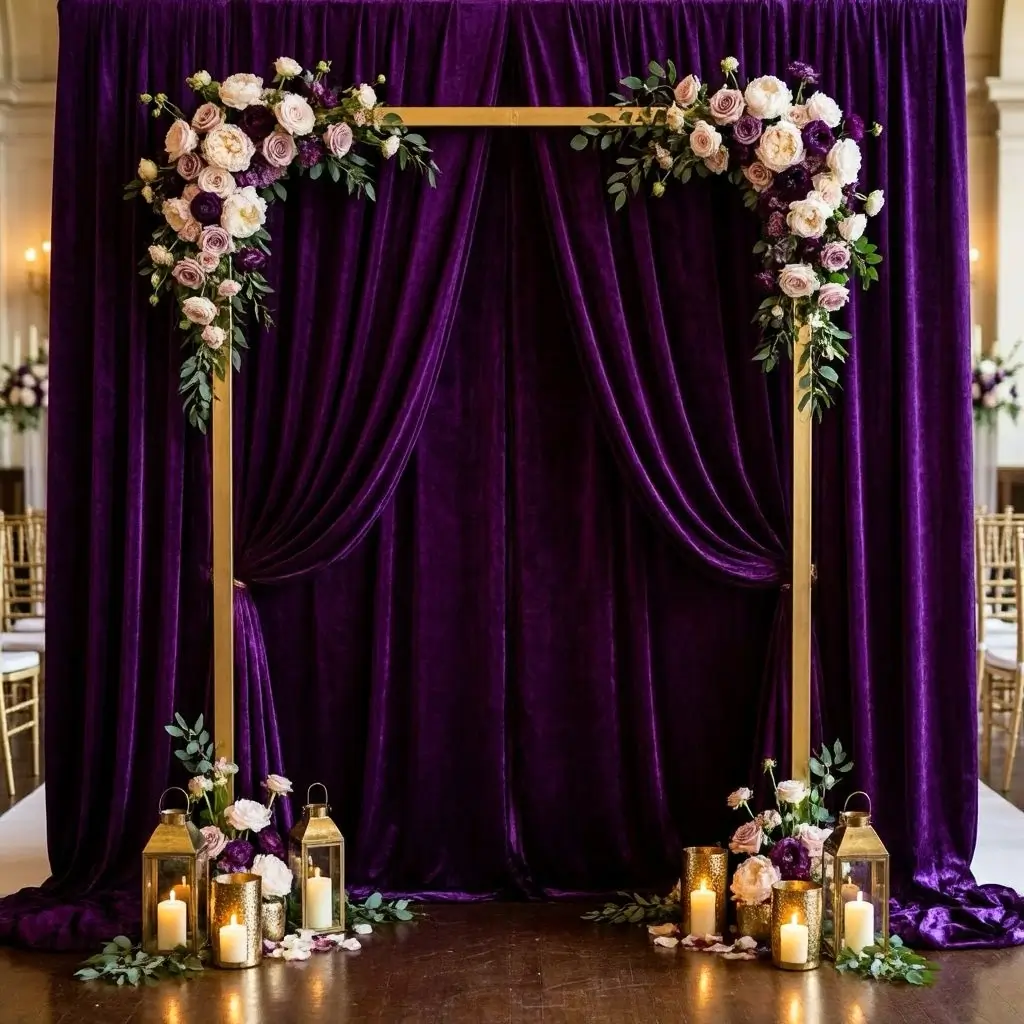
Let me tell you about amethyst purple backdrops – they’re like Instagram filters for your wedding, but in real life. This gorgeous purple creates the most romantic, dreamy atmosphere, especially when you use flowing, draped fabric that catches the light beautifully.
The key to nailing this look is in the fabric choice and draping technique. Chiffon or silk in deep amethyst creates those gorgeous flowing lines that photograph like a dream. The way the fabric moves and catches light adds this ethereal quality that makes every photo look like it belongs in a fairy tale.
But here’s where it gets interesting – amethyst works incredibly well with metallic accents. Silver threading, gold tiebacks, or even some subtle sparkly elements woven through the draping can take your backdrop from pretty to absolutely stunning. The purple provides this rich, royal foundation while the metallics add just enough glamour without being over the top.
Lighting is everything with purple backdrops. Warm white or soft gold lighting makes amethyst look rich and luxurious, while cooler lighting can make it appear more dramatic and mysterious. Both looks are gorgeous – it just depends on the vibe you’re going for.
Consider the placement carefully too. An amethyst backdrop works beautifully behind your sweetheart table, as a ceremony backdrop, or even as a photo booth area. The color is so photogenic that your guests will naturally gravitate toward it for pictures, giving you tons of candid shots with that gorgeous purple backdrop.
Jewel Tone Geometric Table Runners
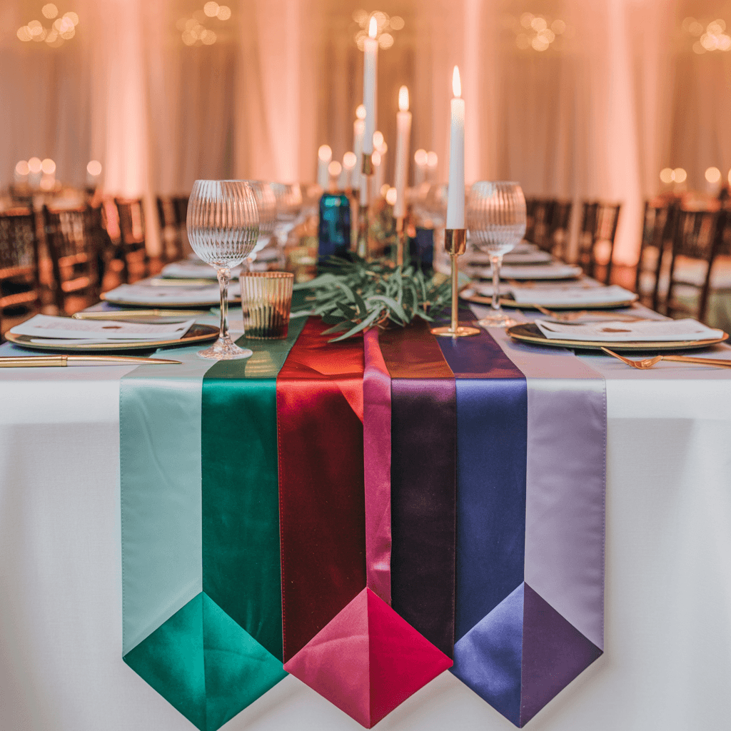
Geometric patterns are having such a moment, and when you combine them with jewel tone colors, you get table runners that are basically works of art. I’m talking about bold patterns in emerald, sapphire, ruby, and amethyst that create this modern, sophisticated look.
The beauty of geometric jewel tone runners is how they can tie your entire color scheme together. Instead of committing to just one jewel tone, you can incorporate multiple colors in one cohesive pattern. Think hexagons in alternating emerald and sapphire, or diamond patterns that blend ruby and amethyst. It’s like having a jewel box right on your table.
These runners work particularly well on neutral tablecloths – white, cream, or even soft gray. The geometric pattern pops against the simple background, creating visual interest without overwhelming your other table elements. Your centerpieces, place settings, and other decor can shine while the runner provides that perfect pop of color and pattern.
Here’s a styling tip that works every time – keep your centerpieces simple when using bold geometric runners. The pattern is already doing the heavy lifting in terms of visual interest, so clean, simple floral arrangements or candle groupings work best. Let the runner be the star of the show.
The modern feel of geometric patterns also makes jewel tones feel fresh and contemporary rather than traditional or old-fashioned. It’s a great way to incorporate rich colors while maintaining a current, stylish aesthetic that feels very now.
Opulent Gemstone-Inspired Wedding Cake
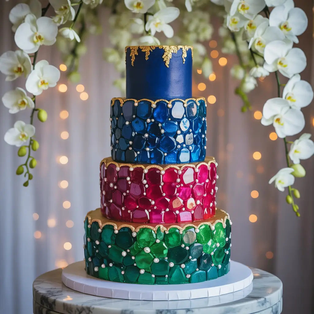
Your wedding cake is basically the centerpiece of your reception, so why not make it look like an actual gemstone masterpiece? I’m talking about cakes that incorporate the colors, textures, and even the crystalline structures of real gems.
The trend toward gemstone-inspired cakes is absolutely gorgeous, and the techniques bakers are using now are mind-blowing. Edible crystals, metallic accents, and marbled fondant that mimics the natural patterns found in real gemstones create cakes that are almost too beautiful to eat. Almost.
Think about incorporating multiple jewel tones in your cake design. A base of deep emerald green with sapphire blue crystal accents and gold leaf details creates this rich, luxurious look that photographs incredibly well. The key is balancing the colors so they complement rather than compete with each other.
Texture is everything with gemstone cakes. Smooth fondant areas contrast beautifully with crystalline sugar work or textured buttercream that mimics the rough surface of uncut gems. The interplay between smooth and textured elements creates visual interest and makes your cake look like an actual work of art.
Don’t forget about the inside! Colored cake layers that match your jewel tone theme create an amazing surprise when you cut the cake. Imagine revealing layers of deep purple, emerald green, and sapphire blue – your guests will be talking about it for years.
Also Read:10 Stunning Brown Wedding Decor Ideas for a Cozy Celebration
Deep Teal and Copper Candle Arrangements
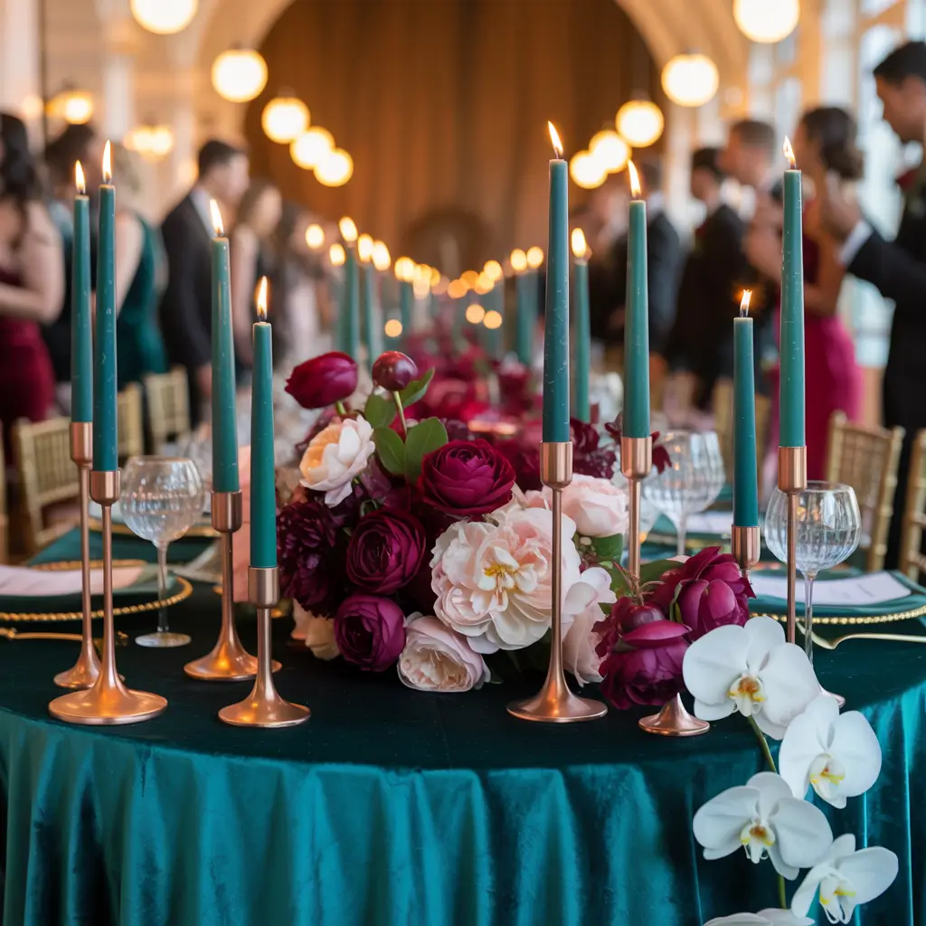
There’s something absolutely magical about deep teal and copper candle arrangements – the combination feels both modern and timeless, sophisticated yet approachable. The warm copper tones against the cool teal create this perfect balance that works in any lighting.
The key to nailing this look is varying your candle heights and incorporating different copper elements. Copper candle holders, copper wire accents, and even copper-colored candles mixed with traditional white or cream candles create layers of interest and warmth. The teal elements – whether through colored glass votives, teal candles, or teal accents – provide that rich, jewel-tone pop.
Here’s what I love about this combination – it photographs beautifully in both daylight and evening settings. During cocktail hour, the copper catches the natural light and creates this warm, inviting glow. As the evening progresses and you’re relying more on candlelight, the teal elements become more prominent and mysterious.
Consider incorporating different textures and materials. Smooth copper vessels mixed with hammered copper accents, clear glass with teal-tinted glass, pillar candles with floating candles – the variety keeps things interesting while maintaining your color scheme.
Safety tip (because someone has to be practical): make sure your candle arrangements are stable and won’t tip over during dinner. Beautiful is great, but safe and beautiful is even better. Your venue coordinator will thank you, and you’ll actually be able to enjoy your reception instead of worrying about fire hazards.
Garnet Red Aisle Petal Decor
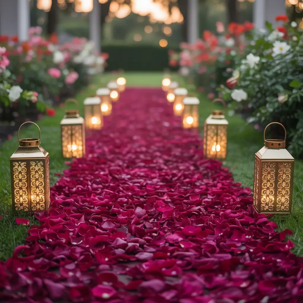
Walking down an aisle scattered with deep garnet red petals is like something out of a romantic movie – except it’s your actual wedding, and you’re the star. This rich, wine-colored red creates such a dramatic and romantic entrance that your guests will literally gasp when you appear.
The beauty of garnet red petals is how they photograph. Unlike lighter colors that can wash out in photos, deep red petals create contrast and definition that looks stunning in every shot. Whether you’re having an outdoor ceremony with natural lighting or an indoor affair with artificial lighting, garnet red holds its color beautifully.
But here’s where you can get creative – don’t just scatter petals randomly. Consider creating patterns or gradients with your petal placement. Start with a light scattering at the back of the aisle and gradually increase the density as you approach the altar. Or create geometric patterns that complement your overall design aesthetic.
Mix in some complementary elements to make your aisle decor even more special. White or cream petals mixed with the garnet red create beautiful contrast, while gold or copper accents (think small metallic leaves or subtle sparkly elements) add just enough glamour without overwhelming the romantic feel.
Think about the practical aspects too. Make sure your petals won’t be slippery (silk petals are often safer than fresh ones), and consider the cleanup factor. Your venue will appreciate thoughtful choices that look gorgeous but don’t create maintenance nightmares.
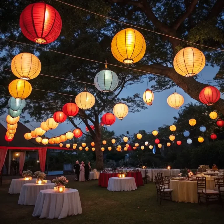
Multicolor Jewel Tone Lanterns
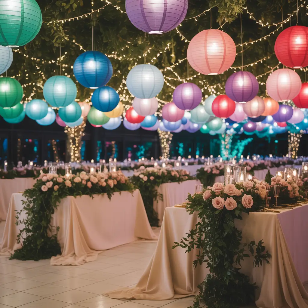
Multicolor jewel tone lanterns are like having a rainbow of gems lighting up your celebration – except way more sophisticated than that description makes them sound. When you combine emerald, sapphire, ruby, and amethyst in lantern form, you create this magical, almost fairy-tale atmosphere.
The trick with multicolor lanterns is strategic placement and varying heights. You don’t want them to look random or chaotic – instead, create intentional groupings that feel balanced and purposeful. Cluster different colored lanterns together, but make sure each grouping has a good mix of your jewel tones.
These lanterns work beautifully both indoors and outdoors. For outdoor ceremonies or receptions, they create this enchanting ambiance as the sun sets and the lanterns become more prominent. Indoor venues benefit from the warm, colored light that jewel tone lanterns provide – it’s much more interesting than standard white lighting.
Consider the size variation too. Large statement lanterns mixed with smaller accent pieces create visual interest and prevent the look from feeling too uniform. The interplay between different sizes and colors keeps guests’ eyes moving around the space, taking in all the beautiful details you’ve carefully planned.
Battery-operated LED candles are your friend here – they provide consistent light without the safety concerns of real flames, and many come with timers so you don’t have to worry about turning everything on and off manually. Smart planning makes for stress-free celebrations 🙂
Also Read: 10 Magical Vibrant Wedding Decor Ideas for Dreamy Weddings
Emerald and Sapphire Glassware Accents
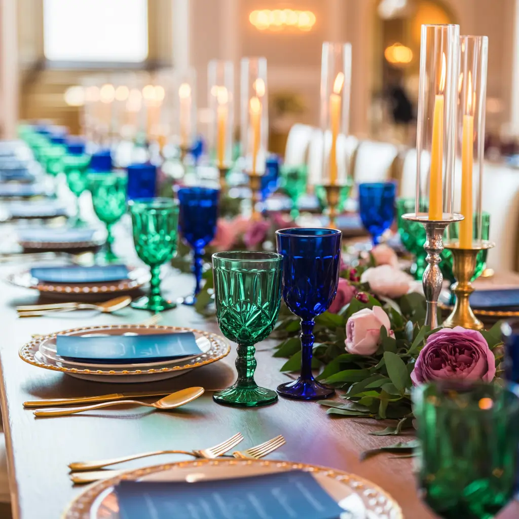
Let’s finish strong with emerald and sapphire glassware accents – because your drinks deserve to be as beautiful as everything else at your wedding. Colored glassware is having such a moment right now, and jewel tones take it to the next level of elegance.
The key to incorporating colored glassware is balance and intentionality. You don’t need every single glass to be colored – in fact, mixing colored pieces with clear crystal creates a more sophisticated and less overwhelming look. Consider emerald water glasses with clear wine glasses, or sapphire cocktail glasses with neutral dinner plates.
Vintage-inspired colored glassware adds character and charm that you just can’t get with modern pieces. The slight variations in color and the way vintage glass catches light creates this beautiful, organic feel that complements the natural beauty of jewel tones perfectly.
Think about how the colored glassware will photograph too. Emerald and sapphire glasses create gorgeous pops of color in table shots and add visual interest to candid photos of guests enjoying cocktails. The colors are rich enough to show up beautifully in photos without looking artificial or overwhelming.
Here’s a practical tip – test your glassware choices with your actual beverages before the big day. Some colored glasses can affect how drinks look (nobody wants green-tinted champagne), so make sure your choices enhance rather than detract from the drinking experience.
Conclusion
There you have it – ten jewel tone wedding decor ideas that’ll transform your celebration from ordinary to absolutely extraordinary. The beauty of jewel tones is their versatility and richness – they work in any season, complement almost any venue, and create that luxurious atmosphere that makes weddings feel truly special.
Remember, you don’t have to incorporate every single idea to create a stunning jewel tone wedding. Pick the elements that speak to you and your partner, and don’t be afraid to mix and match colors and textures. The goal is creating a celebration that feels authentically you – just with a little extra sparkle and a lot more color than the typical wedding palette.
Your wedding should be as unique and precious as the love you’re celebrating. With these jewel tone ideas, you’re well on your way to creating a day that’s truly gem-worthy. Now go forth and plan something beautiful – your future self (and your wedding photos) will thank you!