
15 Stunning Green Backsplash Kitchen Ideas to Transform Your Space
Okay, let’s be real for a second. Choosing a backsplash can be a special kind of torture. You’re staring at a million little samples, your eyes start to cross, and suddenly you’re convinced that beige is a personality trait. Been there, done that, got the paint-splattered t-shirt.
But what if I told you the answer to all your kitchen woes is… green? I know, I know. It sounds bold. Maybe even a little scary.
But trust me on this. Green isn’t just a color; it’s a vibe. It’s the feeling of a lush forest, a calm ocean, a fresh lime in your drink. It’s nature’s neutral, and it has this magical ability to be both incredibly energizing and deeply soothing.
So, if you’re flirting with the idea of a green kitchen backsplash but need a little nudge (or fifteen), you’ve come to the right place. I’ve geeked out over design for years, made a few glorious mistakes, and had a couple of wins that I’m still patting myself on the back for.
Let’s break down 15 stunning green backsplash ideas that will completely transform your kitchen from “meh” to magnificent. Get ready to fall in love.
15 Stunning Green Backsplash Kitchen Ideas
1. Emerald Green Subway Tile Backsplash: The Classic, But Make It Drama
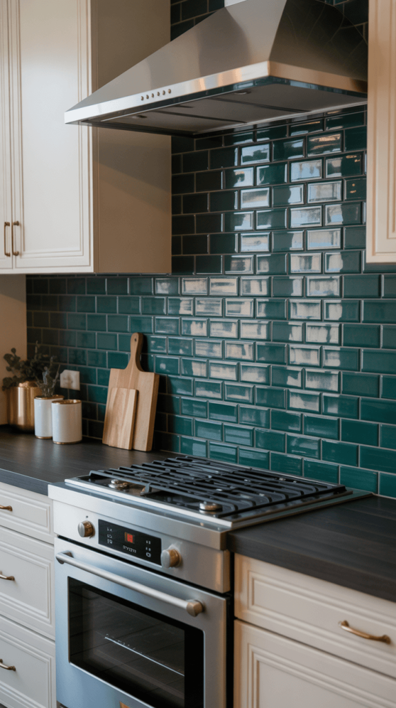
Let’s start with a showstopper, shall we? We all know and love the humble subway tile. It’s the reliable, never-let-you-down jeans of the tile world. But swap that classic white for a deep, luxurious emerald green and—bam—you’ve got a whole new level of sophistication.
- The Look: Imagine that rich, jewel-toned green laid in the classic brick pattern. It’s timeless but with a major personality injection. It catches the light beautifully and creates a depth that lighter tiles just can’t match.
- Why It Works: Emerald green is a power color. It screams elegance and confidence without trying too hard. It pairs phenomenally with both warm tones like brass and gold and cooler tones like polished nickel and chrome. Think dark cabinetry for a moody, intimate feel, or white cabinets for a stunning, high-contrast pop.
- My Two Cents: I once helped a friend install this behind her open shelving, and honestly, it’s the first thing you notice when you walk in. It makes her simple white dishes look like curated art. Pro tip: using a dark grout can help hide potential stains from splatters, which, let’s be honest, is kitchen reality.
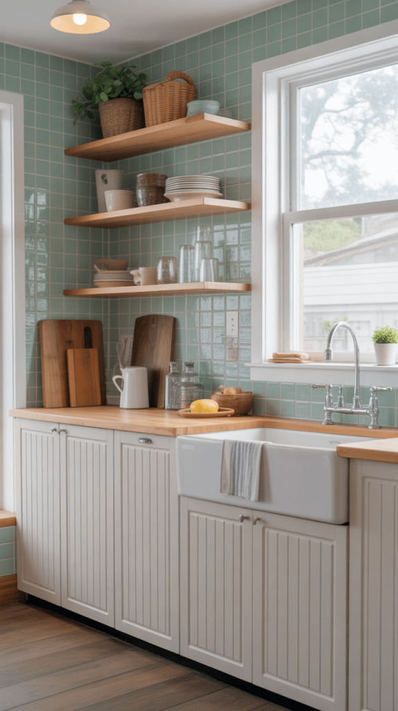
2. Sage Green Matte Kitchen Backsplash: The Calm One
If the thought of a glossy, in-your-face emerald has you breaking out in a cold sweat, let me introduce you to its chill cousin: sage green. This is the backsplash equivalent of a deep breath and a cup of herbal tea.
- The Look: A soft, dusty, greyish-green with a matte finish. It’s understated, earthy, and effortlessly cool. It doesn’t reflect light aggressively, giving your kitchen a soft, diffused glow.
- Why It Works: This is your go-to for a Scandinavian, modern farmhouse, or minimalist aesthetic. It’s a neutral that’s way more interesting than plain white or gray. It looks incredible with warm wood tones (like oak flooring or open shelving), white countertops, and black hardware for a little definition.
- A Quick Warning: Matte finishes can be slightly more prone to showing water spots or grease in a splash zone. Just ensure you choose a tile that is rated for kitchen use and has a good sealant. A quick wipe-down is usually all it needs, though. IMO, the aesthetic payoff is totally worth the extra bit of care.
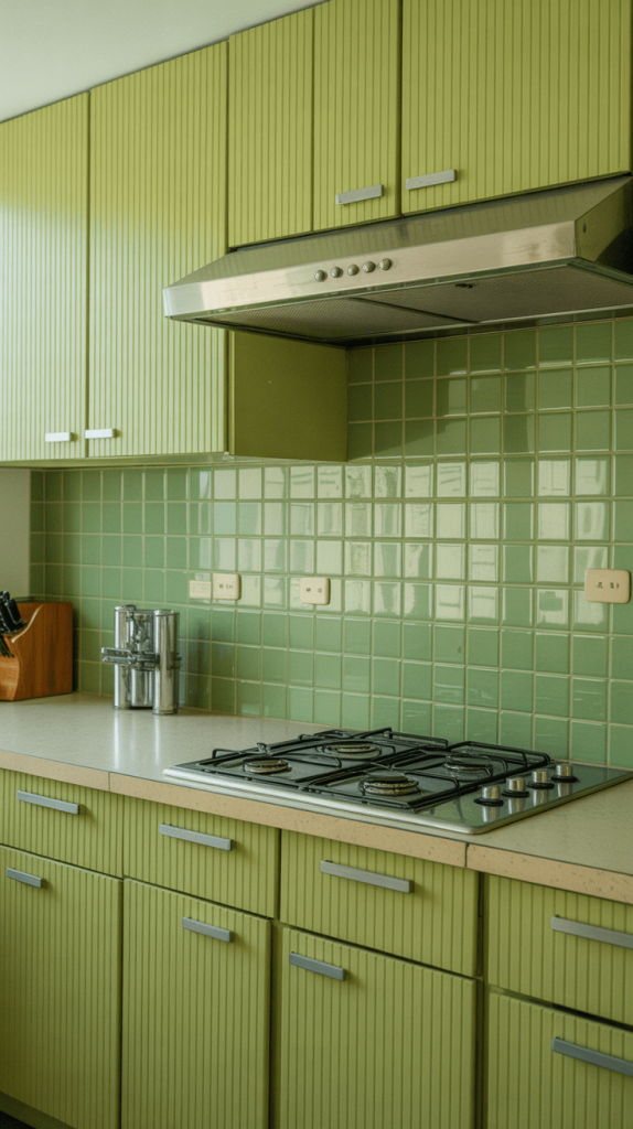
3. Glossy Olive Green Ceramic Tiles: The Retro Charmer
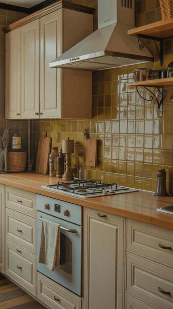
Ready to channel a little 1970s charm without the shag carpet? Glossy olive green is the way to go. It’s warm, it’s inviting, and it has this inherent vintage feel that is just so cool.
- The Look: A warm, earthy green with yellow undertones, shining with a high-gloss finish. This finish will bounce light around your kitchen, making a smaller space feel brighter and more open.
- Why It Works: It creates a cozy, almost nostalgic atmosphere. Pair it with cream-colored cabinets instead of stark white to lean into the warmth. Butcher block countertops are a match made in heaven with this tile. Add some wrought iron or black hardware, and you’ve got a kitchen that feels both historic and fresh.
- Personal Experience: My first apartment had tiny olive green tiles (hello, 1970s original!) and I hated them at first. But after painting the cabinets a cream color, I grew to absolutely love the warmth and character they added. It taught me that sometimes the “dated” feature is the very thing that gives a space its soul.
Also Read: 15 Stunning Green Kitchen Walls Ideas for a Fresh Stylish Look
4. Mint Green Herringbone Backsplash: The Sweet & Sophisticated Twist
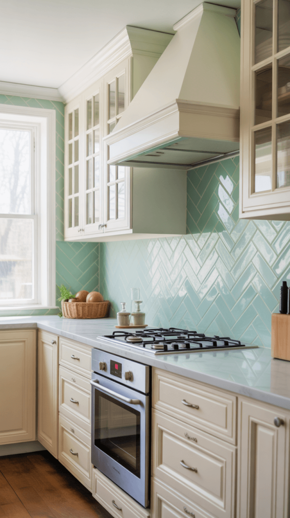
Take a delicate, airy color like mint green and lay it in a dynamic herringbone pattern. You’ve just taken “sweet” and elevated it to “sophisticated.”
- The Look: The soft, almost pastel green feels fresh and clean, while the zig-zag pattern adds movement and modern energy. It keeps the look from feeling too saccharine or childish.
- Why It Works: This is a perfect choice for a cottage-style kitchen, a beach house, or anyone wanting a light, airy feel with a ton of visual interest. It looks beautiful with white shaker cabinets and marble-look countertops. The pattern is busy enough to hide the occasional crumb between cleanings, which is a win in my book 🙂
- FYI: Herringbone installation is more labor-intensive than a standard subway pattern, which can add to the cost. But if your budget allows, it’s a breathtaking detail that makes your kitchen feel custom-designed.
5. Dark Forest Green Marble Backsplash: The Moody Luxury
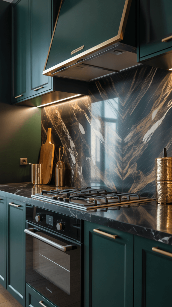
If you want to make a truly decadent statement, look no further. Dark forest green marble is pure, unadulterated drama. It’s like bringing a deep, mysterious woodland right into your kitchen.
- The Look: We’re talking deep, almost black-green with swirling white or gold veining running through it. Every slab is completely unique. It’s luxurious, bold, and seriously glamorous.
- Why It Works: This is a focal point. You build your kitchen around this. Pair it with sleek, flat-panel dark cabinets for a monolithic, modern look, or with light cabinets to let the marble truly sing. Gold faucets and hardware are a non-negotiable pairing here—they lean into the luxury and complement the veining perfectly.
- Let’s Be Practical: Marble is a soft, porous stone. It can etch from acids (like lemon juice) and stain. If you’re a messy cook or just don’t want the maintenance, you can get an incredibly realistic porcelain or ceramic tile that mimics the look without the anxiety. I’d probably go the replica route myself, because I am not gentle with my counters.
6. Teal Green Glass Tile Accent Wall: The Luminous Pop
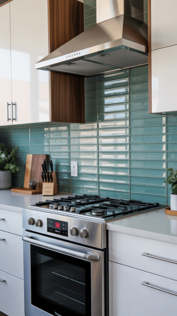
Want color that glows? Glass tile is your answer. Teal—a perfect blend of blue and green—has a mid-century modern sensibility and looks incredible when it’s lit up.
- The Look: Teal glass tiles have a translucent quality that plays with light, creating depth and a watery, luminous effect. A whole wall of this will feel vibrant and alive.
- Why It Works: It’s a brilliant way to add a huge dose of color without making the room feel dark or heavy. It’s a natural fit for modern and MCM homes. Pair it with clean white cabinets, walnut accents, and stainless steel appliances for a timeless retro-future look.
- Installation Pro-Tip: The color of the adhesive (mastic) matters with glass tile! A white-based adhesive will keep the color true and bright, while a gray-based one can dull it down. Always confirm with your installer.
Also Read: 15 Stunning Olive Green Kitchen Ideas for a Stylish Home Makeover
7. Pastel Green Hexagon Backsplash: The Modern Sweetheart
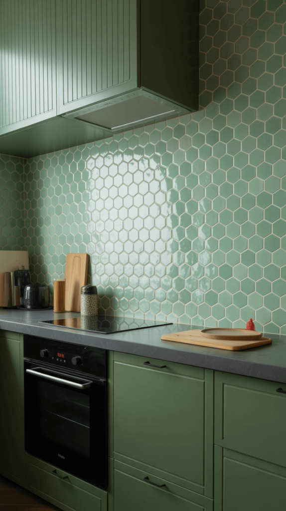
Hexagons are the cool geometric shape that took over design world, and for good reason. They feel modern, honeycomb-chic, and just a little bit fun. In a soft pastel green, they become utterly delightful.
- The Look: Small, six-sided tiles in a muted pistachio or seafoam green, arranged in a honeycomb pattern. It’s a fantastic way to use pattern on a smaller, more intricate scale.
- Why It Works: It adds texture and a modern whimsy to a kitchen. It’s unexpected and fresh. This look shines against dark cabinetry, where the soft green really pops, or in an all-white kitchen for a subtle hint of personality.
- Anecdote Time: I used a similar tile in a small bathroom renovation, and the number of compliments I get is ridiculous for such a small space. It proves that you don’t need a huge area to make a big impact with tile.
8. Chartreuse Geometric Pattern Backsplash: The Bold & The Beautiful
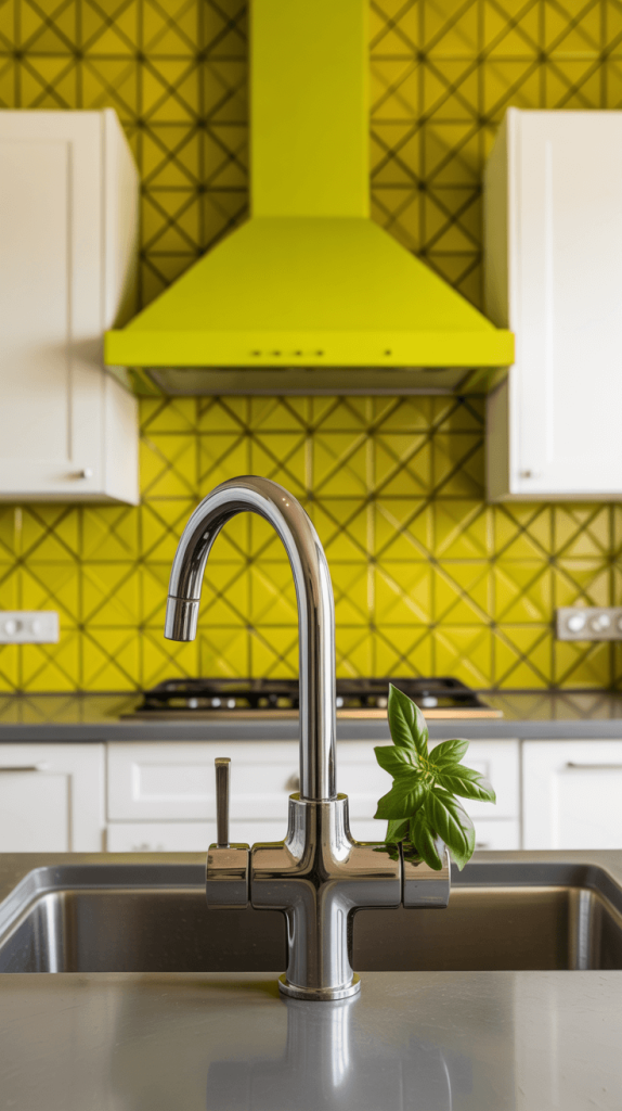
For the true maximalists and color enthusiasts out there, I see you. Chartreuse—that electric, yellow-green—is not for the faint of heart. But when used in a bold geometric pattern? It’s absolute magic.
- The Look: Think intricate patterns of diamonds, triangles, or other shapes in high-gloss chartreuse, often mixed with other colors like white, black, or navy. This is a custom, art-piece moment for your kitchen.
- Why It Works: It is pure joy. It’s energetic, creative, and guaranteed to be a conversation starter. You’d want to keep the rest of the kitchen fairly simple—maybe white cabinets and neutral counters—to let this masterpiece take center stage.
- Rhetorical Question: Ever walked into a kitchen and just felt happy for no reason? That’s the power of a bold, cheerful choice like this. It’s not just a backsplash; it’s a mood.
9. Green and White Checkerboard Backsplash: The Retro Diner Vibes
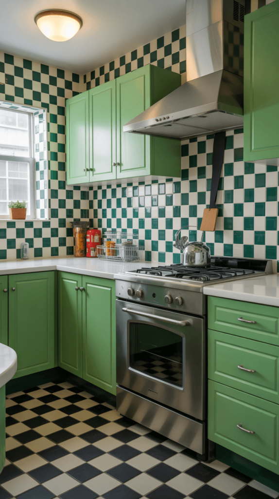
Nostalgic, graphic, and instantly recognizable. The checkerboard pattern is a classic for a reason. In green and white, it feels a little bit retro diner, a little bit country kitchen, and a whole lot of fun.
- The Look: Alternating squares of green and white tile, creating a high-contrast, dynamic pattern. You can go with a classic forest green or a brighter kelly green, depending on the vibe you want.
- Why It Works: It’s playful and packed with personality. It works amazingly in a kitchen with black and white accents—think a black stove, white cabinets, and a black-and-white tile floor. It’s a pattern that encourages you not to take your design too seriously.
- My Opinion: I’d probably use this in a smaller area, like just behind the range, to contain the pattern. But if you have the guts to go floor-to-ceiling, I salute you. It’s a commitment to fun.
Also Read: 15 Stunning Green Countertops Kitchen Ideas for Modern Homes
10. Seafoam Green Farmhouse Kitchen Backsplash: The Coastal Cousin
Farmhouse style meets coastal grandmother. Seafoam green is that beautiful, soft blue-green that reminds you of ocean waves and sunny skies. It’s the perfect way to get that relaxed, lived-in farmhouse feel with a coastal twist.
- The Look: A light, breezy green with clear blue undertones. Pair it with a beveled subway tile or a simple square tile for a classic look.
- Why It Works: It feels open, airy, and incredibly soothing. It’s a natural partner for white shaker cabinets, apron-front sinks, and open wood shelving. Add some woven baskets and terracotta pots, and your kitchen will feel like a permanent vacation.
- A Quick Tip: This color can read more blue or more green depending on the light in your kitchen and the colors you pair it with. Always, always get a sample and look at it in your space at different times of day before you commit. It’s a lesson I learned the hard way!
11. Hunter Green Glossy Tile Kitchen: The Deep Dive
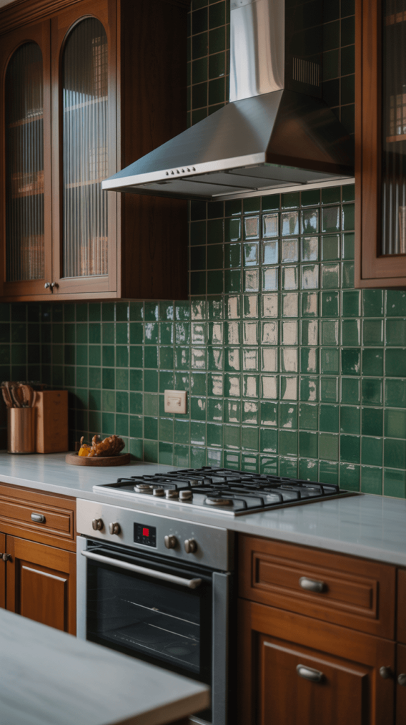
Similar to emerald but often a touch darker and less blue, hunter green is a deep, saturated green that feels traditional and rich. In a high-gloss finish, it becomes incredibly reflective and vibrant.
- The Look: A classic, almost preppy dark green that shines. It’s less jewel-toned and more like the deep green of a pine forest.
- Why It Works: It creates a cozy, library-like atmosphere in a kitchen. It’s fantastic in a traditional-style home with raised-panel wood cabinets, but it also creates an amazing contrast in a modern kitchen with sleek, white cabinets. It’s a surprisingly versatile dark color.
- Lighting is Key: Because it’s so dark, you need to ensure you have good task lighting under your cabinets and good overall ambient lighting. The glossy finish will help bounce that light around, but you don’t want your workspace to feel like a cave.
12. Green Moroccan Tile Kitchen Backsplash: The Global Traveler
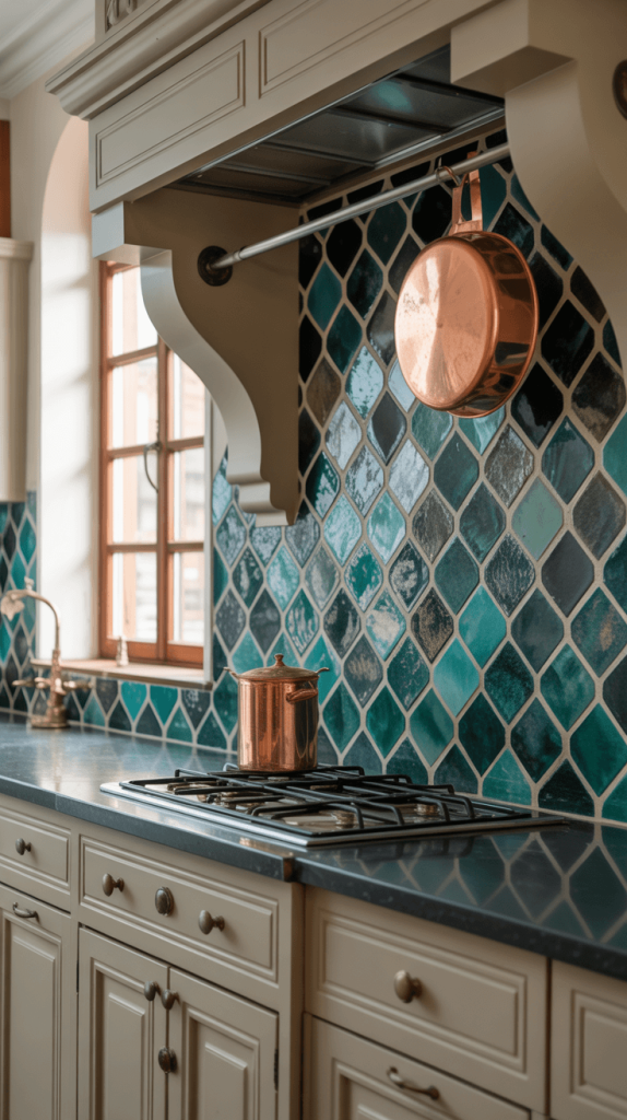
If you want intricate detail and artisan craftsmanship, Zellige or Moroccan-inspired tiles are the way to go. These handcrafted tiles are known for their slight variations in color and sheen, making a wall completely unique.
- The Look: Often in a beautiful emerald, sage, or teal, these tiles feature elaborate geometric or floral patterns. The surface is often slightly irregular, creating a play of light that feels alive.
- Why It Works: It adds an incredible amount of texture, history, and global flair. This isn’t a backsplash you buy off the shelf at a big-box store; it’s a piece of art. Keep the surrounding elements simple and neutral to let the tile work its magic.
- Fair Warning: This is a premium option. The tiles themselves and the installation (fitting all those intricate pieces together) are an investment. But if you want a one-of-a-kind kitchen, it’s worth every penny.
13. Light Green Hand-Painted Tiles: The Artisanal Touch
For a truly custom and personal touch, nothing beats hand-painted tiles. Each one is a little different, giving your kitchen a story and a soul that mass-produced tiles can’t replicate.
- The Look: Imagine a soft light green tile with hand-painted floral details, simple geometric patterns, or even a custom motif. The beauty is in the slight imperfections.
- Why It Works: It’s your kitchen, and it’s personal. You can work with an artist to create a pattern or color that is perfectly suited to your space. It works in everything from a quaint cottage to a modern home that needs a soft, organic element.
- Thinking Point: You don’t need to do an entire wall. A band of these beautiful tiles running between counter and cabinets, or just as a range hood accent, can be a more affordable way to incorporate this beautiful detail.
14. Green Gradient Ombre Kitchen Backsplash: The Modern Masterpiece
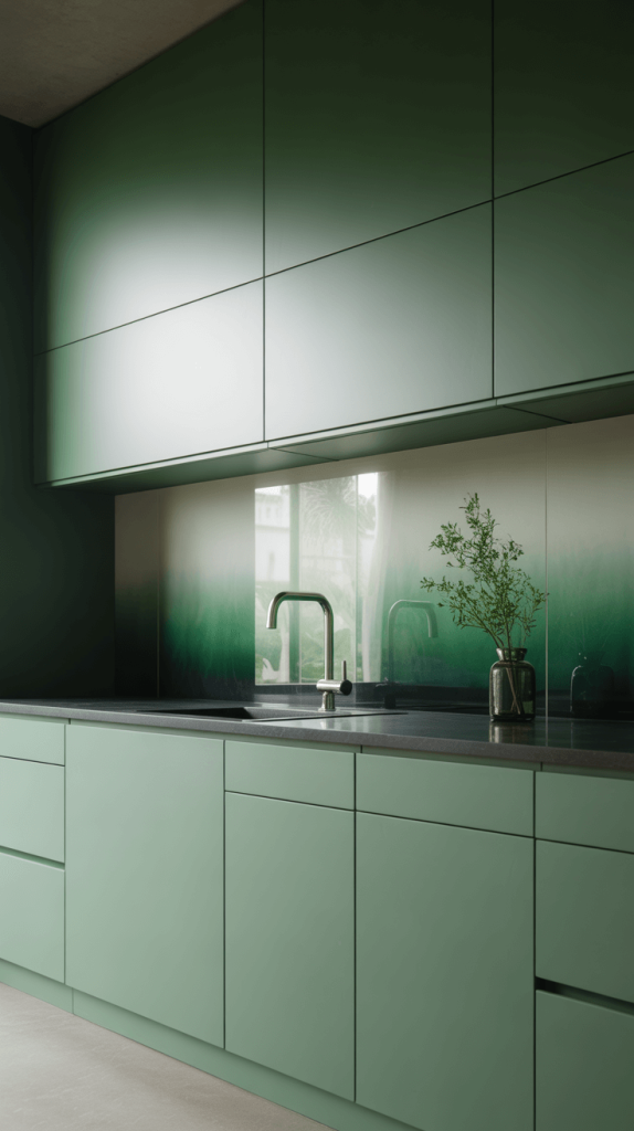
Talk about a conversation starter. An ombre effect, where the color transitions from light to dark (e.g., seafoam to emerald), is a modern, artistic, and utterly stunning choice.
- The Look: A wall that flows from one shade of green to another. It creates a sense of movement and is a truly dynamic focal point.
- Why It Works: It’s for those who see their kitchen as a canvas. It’s dramatic, modern, and incredibly cool. You’d want to pair this with very simple, minimalist cabinets and fixtures so nothing competes with the artistry on the wall.
- How It’s Done: This can be achieved with specially ordered gradient tiles or by using different shades of field tiles and arranging them deliberately. It requires careful planning but the result is a true showstopper.
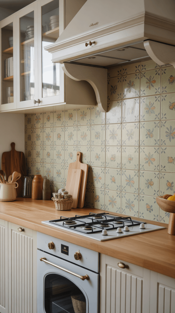
15. Retro Green Ceramic Tile Backsplash: The Nostalgia Trip
We’re ending with a full-circle moment. This isn’t just inspired by retro design; it is retro design. Think of the kitchens in mid-century ranches or 1950s bungalows.
- The Look: Often a specific shade of avocado or mint green, in a smaller size (like 4×4 inches) with maybe even a classic ribbed or fluted texture. It’s a direct homage to a specific era.
- Why It Works: Authenticity. If you’re renovating a vintage home, this is a way to honor its history while updating it for modern life. It pairs perfectly with vintage appliances, Formica countertops, and chrome-legged furniture.
- Final Thought: Design isn’t always about what’s new. Sometimes, it’s about embracing the charm of the past. This look takes confidence, but when done right, it’s not dated—it’s timeless.
So, Which Green is Your Scene?
Whew! That was a whirlwind tour of the wonderful world of green backsplashes. From the moody and dramatic to the light and airy, there’s a shade and a style for literally every single kitchen and personality.
The most important thing to remember? This is your kitchen. Choose the green that makes your heart happy every time you walk into the room. Don’t overthink it too much. Get some samples, tape them to the wall, live with them for a few days, and see how they make you feel.
Are you energized by a bold chartreuse? Do you feel calm looking at a soft sage? That’s your answer. Trust your gut. After all, you’re the one who has to live with it, love it, and—most importantly—cook in front of it.
Now go forth and create a kitchen that’s not just a place to make food, but a space you genuinely adore. And when your friends see it and their jaws drop, you can just casually say, “Oh, this old thing?” 😉


