10 Professional Interior Design Portfolio Ideas and Showcase Tips
You know that moment when you’re staring at your computer screen, trying to figure out how to showcase your interior design work without looking like everyone else? Yeah, I’ve been there. Creating a portfolio that actually stands out feels like trying to pick the perfect paint color—there are endless options, and somehow they all look the same after a while.
Here’s the thing: your portfolio isn’t just a collection of pretty pictures. It’s your chance to tell potential clients who you are, what you bring to the table, and why they should pick you over the designer down the street. After spending years tweaking my own portfolio and helping fellow designers polish theirs, I’ve discovered some killer strategies that actually work.
Minimalist Portfolio Layouts
Let’s start with something that might surprise you—sometimes less really is more. Minimalist portfolios strip away all the unnecessary clutter and let your work breathe. Think of it like designing a space with negative space (see what I did there?).
When I first switched to a minimalist layout, I thought clients would miss all the fancy bells and whistles. Boy, was I wrong. They actually spent more time looking at each project because nothing distracted them from the actual work.
Why Minimalism Works So Well
The beauty of minimalist layouts lies in their simplicity. You’re forcing viewers to focus on what matters—your designs. Clean white backgrounds, plenty of spacing between images, and simple typography create an atmosphere where your projects become the stars of the show.
Want to nail this approach? Here’s what works:
- Use a maximum of two fonts (one for headings, one for body text)
- Stick to a neutral color palette for the portfolio framework
- Let images take up at least 70% of the visual space
- Include only essential navigation elements
Making Minimalism Memorable
Now, minimalist doesn’t mean boring. You can still inject personality through subtle animations, hover effects, or strategic pops of color. I once saw a portfolio where the designer used a single accent color that matched their brand—simple but brilliant.
The trick is restraint. Every element you add should have a purpose. Ask yourself: does this enhance the viewing experience or distract from it?
Interactive Digital Portfolios
Remember when portfolios were just PDFs? Those days are long gone, my friend. Interactive digital portfolios transform passive viewers into active participants, and trust me, clients love feeling involved in the experience.
I started experimenting with interactive elements about three years ago, and the engagement rates went through the roof. We’re talking about portfolios that respond to mouse movements, reveal information on click, and even let visitors customize their viewing experience.
Creating Engagement Without Overwhelm
The key to interactive portfolios? Don’t go overboard. You want to enhance the experience, not create a video game. Some winning interactive features include:
- 360-degree room views that let clients explore spaces
- Before/after sliders they can control
- Clickable hotspots revealing design details
- Smooth parallax scrolling effects
- Interactive floor plans
Technical Considerations That Matter
Here’s where things get real—interactive portfolios need to load fast and work everywhere. Nobody’s going to wait 30 seconds for your fancy animations to load. Keep file sizes optimized and test everything on mobile devices.
FYI, about 60% of my portfolio views come from smartphones. That’s not a stat you can ignore. Make sure those interactive elements translate well to touchscreens, or provide elegant fallbacks.
Before & After Project Showcases
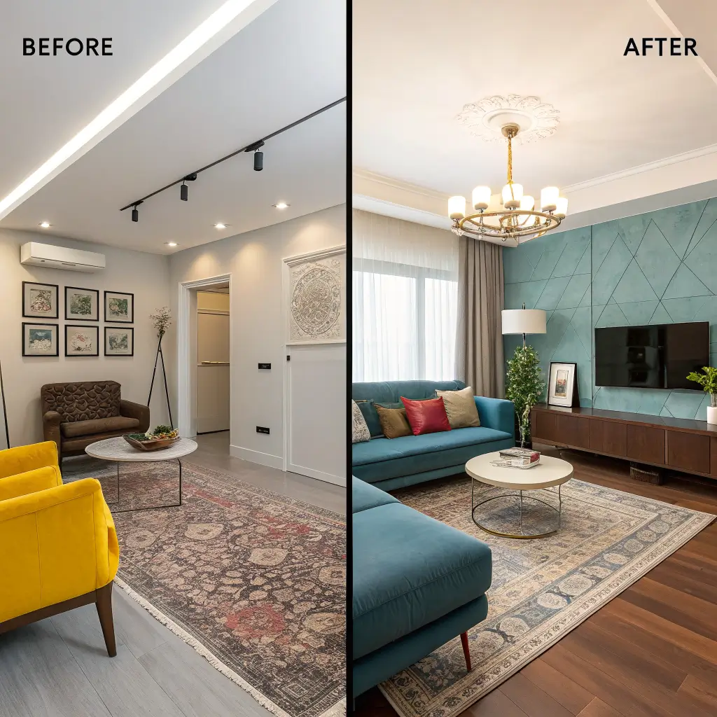
Want to know what makes clients’ jaws drop every single time? Dramatic before and after reveals. There’s something incredibly satisfying about seeing a transformation unfold right before your eyes.
I learned this trick from a photographer friend who specialized in home renovations. She said clients hired her specifically because her portfolio showed the journey, not just the destination. Smart, right?
Storytelling Through Transformation
Before and after showcases aren’t just about showing two pictures side by side. You’re telling a story of problem-solving, creativity, and expertise. Each transformation should highlight specific challenges you overcame.
Consider including:
- Brief descriptions of initial problems
- Your design solution approach
- Unexpected challenges that arose
- Final results with client testimonials
Presentation Techniques That Pop
Ever wondered why some before/after presentations grab attention while others fall flat? It’s all in the presentation. Here are my favorite methods:
- Slider comparisons where viewers control the reveal
- Side-by-side grid layouts with consistent angles
- Video transitions showing the transformation
- Sequential galleries walking through each phase
The slider option works particularly well on websites. Something about physically dragging that slider makes people feel connected to the transformation process.
Also Read: 12 Creative Interior Design Styles Ideas And Stylish Spaces
Mood Board Inspired Portfolios
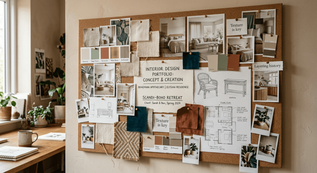
Okay, this one’s for designers who really want to show their creative process. Mood board inspired portfolios give clients a peek behind the curtain, showing how initial inspiration transforms into finished spaces.
When I first started incorporating mood boards, some colleagues thought I was giving away trade secrets. But here’s what actually happened—clients started trusting my process more because they could see the thought behind every decision.
Building Visual Narratives
A mood board portfolio section should flow naturally from inspiration to execution. Start with your initial concept boards showing:
- Color palettes and swatches
- Texture samples and materials
- Inspiration images and references
- Furniture and fixture selections
- Preliminary sketches or concepts
Then transition smoothly into the final results, showing how each element from the mood board found its place in the completed design.
Making Mood Boards Client-Friendly
Not everyone understands mood boards immediately. Some clients might see a collection of random images and wonder what they’re looking at. Add brief explanations or captions that connect the dots between inspiration and implementation.
I like to use subtle animations or highlights that draw connections between mood board elements and their real-world applications. It’s like giving a mini design education while showcasing your work.
3D Rendered Interior Highlights
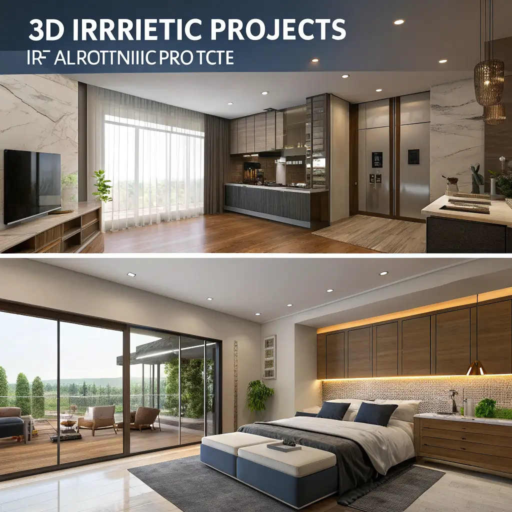
Welcome to the future of interior design portfolios! 3D renders let you showcase designs that haven’t been built yet or demonstrate your ability to visualize spaces before implementation.
I was skeptical about 3D renders at first—wouldn’t clients prefer seeing real photos? Turns out, high-quality renders can actually be more impressive because they show your ability to plan and visualize complex spaces.
When Renders Beat Reality
Sometimes renders tell the story better than photos ever could. Consider using 3D highlights for:
- Proposed designs awaiting approval
- Alternative layout options for the same space
- Impossible photography angles
- Perfect lighting conditions
- Design concepts for future projects
Balancing Renders with Real Work
Here’s the thing—you don’t want your portfolio to look like a video game showcase. Mix rendered projects with photographed ones to demonstrate both your vision and execution abilities.
Label renders clearly so clients know what they’re looking at. Transparency builds trust, and trust gets you hired. I usually include a small “3D Visualization” tag on rendered images.
Client-Centric Case Studies
Want to know what really sells your services? Stories about solving real problems for real people. Client-centric case studies transform your portfolio from a gallery into a problem-solving showcase.
Every designer has that one project where everything went wrong until they saved the day. That’s the story clients want to hear! They’re not just buying beautiful spaces; they’re buying your ability to handle their specific challenges.
Structuring Compelling Case Studies
A killer case study follows this flow:
- The Challenge: What problem did the client face?
- The Approach: How did you tackle it?
- The Process: What steps did you take?
- The Solution: What was the final outcome?
- The Impact: How did it improve the client’s life?
Keep each section punchy and focused. Nobody wants to read a novel, but they do want enough detail to understand your thinking.
Including Client Voices
Nothing beats actual client testimonials. Weave quotes throughout your case studies to add authenticity and credibility. When clients read how you solved someone else’s nightmare renovation, they start imagining you solving theirs.
I once had a client tell me she hired me specifically because another client’s testimonial mentioned how I handled a contractor dispute. She was dealing with the same issue. Sometimes it’s the unexpected details that seal the deal 🙂
Also Read: 10 Elegant Luxury Interior Design Ideas To Try Now
Eco-Friendly Design Portfolios
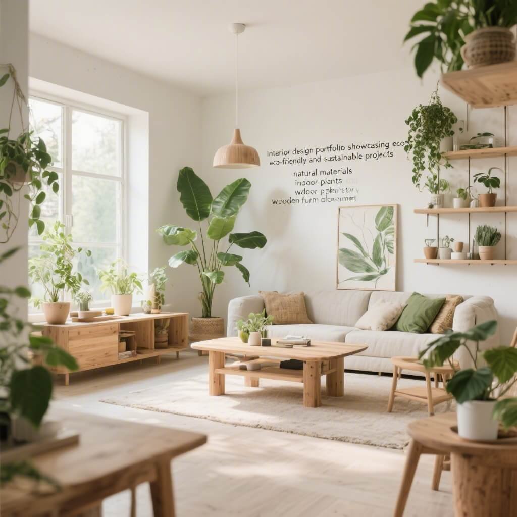
Sustainability isn’t just trendy—it’s becoming essential. Eco-friendly design portfolios attract environmentally conscious clients and showcase your commitment to responsible design.
When I started highlighting my sustainable projects, I noticed a shift in the clients reaching out. They were more aligned with my values and willing to invest in quality, long-lasting solutions.
Showcasing Sustainable Solutions
Don’t just mention that a project is eco-friendly—show exactly what makes it sustainable:
- Materials used and their environmental benefits
- Energy-saving features implemented
- Local sourcing and craftspeople involved
- Waste reduction strategies employed
- Long-term sustainability plans
Making Green Design Appealing
Here’s a secret—eco-friendly doesn’t mean sacrificing style. Your sustainable portfolio should be just as visually stunning as any other. Highlight how sustainable choices enhanced the design rather than limited it.
I love showing comparison charts of energy savings or carbon footprint reductions. Numbers make the impact tangible, and clients appreciate seeing the real-world benefits of their investment.
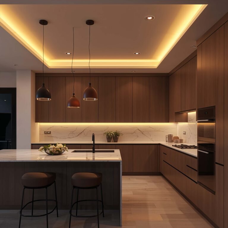
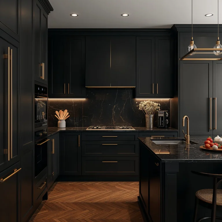
Thematic Room-by-Room Portfolios
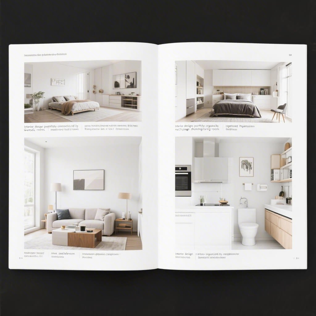
Sometimes the best way to organize your work is by room type. Thematic portfolios let potential clients quickly find examples relevant to their specific needs.
Think about it—someone looking for kitchen inspiration doesn’t want to scroll through bedrooms and bathrooms first. They want kitchens, and they want them now. This approach respects your viewer’s time and intent.
Creating Cohesive Room Collections
Each room category should feel like its own mini-portfolio:
- Living Rooms: Focus on layout, flow, and comfort
- Kitchens: Emphasize functionality and style
- Bedrooms: Highlight personalization and tranquility
- Bathrooms: Showcase luxury in small spaces
- Home Offices: Demonstrate productivity meets aesthetics
Telling Room-Specific Stories
Every room type has unique challenges and considerations. Address these specifically in your descriptions. Kitchen projects might emphasize workflow optimization, while bedroom designs could focus on creating peaceful retreats.
I organize my room sections with the most dramatic transformations first. Hook them with the wow factor, then show the range of your abilities.
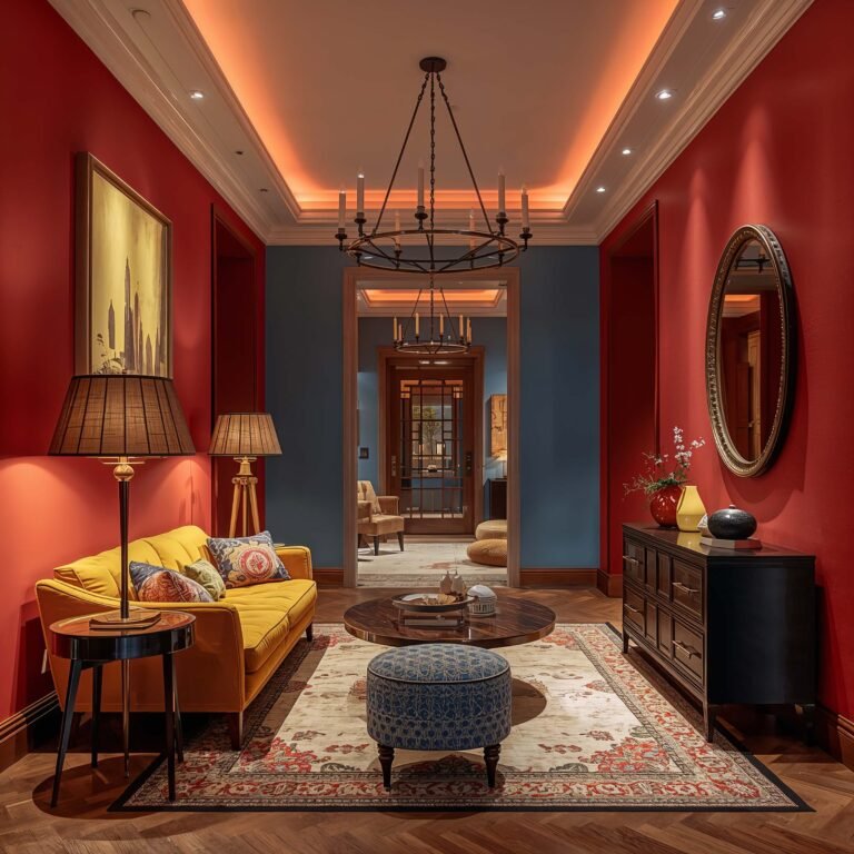
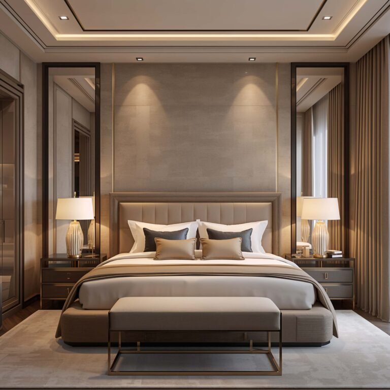
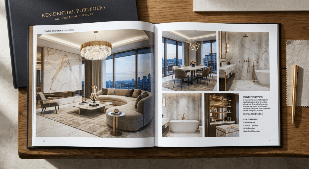
Luxury & High-End Interior Portfolios
Let’s talk about attracting those dream clients with deep pockets. Luxury portfolios require a different approach—one that whispers elegance rather than shouts it.
When I decided to pivot toward high-end clients, I completely reimagined my portfolio presentation. Gone were the busy layouts and multiple images per page. Instead, I embraced space, quality, and exclusivity.
Curating for Affluence
High-end portfolios should feel exclusive from the first click:
- Fewer, higher-quality images (quality over quantity always)
- Professional photography with perfect lighting
- Detailed shots of custom elements and finishes
- Subtle animations and transitions
- Premium typography and spacing
Demonstrating Attention to Detail
Luxury clients obsess over details, so your portfolio should too. Zoom features on custom hardware, close-ups of fabric textures, and detailed shots of architectural elements show you understand what matters at this level.
Include information about exclusive suppliers, custom fabrications, and artisan collaborations. These clients want to know they’re getting something unique, not off-the-shelf solutions.
Also Read: 12 Gorgeous Clinic Interior Design Ideas Modern Touches
Animated Storytelling Portfolios
Ready for something really different? Animated storytelling portfolios guide viewers through your projects like a movie, complete with narrative arc and emotional engagement.
I’ll be honest—this approach isn’t for everyone. But if you nail it, you’ll be unforgettable. The first time I saw an animated portfolio that revealed a project room by room with smooth transitions and ambient music, I was mesmerized.
Building Visual Journeys
Animated portfolios work best when they follow a clear narrative:
- Set the scene with establishing shots
- Build tension by showing the problem
- Create anticipation through process reveals
- Deliver satisfaction with the final reveal
- Provide resolution with happy client outcomes
Technical Execution Without Frustration
Here’s where many designers stumble—animations that take forever to load or don’t work on mobile. Keep animations smooth but lightweight. Use CSS animations over heavy JavaScript when possible.
Consider offering a “skip intro” option (yes, like those old Flash websites, but better executed). Some viewers want the full experience; others just want to see your work. Respect both preferences.
Combining Animation with Usability
The best animated portfolios enhance rather than hinder navigation. Use animation to guide attention, not confuse visitors. Subtle movements drawing the eye to important information work better than flashy effects that distract.
IMO, micro-animations often work better than grand gestures. A gentle fade-in, a smooth scroll transition, or a subtle hover effect can be more effective than elaborate animated sequences.
Bringing It All Together
So there you have it—ten ways to transform your interior design portfolio from forgettable to phenomenal. The key is choosing the approach that authentically represents your brand and resonates with your ideal clients.
Remember, your portfolio evolves with you. What works today might feel stale tomorrow, and that’s okay. Keep experimenting, keep refining, and most importantly, keep showcasing work that makes you proud.
Whether you go minimalist or animated, sustainable or luxury, the goal remains the same: showing potential clients not just what you’ve done, but what you could do for them. Your portfolio should make them think, “This designer gets it. They understand exactly what I need.”
And hey, if you’re feeling overwhelmed by all these options, start with one approach and build from there. Rome wasn’t built in a day, and neither is a killer portfolio. The important thing is to start somewhere and keep improving.
Your work deserves to be seen in its best light. These portfolio strategies ensure it will be. Now stop reading and start creating—your next client is out there waiting to be wowed by what you can do!