15 Inspiring Painted Bedroom Furniture Ideas to Refresh Your Room
Remember that boring beige dresser you’ve been meaning to do something about for the past three years? Yeah, me too. Here’s the thing – transforming bedroom furniture with paint isn’t just about slapping on a new color and calling it a day.
I’ve learned this the hard way after turning my grandmother’s vintage nightstand into what my sister lovingly calls “that purple monstrosity.” But hey, we live and learn, right?
Today I’m sharing 15 painted furniture ideas that actually work. These aren’t your typical Pinterest-perfect projects that require an art degree and unlimited patience.
I’ve tested most of these techniques myself, and the ones I haven’t? Well, I’ve watched enough friends struggle through them to know exactly what works and what doesn’t.
Pastel Dream Bedroom Furniture

Who says pastels are just for nurseries? I painted my entire bedroom set in soft pastels last spring, and honestly, it’s like waking up inside a macaron every morning – in the best way possible. Soft pinks, mint greens, and lavender blues create this dreamy atmosphere that makes your bedroom feel like a personal retreat.
The trick with pastels? You need to prep your furniture properly, or those lovely soft colors will look chalky and uneven. I learned to sand everything down to create a smooth surface first. Then I apply a quality primer – this step makes all the difference between professional-looking results and something that screams “weekend DIY disaster.”
Color Combinations That Work
Here’s what I’ve discovered works best for pastel furniture:
- Blush pink + white: Classic and timeless
- Sage green + cream: Surprisingly sophisticated
- Powder blue + gold hardware: Adds just enough glam
- Lavender + silver accents: Modern yet soft
When choosing your pastel shade, consider your room’s lighting. North-facing rooms need warmer pastels like peach or coral, while south-facing rooms can handle cooler tones like mint or sky blue. Trust me, I once painted a dresser the perfect shade of lilac, only to have it look completely gray in my cave-like bedroom.
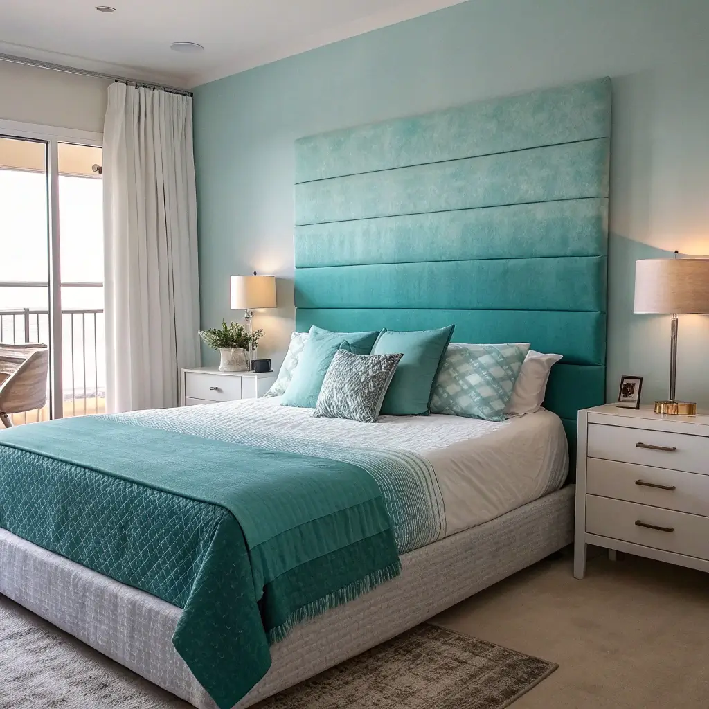
Ombre Painted Dresser Inspiration
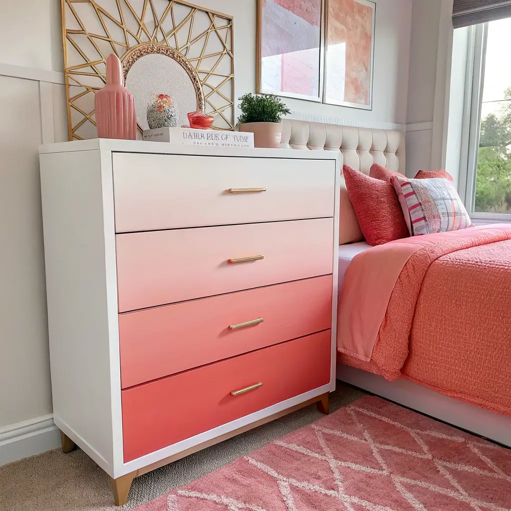
Ever wanted furniture that looks like a sunset? That’s basically what ombre painting gives you. I tackled my first ombre dresser last summer, and while it took forever, the results were absolutely worth the sore arms and paint-splattered clothes.
The key to a successful ombre effect? Blend, blend, and blend some more. Start with your darkest color at the bottom and gradually lighten as you move up. I use a large brush and work while the paint is still wet – this creates those smooth transitions that make people ask, “Where did you buy that?”
Step-by-Step Ombre Technique
My foolproof method involves:
- Starting with a white or light base coat
- Mixing five gradual shades of your chosen color
- Applying each shade in horizontal bands
- Blending edges with a dry brush while paint is tacky
Pro tip: Practice on a piece of cardboard first. Seriously. My first attempt looked less “sunset gradient” and more “someone spilled paint down the front.” The learning curve is real, but once you nail the technique, you’ll want to ombre everything in sight.
Bold Accent Color Nightstands
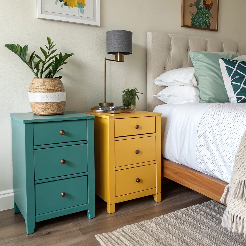
Sometimes you just need that pop of color that makes people do a double-take. I painted my nightstands in electric teal last year, and they’ve become the conversation starters of my bedroom. Bold doesn’t have to mean garish – it’s about choosing colors that complement your space while making a statement.
Think about jewel tones like emerald green, sapphire blue, or ruby red. These colors work especially well against neutral bedding and walls. The contrast creates visual interest without overwhelming the space.
Choosing Your Bold Color
Consider these factors when going bold:
- Room size: Darker colors work better in larger rooms
- Natural light: Bright colors need good lighting to shine
- Existing decor: Pick a color that appears elsewhere in small doses
- Your commitment level: Remember, you’ll see this every morning!
I always test bold colors on the inside of a drawer first. If I still love it after a week, I go for it. This saved me from painting everything in what I thought was “gorgeous mustard” but turned out to be “baby food yellow” under my bedroom lighting.
Also Read: 15 Elegant Bedroom Furniture Layout Ideas for Stylish Rooms
Vintage Whitewashed Furniture Makeover

There’s something magical about whitewashed furniture that instantly adds character to any bedroom. I inherited my grandmother’s dark mahogany dresser, and while it was beautiful, it made my small bedroom feel like a cave. Whitewashing transformed it into a light, airy piece that still shows the wood grain underneath.
The technique is surprisingly forgiving – perfect for beginners who worry about messing up. You’re essentially creating a translucent white layer that lets the wood’s natural beauty peek through. It’s like putting a filter on your furniture, but IRL.
Whitewashing Methods That Actually Work
I’ve tried three different approaches:
- Water-diluted paint (1:1 ratio): Most control, best for beginners
- Dry brush technique: Creates more texture
- Wax and paint mixture: Gives an authentic aged look
The water-diluted method works best IMO. Mix equal parts white paint and water, brush it on in sections, then wipe off excess with a clean rag. Work quickly because once it dries, you’re stuck with it. Ask me how I know this…
Two-Tone Painted Bed Frames

Why settle for one color when you can have two? I painted my bed frame in charcoal gray and cream last fall, and it completely changed the room’s dynamic. Two-tone painting adds depth and visual interest without the commitment of a bold single color.
The trick lies in choosing colors that complement each other. I typically go for a light and dark combination, but you could also do two shades of the same color family. The contrast creates definition and highlights the furniture’s architectural details.
Color Pairing Ideas
Some combinations that never fail:
- Navy and white: Nautical without being kitschy
- Black and natural wood: Modern and sophisticated
- Gray and yellow: Unexpected but cheerful
- Green and cream: Fresh and organic
Use painter’s tape to create clean lines between colors. And here’s a tip that took me way too long to learn: remove the tape while the paint is slightly tacky. Wait until it’s completely dry, and you’ll peel off chunks of your perfect paint job. Not fun.
Floral Hand-Painted Drawer Designs
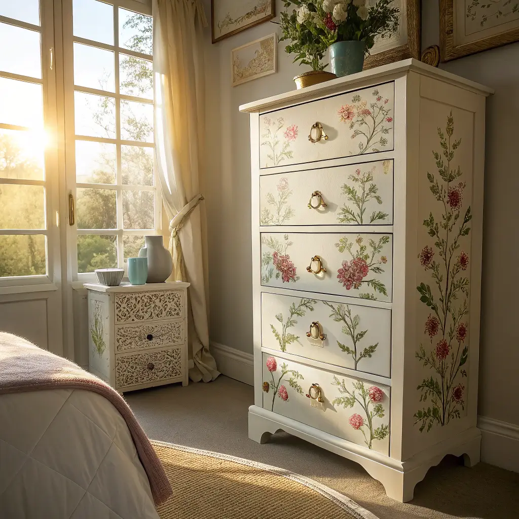
Okay, I’ll admit it – hand-painting florals scared me for years. But after taking a weekend workshop (and consuming maybe too much wine during it), I discovered it’s not as intimidating as it looks. Small floral details on drawer fronts or corners add personality without requiring Michelangelo-level skills.
Start simple with basic flower shapes. Roses are actually easier than you’d think – just overlapping C-shapes in a circle. Daisies? Even simpler. The beauty of hand-painted florals lies in their imperfection. Those little wobbles and variations make each piece unique.
Essential Supplies for Floral Painting
Here’s what you actually need:
- Small artist brushes (sizes 0, 2, and 4)
- Acrylic paints in your chosen colors
- Chalk or pencil for sketching
- Sealant to protect your artwork
Practice on paper first. I spent an entire Saturday painting flowers on newspaper before touching my furniture. YouTube tutorials are your friend here – watch them at half speed if needed. Nobody’s judging 🙂
Also Read: 15 Stunning Luxury Bedroom Furniture Ideas for Elegant Spaces
Chalk Paint Rustic Bedroom Furniture

Chalk paint changed my life. Okay, that’s dramatic, but it seriously revolutionized how I approach furniture makeovers. No priming, minimal sanding, and that gorgeous matte finish that screams “farmhouse chic” – what’s not to love?
I’ve chalk painted everything from nightstands to entire bedroom sets. The paint adheres to almost any surface, making it perfect for those vintage finds with mystery finishes. Plus, the rustic texture hides a multitude of sins (looking at you, ding in my dresser from that time I moved apartments).
Getting the Perfect Rustic Finish
My go-to technique:
- Apply two coats of chalk paint
- Lightly sand edges for worn effect
- Apply dark wax in crevices
- Buff with clear wax for protection
The waxing step transforms chalk paint from flat and chalky to rich and dimensional. Skip this, and your furniture will look unfinished. I learned this after proudly showing off my “completed” nightstand, only to have my friend ask when I was planning to finish it. Ouch.
Metallic Painted Accent Pieces

Want furniture that catches light and adds glamour? Metallic paints deliver that expensive look without the designer price tag. I painted an old mirror frame and lamp base in rose gold last year, and they’ve become the jewelry of my bedroom.
The secret to metallics that don’t look cheap? Quality paint and proper application. Those $3 bottles of craft paint might work for small projects, but for furniture, invest in the good stuff. The pigment distribution makes all the difference between “elegant shimmer” and “craft store explosion.”
Metallic Application Tips
Follow these rules for success:
- Prime with black for deeper metallic tones
- Apply thin, even coats
- Use a foam roller for smooth surfaces
- Consider metallic wax for subtle shimmer
Mix metallic with matte finishes for balance. I painted just the drawer pulls and legs of my dresser in copper, keeping the body matte black. The contrast makes the metallic elements pop without overwhelming the piece.
Coastal Blue Bedroom Furniture Ideas

Living nowhere near the ocean doesn’t stop me from creating that breezy, beachy vibe in my bedroom. Coastal blues ranging from soft sky to deep ocean create instant calm. I painted my entire bedroom suite in various shades of blue, and now every morning feels like a mini vacation.
The key to coastal style without looking like a beach-themed restaurant? Stick to sophisticated shades and avoid anything too literal. No seashell stencils or anchor motifs needed – let the colors do the work.
Perfect Coastal Blue Shades
My favorite blues for furniture:
- Benjamin Moore Palladian Blue: Soft with gray undertones
- Sherwin Williams Sea Salt: Blue-green perfection
- Farrow & Ball Hague Blue: Deep and dramatic
- Behr Dynasty Tidewater: Fresh and bright
Layer different blue tones for depth. I painted my dresser in a medium blue, nightstands in a lighter shade, and added navy blue knobs. The variation creates interest while maintaining the cohesive coastal theme.
Also Read: 15 Cozy Dark Furniture Bedroom Ideas and Warm Décor Touches
Color-Blocked Dresser Trends

Color blocking isn’t just for fashion – it’s taking over furniture too. I transformed a boring dresser into a modern masterpiece using three complementary colors in geometric blocks. The result? Instant art piece that also holds my sweaters.
This trend works best with colors from the same family or complementary pairs on the color wheel. Think pink, coral, and orange, or blue, green, and teal. The blocks can follow the natural lines of your furniture or create entirely new patterns.
Creating Clean Color Blocks
Essential steps for crisp lines:
- Map your design with painter’s tape
- Press tape edges with credit card
- Paint lightest colors first
- Remove tape at 45-degree angle
FYI, cheap painter’s tape will ruin your life. Invest in the good stuff – your sanity will thank you. I once spent three hours fixing bleed-through because I wanted to save $5 on tape. Never again.
Shabby Chic Distressed Furniture
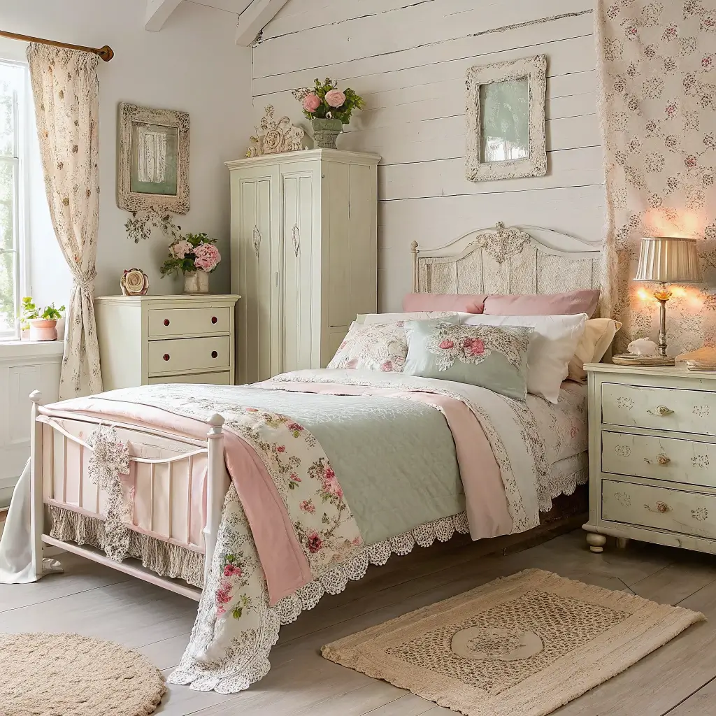
Shabby chic might feel overdone, but when executed well, it creates the most romantic bedroom atmosphere. I distressed my vintage vanity last spring, and it looks like it came straight from a French countryside cottage. Strategic distressing highlights natural wear patterns, making new furniture look authentically aged.
The mistake most people make? Over-distressing. You want it to look naturally worn, not like you attacked it with sandpaper in a rage. Focus on areas that would naturally see wear – edges, corners, and around hardware.
Distressing Techniques That Look Natural
My approach to authentic distressing:
- Sand edges and high-touch areas first
- Use varying grits of sandpaper
- Add dark wax in crevices for age
- Layer paint colors for depth when sanding through
Start subtle – you can always distress more, but you can’t undistress. I learned this after turning a nightstand into what looked like termite damage. Sometimes less really is more.
Modern Matte Finish Furniture
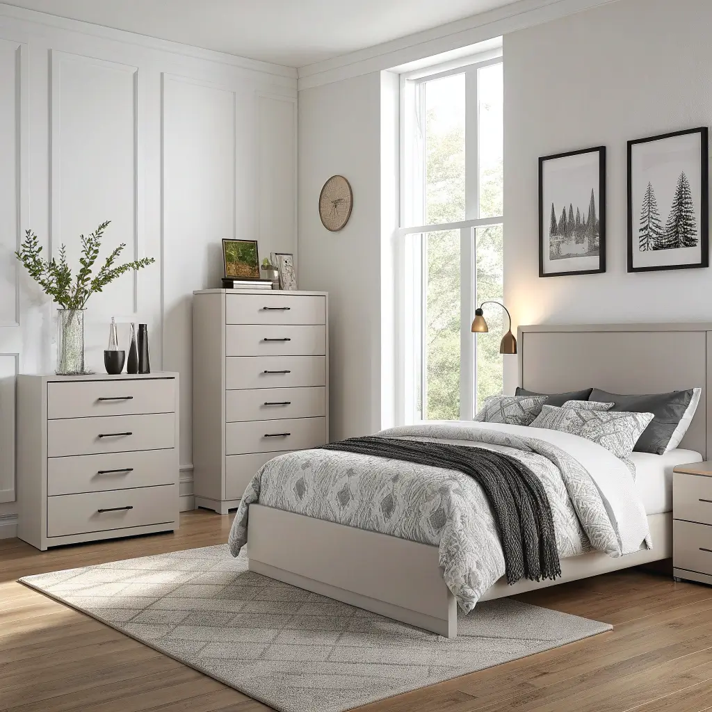
Matte finishes scream sophistication. I painted my bedroom furniture in matte charcoal last year, and the lack of shine creates this expensive, gallery-like quality. No fingerprints, no glare, just pure color that looks good from every angle.
The challenge with matte paint? It shows every imperfection. Prep work becomes crucial – any bump, scratch, or uneven surface will be visible. But when done right, nothing beats that velvety smooth finish.
Achieving the Perfect Matte Finish
Critical steps for matte success:
- Sand thoroughly with fine grit paper
- Apply primer designed for matte finishes
- Use foam rollers to avoid brush marks
- Apply thin, even coats
Protect matte finishes with appropriate sealers. I use a matte polycrylic that maintains the flat finish while adding durability. Skip this step, and your beautiful matte dresser will show every water ring and scratch within weeks.
Gradient Painted Headboards
Why buy an expensive headboard when you can create a stunning focal point with paint? I painted a gradient sunset on my headboard wall, and it transformed the entire room. Gradient techniques work on actual headboards too, creating depth and movement.
The gradient effect works best with colors in the same family. Think light pink to deep burgundy, or pale yellow to burnt orange. The transition should feel natural, like watching the sky change colors at sunset.
Planning Your Gradient Design
Consider these elements:
- Number of color transitions (5-7 works best)
- Direction of gradient (vertical, horizontal, or diagonal)
- Color intensity progression
- Room’s existing color scheme
Mix your paint colors in advance and label them. Nothing worse than trying to recreate that perfect mid-tone while your base coat is drying. I keep color swatches taped to my paint cans for reference.
Geometric Pattern Furniture Ideas
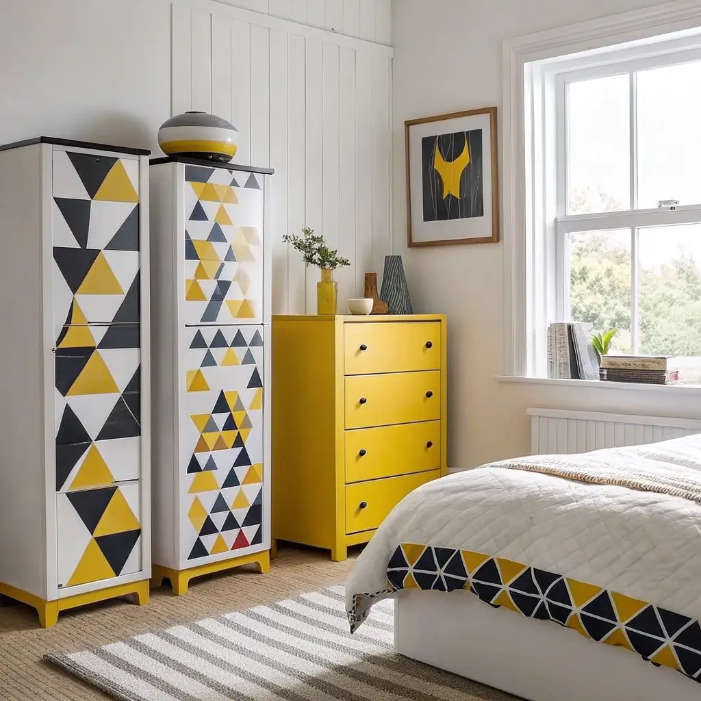
Geometric patterns transform basic furniture into modern art pieces. I painted chevron stripes on my dresser drawers, and now it looks like something from a high-end furniture store. The key lies in precise measurement and patience – lots of patience.
Start with simple patterns like stripes or triangles before attempting complex designs. Once you master the basics, move on to hexagons, diamonds, or even moroccan-inspired patterns. The transformation potential is endless.
Tools for Perfect Geometric Patterns
Must-have supplies:
- Measuring tape and ruler
- Level for straight lines
- Quality painter’s tape
- Pencil for marking
- Protractor for angles
Create a template from cardboard for repeating shapes. This ensures consistency and saves time. I spent hours hand-measuring triangles before realizing I could just trace a template. Work smarter, not harder.
DIY Stenciled Furniture Designs

Stenciling offers the detail of hand-painting without requiring artistic skills. I stenciled a mandala pattern on my nightstand top, and visitors always assume I hired an artist. Quality stencils and proper technique create professional-looking results every time.
The variety of available stencils means you can match any style – from moroccan tiles to botanical prints to modern geometrics. Mix and match stencils for custom designs that nobody else will have.
Stenciling Like a Pro
Master these techniques:
- Secure stencils with temporary spray adhesive
- Use very little paint on brush
- Dab, don’t brush, to avoid bleeding
- Clean stencils between uses
- Layer stencils for complex designs
Invest in stencil brushes – regular brushes push paint under the edges. I ruined my first project using a regular brush, creating blurry blobs instead of crisp patterns. The right tools make all the difference.
Final Thoughts
After years of painting furniture (and making every mistake possible), I’ve learned that the best results come from choosing techniques that match your skill level and patience. Start simple, build confidence, and gradually tackle more complex projects.
Remember, painted furniture is forgiving. Hate the color? Paint over it. Messed up the technique? Sand it down and try again. Unlike that tattoo you got in college, furniture makeovers aren’t permanent. So grab that paintbrush and transform that boring bedroom furniture into something that actually makes you smile every morning.
The real secret? There’s no single “right” way to paint furniture. What matters is creating pieces you love waking up to. Whether that’s a subtle whitewash or electric purple nightstands, own your choices and enjoy the process. Your bedroom should reflect your personality, not some magazine’s idea of perfection. Now excuse me while I go plan my next furniture painting adventure – I’m thinking rainbow ombre this time. What could possibly go wrong? 😉