10 Beautiful Neutral Classroom Decor Ideas to Inspire Students
Remember walking into that one classroom that just felt right? You know, the one where you actually wanted to stay after the bell rang? That’s the magic of thoughtful classroom design, and spoiler alert: you don’t need rainbow-colored everything to make it happen.
I’ve spent the last decade transforming learning spaces (and okay, maybe obsessing over Pinterest boards at 2 AM), and I’ve discovered something revolutionary: neutral doesn’t mean boring.
In fact, some of the most engaging, calming, and productive classrooms I’ve ever created relied on subtle, neutral palettes that let students’ creativity shine without overwhelming their senses.
Think about it – our kids spend roughly 1,000 hours a year in these spaces. Shouldn’t we make them feel less like sensory assault zones and more like places where actual thinking can happen? That’s exactly why I’m sharing these game-changing neutral classroom decor ideas that teachers everywhere keep begging me for details about.
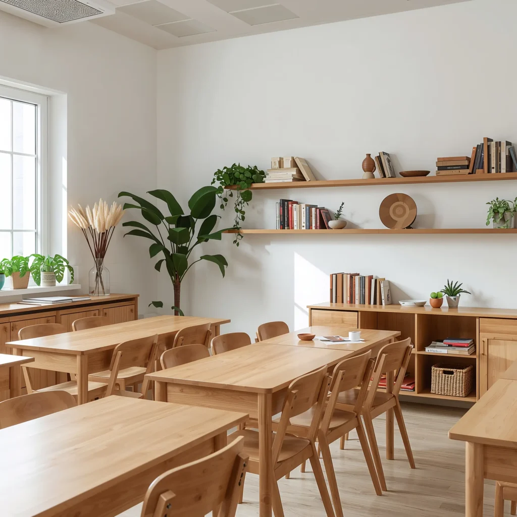
Minimalist Scandinavian Classroom
Let’s kick things off with the style that basically invented the art of looking effortlessly put-together – Scandinavian minimalism. This approach transforms your classroom into a space that whispers rather than shouts, and trust me, your students’ focus will thank you for it.
Picture this: clean white walls, light wood furniture, and just enough visual interest to keep things engaging without causing sensory overload. I implemented this style in my own classroom three years ago, and the transformation was honestly shocking. Students who usually bounced off the walls suddenly found themselves… actually sitting still?
The key here revolves around three main elements: functionality, simplicity, and that cozy factor the Scandinavians call “hygge.” Start with white or light gray walls as your base. Then layer in natural wood desks or shelving units – IKEA becomes your best friend here, FYI. Keep decorative elements minimal but meaningful: maybe a single green plant in a simple ceramic pot, or a few carefully chosen educational posters in muted tones.
Making It Work on a Budget
You don’t need to raid a Swedish furniture store to nail this look. I’ve found amazing light wood contact paper that transforms old dark furniture in minutes. Cover those dated brown bookshelves with it, and boom – instant Scandi vibes.
Add some simple white bins for storage (dollar store finds work perfectly), and organize supplies by category. Label everything with clean, sans-serif fonts printed on white labels. The organization itself becomes part of the aesthetic, which basically means you’re decorating while decluttering. Win-win, right?
The Student Response
Here’s what really sold me on this approach: my students started treating the space with more respect. Something about the clean, intentional design made them naturally lower their voices and handle materials more carefully. One parent even asked if I’d hired a professional designer. (I hadn’t, but I definitely didn’t correct them.)
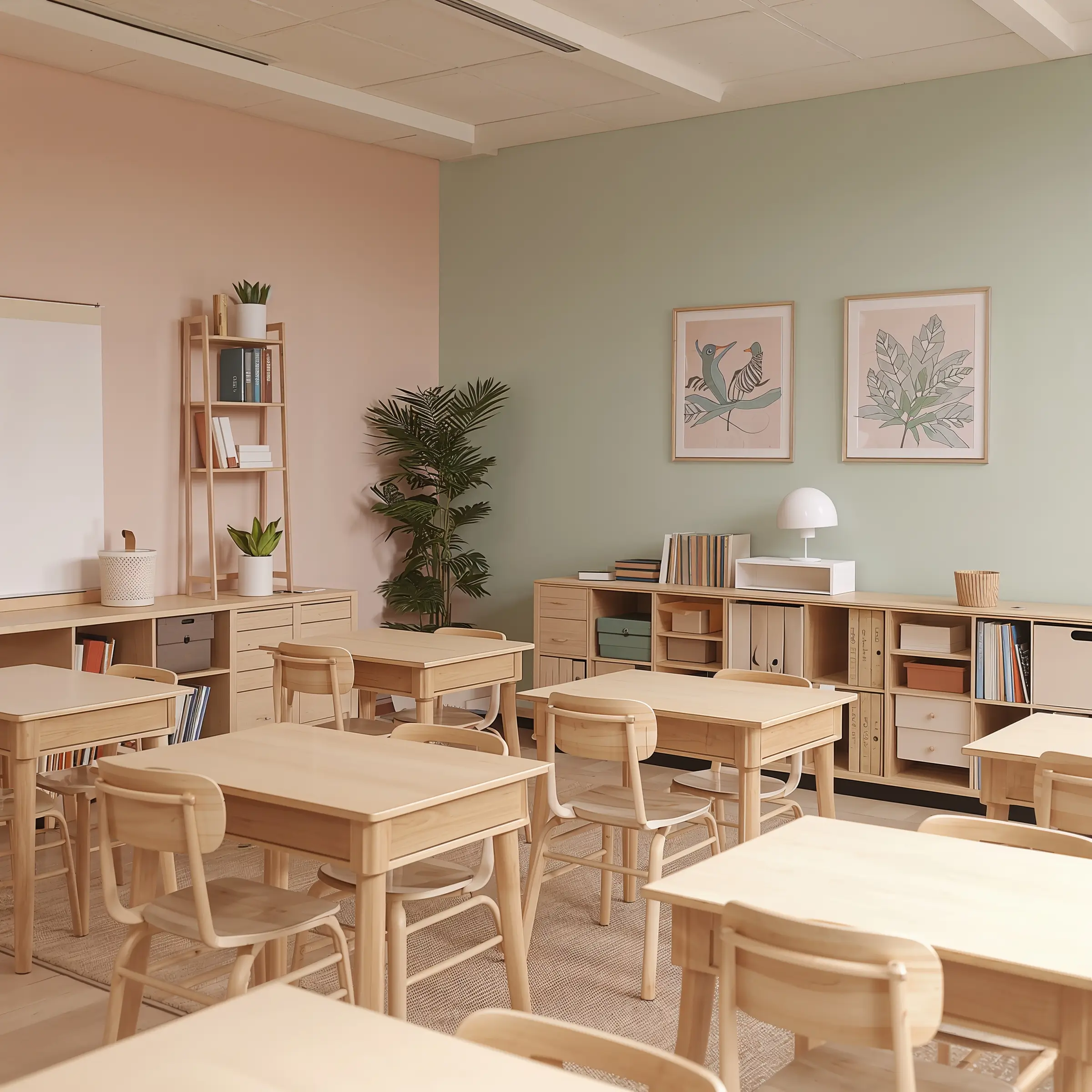
Soft Pastel Calm Learning Space

Now, before you run away thinking “pastels” means baby nursery vibes, hear me out. Strategic use of muted pastels creates an atmosphere that’s both energizing and soothing – basically the holy grail of classroom environments.
I’m talking sage greens, dusty roses, and soft lavenders that barely whisper their presence. These colors work like magic on overstimulated nervous systems. Remember that kid who always seems wound up? Watch them actually relax in a space dominated by these gentle hues.
The science backs this up too. Soft colors reduce cortisol levels and help maintain steady attention spans. I noticed this firsthand when I switched from primary colors to pastels – afternoon meltdowns dropped by about 70%. Not even exaggerating.
Implementation Strategy
Start with one accent wall in your chosen pastel shade. If painting isn’t an option (hello, restrictive school policies), removable wallpaper or fabric panels work brilliantly. Choose one main pastel and two supporting neutrals – maybe soft mint with cream and light gray.
Layer in matching elements through:
- Cushion covers for reading corners
- Folder organizers in coordinating shades
- Border trim in complementary pastels
- Area rugs that tie the whole palette together
Avoiding the Nursery Trap
The trick to keeping things sophisticated? Balance those pastels with plenty of white space and natural textures. Add woven baskets, linen curtains, or jute rugs to ground the softness with earthier elements. This prevents the space from feeling too precious or juvenile.
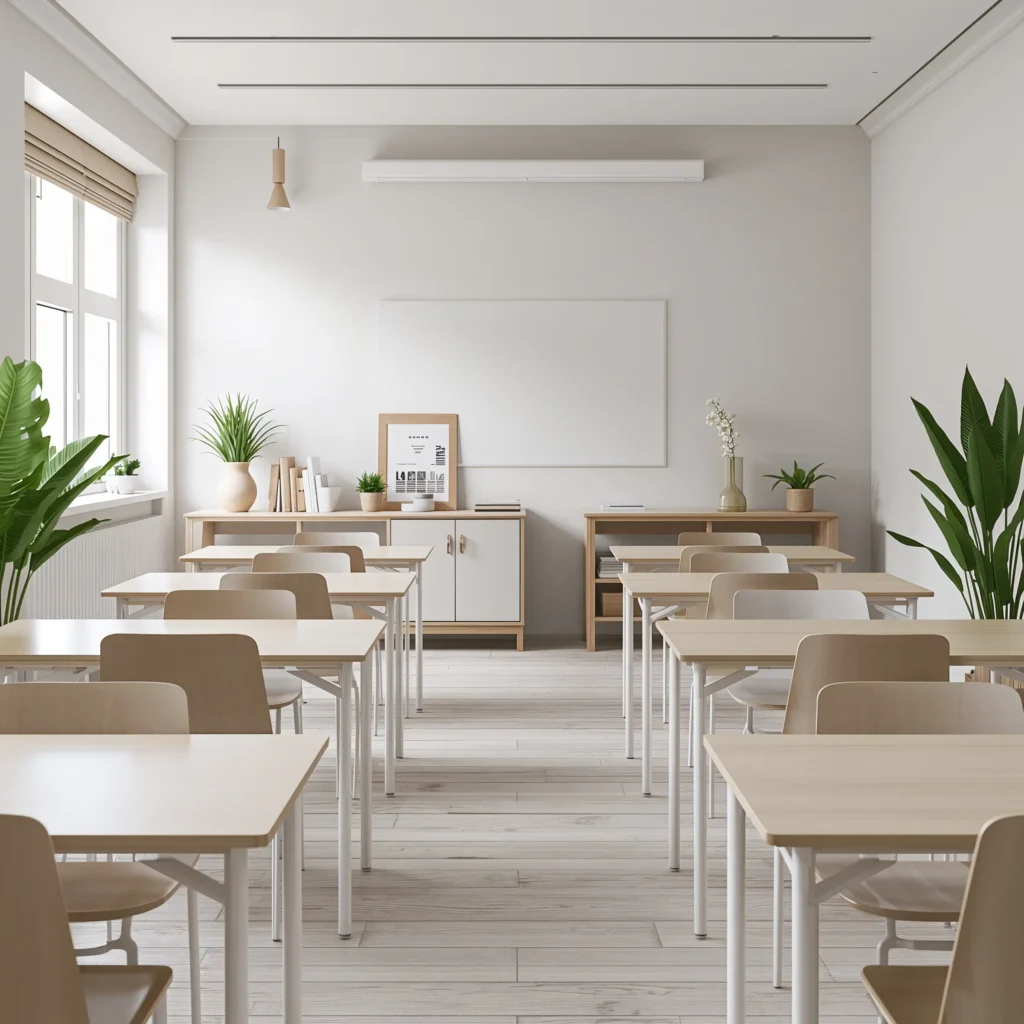
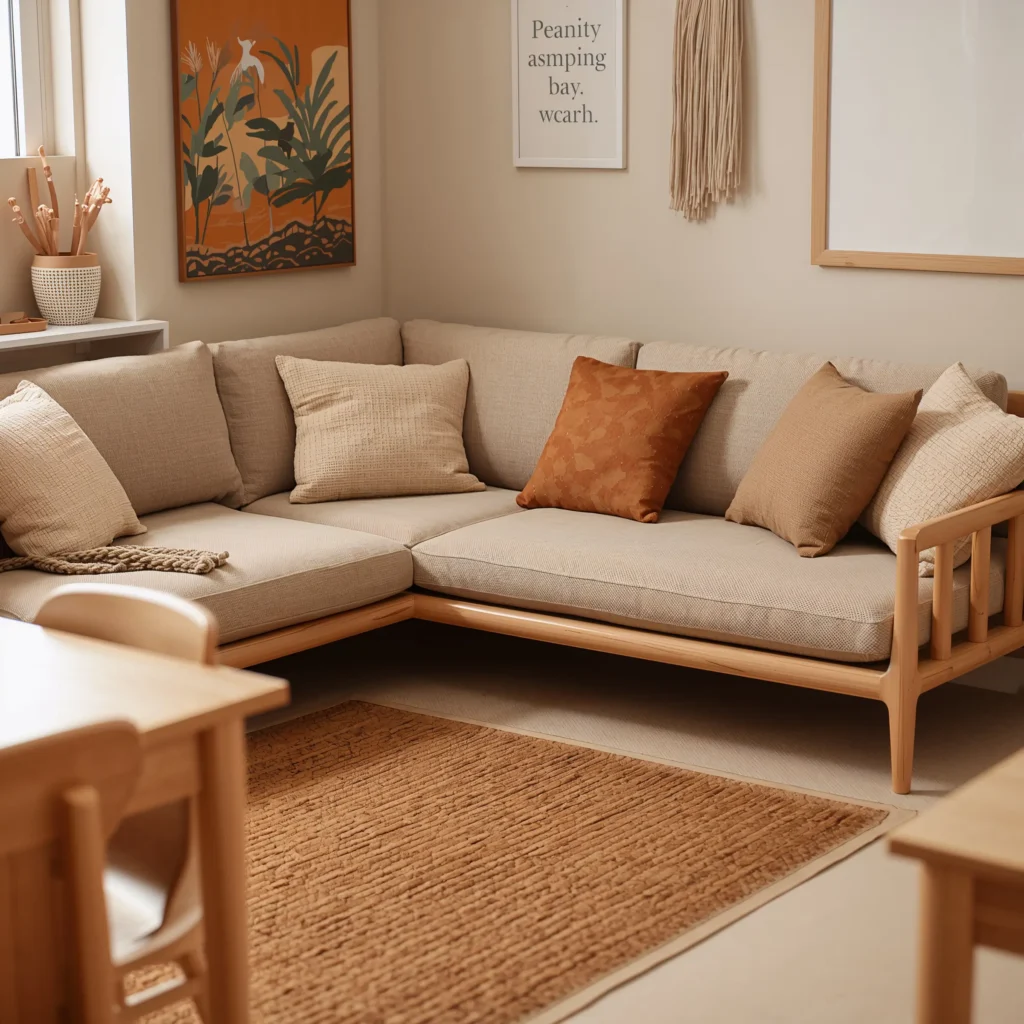
Natural Wood and White Classroom
This combination never goes out of style because it just works. The warmth of natural wood paired with crisp white creates a timeless backdrop that adapts to any teaching style or student age group.
I stumbled into this aesthetic accidentally when budget constraints forced me to work with existing wooden furniture and white walls. But you know what? It became my signature look, and other teachers constantly ask how I make it look so intentional.
The beauty lies in the contrast. White walls and surfaces reflect light, making even small spaces feel larger and brighter. Meanwhile, wooden elements add warmth and texture that prevent the space from feeling clinical or cold. It’s basically the classroom equivalent of a perfect white t-shirt and jeans combo – classic, versatile, and always appropriate.
Wood Placement Strategy
Strategic placement of wooden elements makes all the difference:
- Use wood for larger furniture pieces like desks and bookshelves
- Add wooden picture frames for student work displays
- Incorporate wooden crates for flexible storage
- Install wooden trim or wainscoting if possible
Keep the wood tones consistent – mixing cherry, oak, and pine creates visual chaos. Pick one wood tone and stick with it throughout the space.
The White Space Rules
White doesn’t mean sterile hospital vibes. Layer different shades and textures of white to create depth:
- Bright white for walls
- Cream or ivory for fabric elements
- Off-white for storage containers
- Eggshell for larger surface areas
This subtle variation keeps things interesting while maintaining that clean, cohesive look.
Also Read: 10 Stylish High School Classroom Decor Ideas for Modern Classrooms
Earth-Tone Focus Corners
Ever notice how earth tones make you want to take a deep breath? That’s not coincidence – these colors literally ground us, creating perfect conditions for concentration and calm.
I discovered this when I created a dedicated focus corner using only browns, tans, terracottas, and deep greens. Students naturally gravitated there when they needed to concentrate or decompress. One particularly hyperactive student started requesting “focus corner time” instead of having meltdowns. Talk about a game-changer!
Creating Your Earth-Tone Oasis
Start small with one corner of your classroom. You don’t need to transform the entire space:
- Lay down a brown or tan area rug
- Add floor cushions in terracotta or sage
- Include a small bookshelf painted in deep olive or warm brown
- Display natural elements like pinecones, smooth stones, or dried grasses
The key is layering different earth tones without making the space feel dark or heavy. Balance darker elements with lighter sandy beiges and warm creams.
Functional Focus Elements
Make this corner work harder by including:
- Noise-canceling headphones in a woven basket
- Fidget tools in natural materials (wooden puzzles, stress stones)
- Task cards in earth-tone folders
- A small sand timer for self-regulated breaks
Students learn to self-monitor when they have a designated space that signals “quiet work time” through its very design.
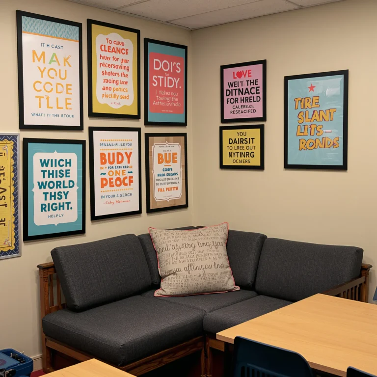
Monochrome Typography Wall Art
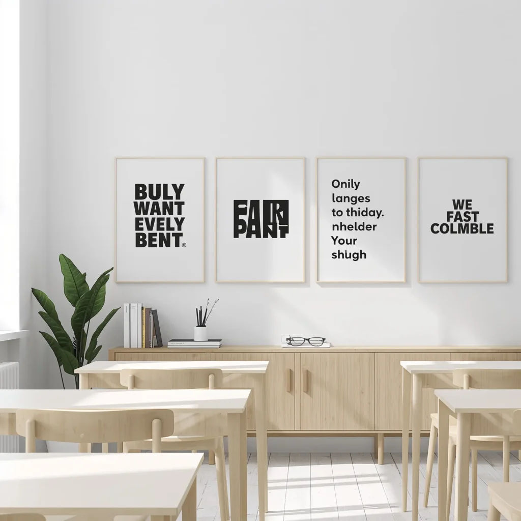
Who says educational posters need to look like they escaped from a craft store explosion? Monochrome typography art delivers important messages while maintaining sophisticated style.
I started creating my own after getting tired of cartoon alphabet trains. Black text on white backgrounds, or white on black – simple, powerful, and surprisingly engaging for students. The lack of color actually makes kids focus on the actual words and messages. Revolutionary concept, right? :/
DIY Typography That Doesn’t Suck
You don’t need graphic design skills to nail this:
- Use free online tools like Canva
- Choose bold, simple fonts (avoid Comic Sans, please)
- Stick to inspirational quotes, classroom rules, or subject-specific content
- Print on regular paper and frame in simple black frames
Mix different sizes and orientations to create visual interest. Group smaller pieces together for gallery wall impact, or go big with one statement piece.
Content That Actually Matters
Instead of generic “Believe in Yourself” posters, try:
- Growth mindset phrases: “Mistakes help my brain grow”
- Subject-specific content: Mathematical formulas in beautiful typography
- Student-generated quotes from class discussions
- Weekly rotating vocabulary words in artistic layouts
The monochrome palette means you can change content frequently without disrupting your overall aesthetic. Students actually read these because they look intentional, not like afterthoughts.
Cozy Reading Nook with Neutrals
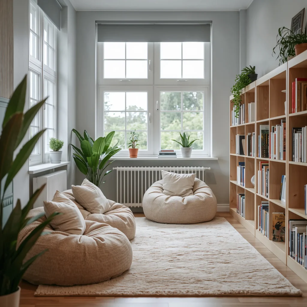
Every classroom needs that magical corner where books come alive, and neutral tones create the perfect backdrop for imagination to flourish. Think of it as creating a mini living room within your classroom – comfortable, inviting, and distraction-free.
My reading nook transformation happened after I realized bright colors were actually deterring kids from settling in with books. The rainbow bean bags looked cute in photos but created sensory competition with the actual reading material. Once I switched to neutrals, reading time became everyone’s favorite part of the day.
Building Your Neutral Sanctuary
Start with these foundation pieces:
- A neutral-colored area rug (beige, gray, or cream)
- Floor cushions in varying neutral shades
- A low bookshelf in white or natural wood
- Soft lighting from a table lamp or string lights
Layer textures to add interest without color: knit throw pillows, woven baskets, faux fur cushions, and linen curtains all contribute to that cozy factor without visual chaos.
The Comfort Factor
Make it actually comfortable, not just Instagram-worthy:
- Include back support with larger floor pillows
- Provide individual lap desks for students who prefer structure
- Add soft throws for chilly mornings
- Position near natural light when possible
The goal? Creating a space so inviting that students beg for extra reading time.
Also Read: 10 Inspiring Middle School Classroom Decor Ideas Kids Will Love
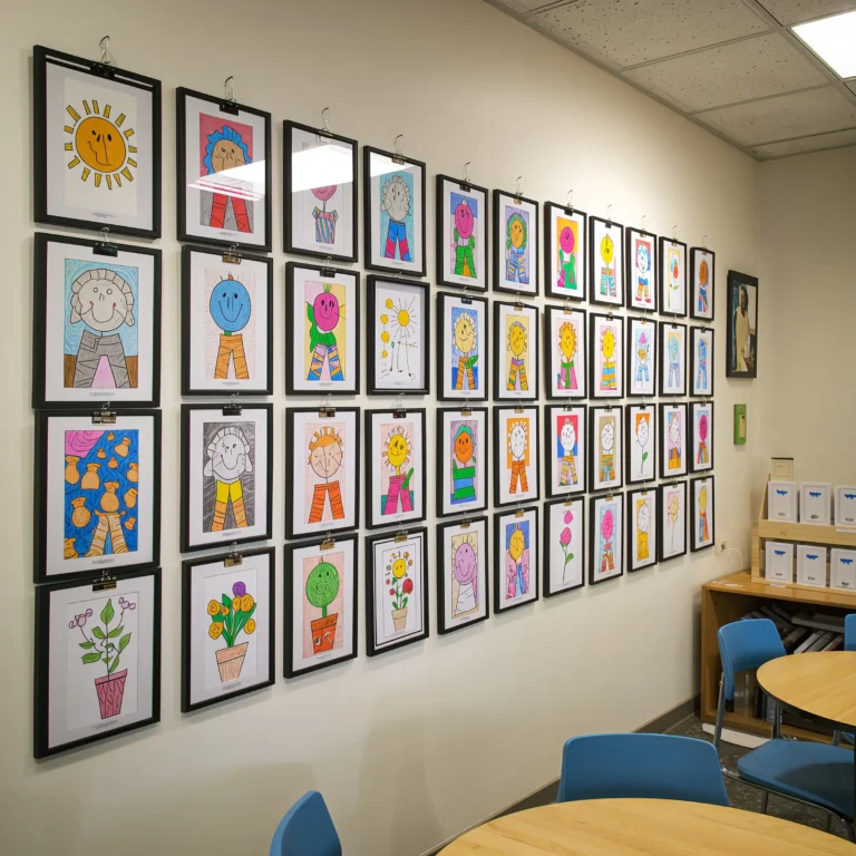
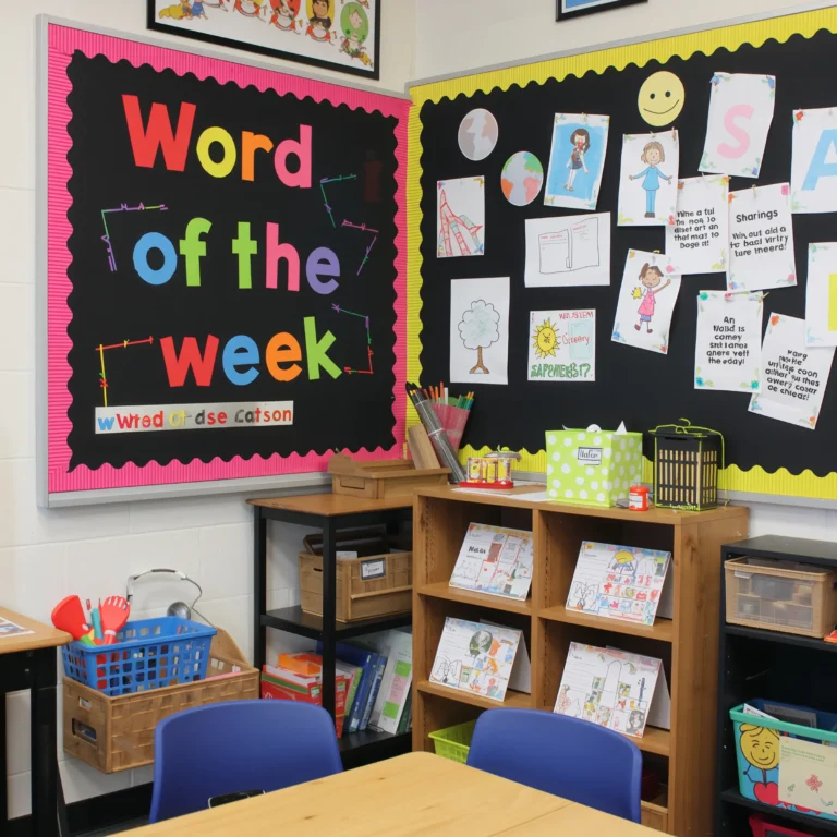
Neutral Bulletin Boards with Texture
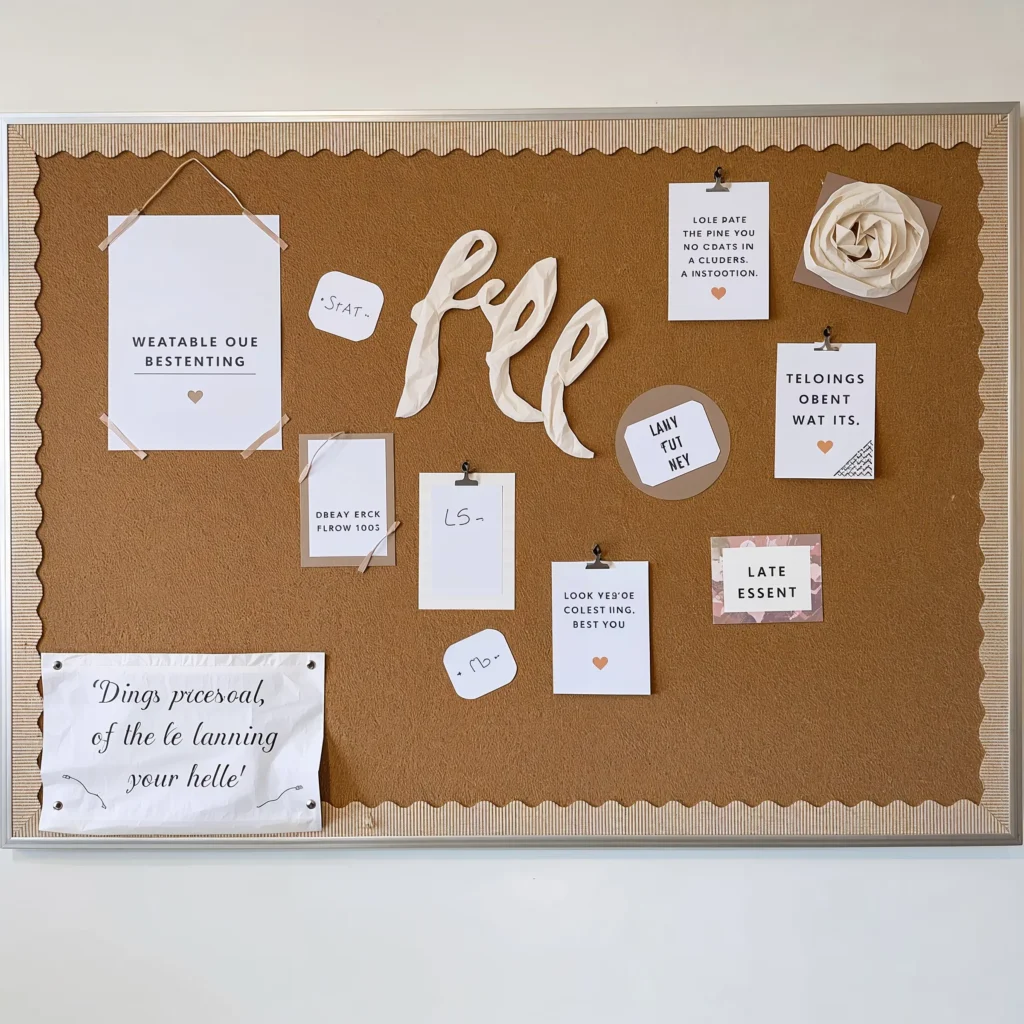
Bulletin boards don’t need to scream for attention to be effective. Textured neutral backgrounds actually showcase student work better than busy patterns ever could.
I learned this lesson the hard way after spending hours on elaborate bulletin board designs that nobody noticed after day two. Now I keep backgrounds simple and let the content shine. IMO, this approach respects both your time and your students’ work.
Texture Without Color Chaos
Transform boring boards with:
- Burlap fabric as backing (hot glue gun = your friend)
- Cork tiles arranged in patterns
- Neutral wrapping paper in subtle patterns
- Linen or canvas fabric for sophisticated texture
The texture adds visual interest while maintaining that calm, cohesive look. Plus, these backgrounds last all year – no monthly overhauls required.
Display Strategies That Work
Organize displays using:
- Consistent border materials (twine, wooden clothespins, washi tape)
- Uniform matting for student work (kraft paper or white card stock)
- Clear labeling with simple fonts
- Rotating displays to maintain freshness
Students take more pride in their displayed work when it’s presented professionally rather than lost in visual clutter.
Beige and Linen Desk Organization
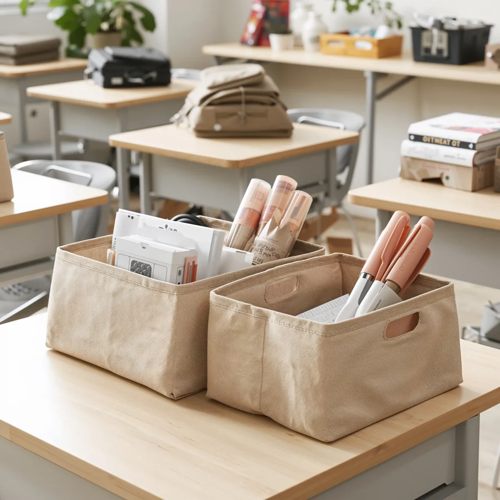
Let’s talk about the daily reality of classroom chaos – I mean, organization. Beige and linen tones for desk organizers might sound boring, but they’re secretly genius at hiding the inevitable marker stains and pencil smudges.
After years of fighting the good fight with clear plastic organizers (why do they get so grimy so fast?), I discovered the magic of neutral-toned organization. Everything looks intentional, even when Jimmy’s desk resembles a paper explosion.
Practical Organization Solutions
Invest in these game-changers:
- Linen-textured file folders
- Beige plastic caddies for supplies
- Natural canvas pencil pouches
- Cream-colored desktop organizers
Group supplies by frequency of use, not by color or type. Daily essentials in easy-reach beige bins, occasional supplies in labeled linen boxes on shelves.
The Student Desk Revolution
Transform individual student desks:
- Provide each student with a neutral-toned supply box
- Use manila folders for ongoing work
- Implement cream-colored name tags and labels
- Add small linen pouches for personal items
The uniform color scheme reduces visual competition and helps students focus on actual work rather than rainbow-colored distractions.
Rustic Minimalist Storage Solutions
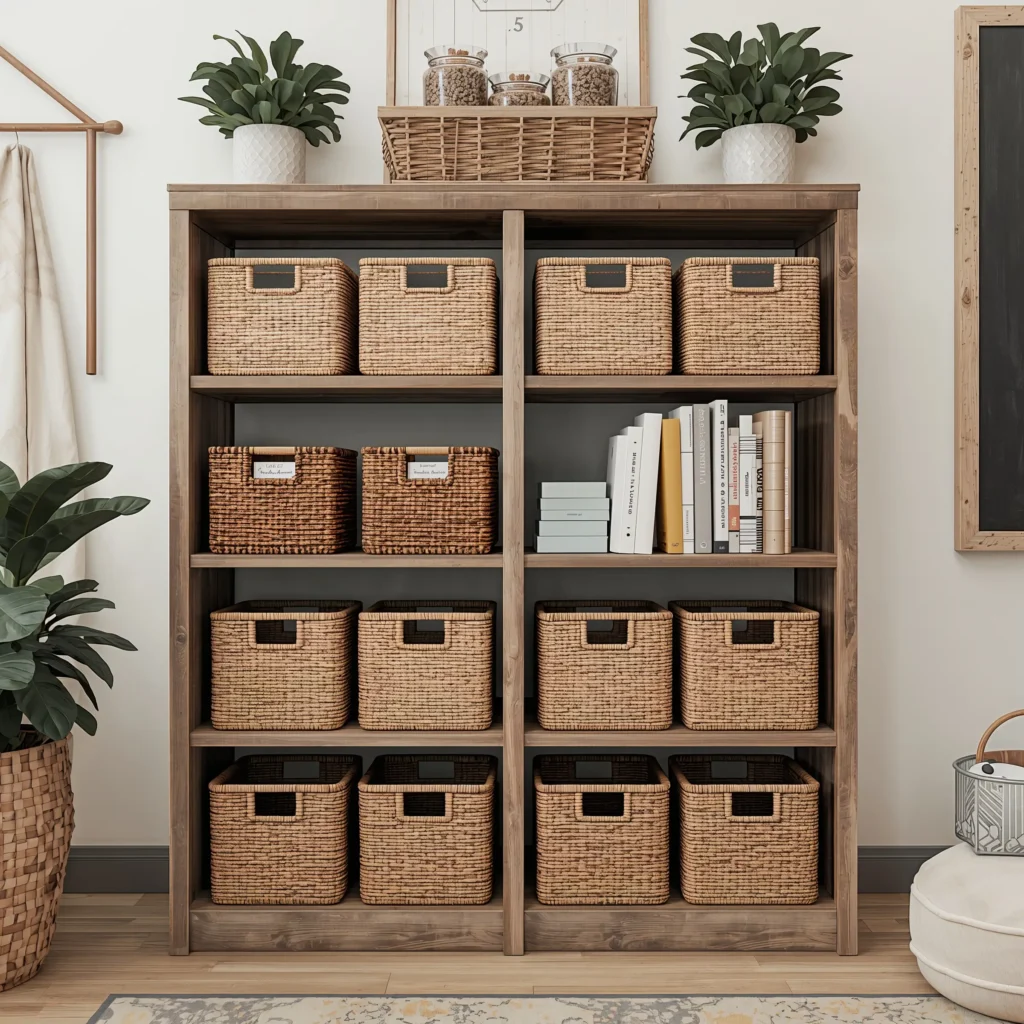
Storage doesn’t need to hide in shame behind closed doors. Rustic minimalist storage becomes part of your decor while keeping chaos at bay. We’re talking about storage so pretty, you actually want to keep it organized. 🙂
I discovered this approach after inheriting a classroom with zero built-in storage. Instead of plastic tubs everywhere, I created a storage system that looked intentional and added to the room’s aesthetic. Parents at open house asked if the wooden crates were “decorative.” Nope, they’re holding 30 sets of math manipulatives, thanks.
Storage That Doesn’t Scream “Storage”
Build your system with:
- Wooden crates in natural or whitewashed finishes
- Woven baskets in various sizes
- Metal bins with rustic finishes
- Open shelving units in light wood
Label everything clearly but beautifully – chalkboard labels, kraft paper tags, or simple printed labels in consistent fonts.
Functional Beauty in Action
Organize by zones:
- Art supplies in gathered baskets near the creative corner
- Books in wooden crates turned sideways as shelving
- Math materials in labeled metal bins
- Science equipment in clear glass jars on open shelves
The key? Everything has a designated spot that makes sense functionally AND aesthetically. Students quickly learn the system because it’s visually logical.
The Accessibility Factor
Keep frequently used items at student height in attractive containers. They’re more likely to maintain organization when the system feels accessible and appealing. Reserve higher shelves for teacher supplies or seasonal materials in matching storage boxes.
Also READ: 10 Creative Music Classroom Decor Ideas That Inspire Learning
Soft Glow Lighting Corners
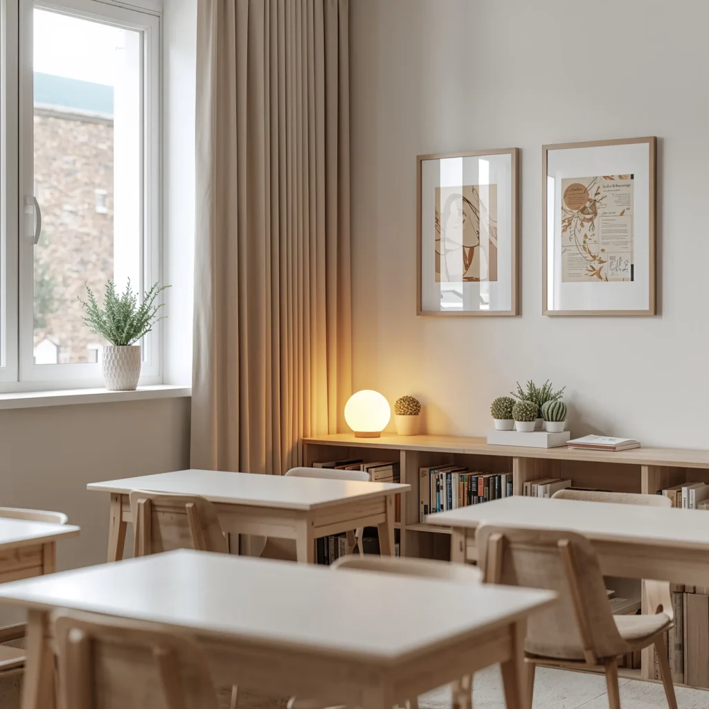
Fluorescent lighting makes everyone look like zombies, and frankly, it’s not doing anyone’s mood any favors. Strategic soft lighting transforms harsh classroom atmospheres into spaces where learning feels less like interrogation and more like exploration.
I started experimenting with alternative lighting after noticing how students’ behavior changed during our “lamp only” reading times. Aggression decreased, focus increased, and somehow everyone whispered without being asked. Lighting psychology is real, folks.
Creating Light Layers
Build your lighting scheme:
- Table lamps with warm white bulbs in corners
- String lights along one wall or window
- Battery-operated LED candles for safe ambiance
- Himalayan salt lamps for subtle color without brightness
Never rely solely on overhead fluorescents when you can help it. Even one alternative light source changes the entire room’s energy.
Strategic Placement for Maximum Impact
Position soft lighting:
- Near reading areas for comfortable browsing
- At computer stations to reduce eye strain
- Around calm-down corners for soothing atmosphere
- Behind teacher’s desk for approachable conferences
The goal isn’t to darken the room but to create pockets of gentler light where students can escape the harsh overhead glare.
The Practical Side
Let’s be real about safety and policy:
- Check school regulations about plug-in devices
- Use battery-operated options when outlets are limited
- Position cords safely with cord covers
- Choose LED bulbs for energy efficiency and cool operation
Some administrators might question the “mood lighting,” but frame it as supporting different learning styles and reducing sensory overload. Hard to argue with that logic.
Bringing It All Together
Creating a neutral classroom isn’t about playing it safe or lacking creativity. It’s about building an environment that supports learning without overwhelming developing minds. These ideas work because they respect both aesthetic appeal and functional reality.
After transforming dozens of classrooms with these principles, I’ve seen firsthand how neutral decor reduces behavioral issues, increases focus, and creates spaces where both teachers and students want to spend time. The best part? You don’t need a massive budget or design degree to implement these ideas.
Start small – pick one area or one concept that resonates with you. Maybe it’s creating that earth-tone focus corner, or perhaps switching to monochrome wall art. Every small change contributes to the overall atmosphere. Your students might not consciously notice the beige desk organizers or the soft lighting, but their nervous systems will thank you.
Remember, the most effective classroom decor doesn’t compete with learning – it enhances it. These neutral approaches provide the perfect backdrop for the real stars of the show: your students and their work. When the environment whispers instead of shouts, everyone can finally hear themselves think.
So go ahead, embrace the neutral side. Your classroom (and your sanity) will thank you for it. Who knew beige could be so revolutionary?