10 Elegant Cafe Counter Design Ideas for Luxury Looks
Look, I’ve spent more hours than I’d care to admit stalking coffee shops on Instagram (don’t judge me), and one thing’s crystal clear: your counter design can make or break the entire vibe.
You could serve liquid gold in a cup, but if your counter looks like it belongs in a 1980s office break room, good luck getting those repeat customers.
Whether you’re opening your first cafe or giving your current spot a much-needed facelift, the counter is where the magic happens. It’s where customers decide if they want to linger with their laptops or grab their coffee and run.
After visiting way too many cafes and obsessing over design details, I’ve compiled ten counter designs that actually work – not just the pretty ones that look good in photos but fall apart in real life.
1. Minimalist Wooden Cafe Counter with Warm Lighting
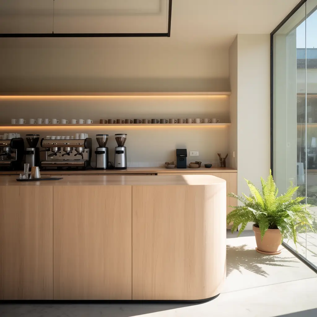
Clean lines meet cozy vibes – that’s exactly what you get with a minimalist wooden counter. I’m talking about smooth, uncluttered surfaces where every element has a purpose. No random decorative nonsense cluttering up the workspace.
The beauty of this design lies in its warm wood tones paired with strategically placed lighting. Think pendant lights hanging at just the right height (not so low that your tall customers bump their heads, trust me on this one). The wood grain becomes the star of the show when you highlight it properly with warm, golden lighting that makes everyone look good in their selfies.
Here’s what makes this design work:
• Light oak or maple surfaces that age beautifully and hide minor scratches
• Under-counter LED strips that create ambient lighting without harsh shadows
• Simple geometric shapes – rectangles and clean lines only
• Hidden storage solutions to keep the surface clutter-free
The trick is choosing the right wood finish. Too glossy and it looks cheap; too rustic and it clashes with the minimalist aesthetic. I’ve seen cafes nail this with a matte polyurethane finish that protects the wood while maintaining that natural, touchable texture.
Ever notice how some minimalist spaces feel cold and unwelcoming? The warm lighting prevents that. Position your lights to create pools of warmth rather than harsh, even illumination. Your customers will subconsciously feel more comfortable, and comfortable customers stick around longer.
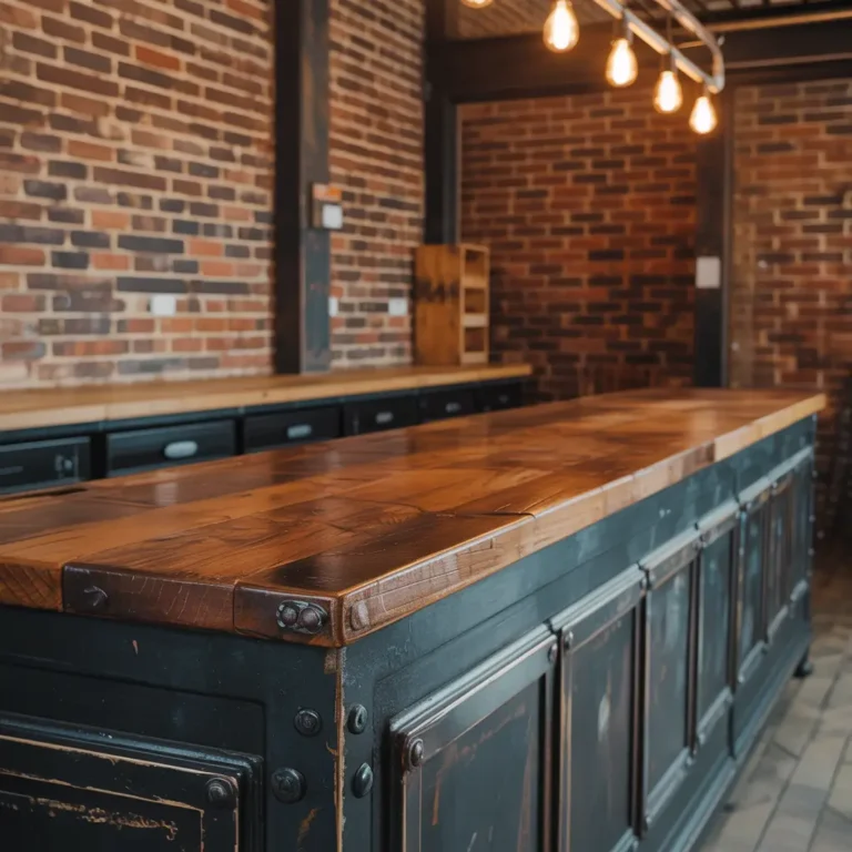
2. Industrial Style Cafe Counter with Brick Backdrop
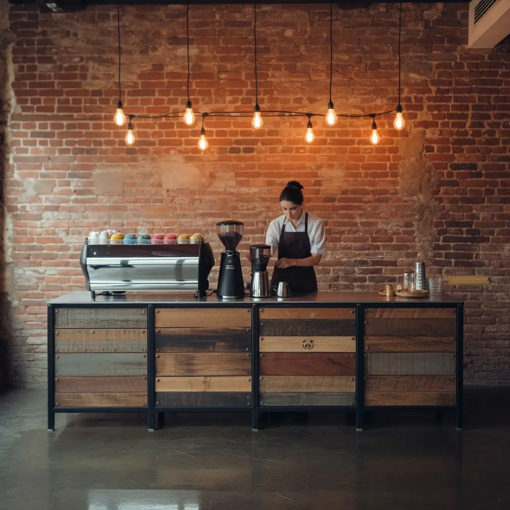
Nothing says “I’m too cool for mainstream coffee chains” quite like exposed brick and raw materials. This design screams authenticity – assuming you do it right and don’t end up looking like you’re trying too hard to be edgy.
Raw steel meets reclaimed wood in this setup, with that gorgeous brick wall serving as the perfect backdrop. But here’s the thing about industrial design: it can quickly become a cold, unwelcoming space if you’re not careful. The secret is balancing those hard materials with warmer elements.
Key elements that make this work:
• Reclaimed wood countertops with visible grain and character marks
• Black steel framework for that authentic industrial feel
• Edison bulb pendant lighting (yeah, I know they’re everywhere, but they work)
• Open shelving with metal brackets to display cups and equipment
I’ve seen too many cafes go overboard with the industrial theme and end up with spaces that feel more like construction sites than coffee shops. The brick backdrop should complement, not dominate. If you’re adding brick veneer (because not everyone has authentic exposed brick), make sure it looks convincing – cheap fake brick is worse than no brick at all.
Pro tip: Mix in some copper accents or warm metal finishes to soften the harshness. A copper espresso machine or some brass fixtures can bridge the gap between industrial and inviting.
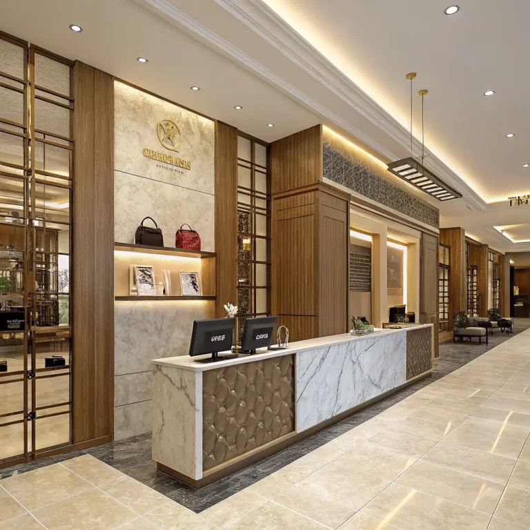
3. Luxury Marble Cafe Counter with Gold Accents
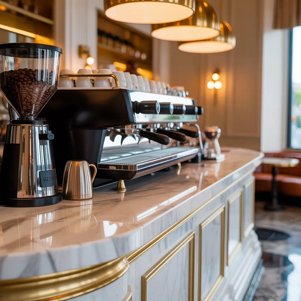
Want to charge premium prices? You better look the part. A marble counter with gold accents screams luxury, but it also requires some serious commitment to maintenance and budget.
Real marble is stunning but high-maintenance. It stains, it etches from acidic substances (hello, coffee and lemon), and it needs regular sealing. But when done right, the visual impact is undeniable. That natural veining creates movement and interest that you simply can’t fake with cheaper alternatives.
The gold accents are where you can really make this design sing:
• Brass or gold-finished faucets for that high-end coffee equipment
• Metallic bar stools with velvet or leather cushions
• Gold-framed mirrors to amplify the luxurious feeling
• Warm gold lighting fixtures that complement the metal finishes
Here’s my honest take: if you’re going marble, go Carrara or Calacatta – they’re classic for a reason. Avoid the super-exotic options that look like they belong in a nightclub rather than a coffee shop. The goal is sophisticated, not flashy.
Budget reality check: Marble counters aren’t cheap, and the gold accents add up quickly. But if you position yourself as a luxury coffee experience, customers will pay for the ambiance. IMO, it’s worth the investment if you can maintain the quality standards that match the aesthetic.
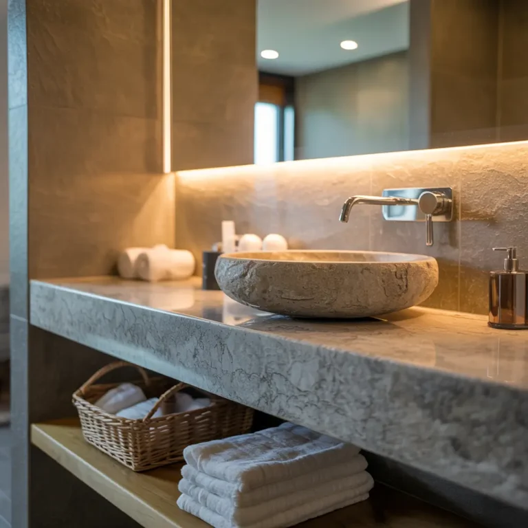
Also Read: 10 Amazing Basin Counter Design Ideas For Luxury Bathrooms
4. Small Space Compact Coffee Bar Counter Design
Not everyone has the luxury of a massive space, and honestly? Some of the most charming cafes I’ve visited have been tiny. Working with limited space forces creativity and can result in incredibly efficient, cozy designs.
The key is maximizing vertical space and creating multi-functional elements. Every square inch needs to work harder when you’re dealing with a compact footprint.
Smart design elements for small spaces:
• Multi-level counters that create visual interest and separate workspace from customer area
• Pull-out drawers instead of traditional cabinets to save space
• Wall-mounted equipment to free up counter space
• Fold-down elements that can be tucked away during slow periods
I’ve seen brilliant compact designs that use mirrors strategically to make the space feel larger without looking like a funhouse. One cafe I visited had a narrow counter that ran along the window, creating a coffee bar experience while maximizing the limited floor space.
Storage is everything in a compact design. Think about how you can incorporate storage into every element – hollow counter bases, overhead cabinets that don’t feel imposing, and even storage that doubles as seating.
The mistake I see most often? Trying to cram too much into a small space. Embrace the intimacy of a compact design rather than fighting against it. Sometimes cozy beats spacious, especially when you’re building a neighborhood coffee spot.
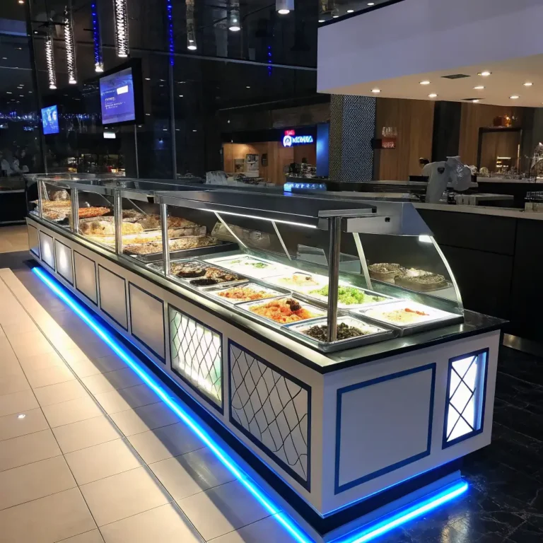
5. Modern Glass Display Cafe Counter Setup
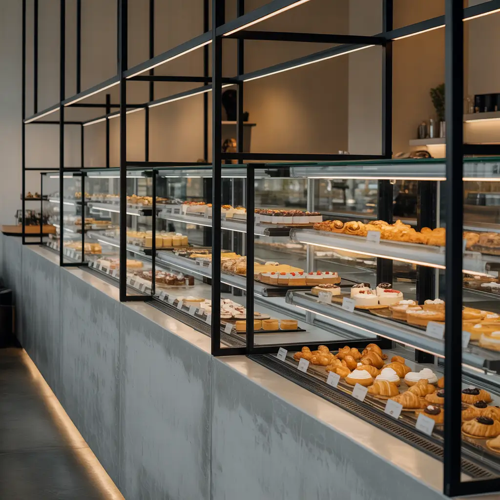
Want to show off your pastries and coffee beans while maintaining that sleek, contemporary vibe? Glass display cases integrated into your counter design create transparency and trust – customers can see exactly what they’re buying.
This design works particularly well when you’ve got beautiful products to showcase. There’s something about seeing those croissants and muffins behind clean glass that elevates the perceived quality of everything you serve.
Essential elements for this design:
• Temperature-controlled display cases to keep products fresh and appealing
• LED strip lighting inside displays to make everything look Instagram-ready
• Clean lines and minimal frames to keep focus on the products
• Easy-access design for staff efficiency during busy periods
The lighting inside these displays is crucial. Get it wrong, and your beautiful pastries look like they’ve been sitting under a heat lamp for hours. Cool white LED strips positioned to minimize shadows work best for food display.
Maintenance reality: Glass surfaces show every fingerprint and water spot, so factor in the cleaning time. But the visual appeal often outweighs the extra maintenance, especially if you’re competing with other cafes in a busy area.
One design element I love is when the glass display curves seamlessly into the counter surface. It creates this continuous flow that feels modern and sophisticated without being cold or sterile.
6. Rustic Farmhouse Style Wooden Cafe Counter
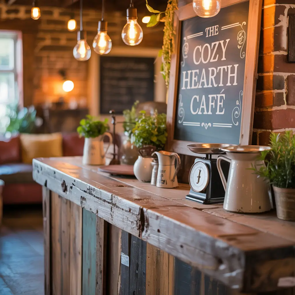
Shiplap and distressed wood might be everywhere these days, but there’s a reason farmhouse style has staying power – it feels like home. This design works especially well in suburban locations or anywhere you want to create that “countryside escape in the city” vibe.
The key to authentic farmhouse style is using genuine reclaimed materials when possible. Real barn wood has character marks and weathering that you simply can’t replicate with new lumber and artificial distressing techniques.
Farmhouse counter elements that work:
• Thick, chunky wood countertops with visible grain and imperfections
• Shiplap or board-and-batten backsplash painted in classic farmhouse white
• Mason jar lighting fixtures (if you can pull them off without looking too Pinterest-y)
• Open shelving with wrought iron brackets for a functional, lived-in feel
I’ll be honest – farmhouse style can go wrong fast if you overdo it. Avoid the theme park effect by choosing one or two key elements and letting them shine rather than cramming in every farmhouse cliche you can find.
The color palette is crucial here. Whites, creams, and natural wood tones create that clean, fresh feeling, while black accents add sophistication. Think more “modern farmhouse” than “country store explosion.”
Personal experience: I visited a cafe that nailed this style by using an actual antique farm table as their counter base. The authenticity was obvious, and it became a conversation starter with customers. Sometimes the real thing is worth hunting for.
Also Read: 10 Modern Office Counter Design Ideas for Sleek Workspaces
7. Neon Lit Instagram Aesthetic Cafe Counter
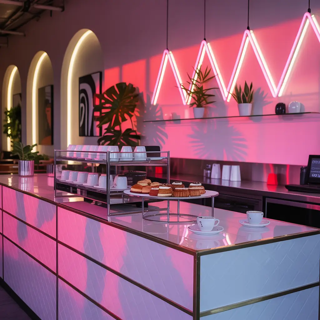
Let’s be real – sometimes you need to design for the ‘gram. Neon lighting creates that electric, energetic vibe that has customers pulling out their phones before their coffee even arrives.
But here’s the thing about neon: it can easily cross the line from trendy to tacky. The secret is strategic placement and color choice. You want enough neon to create ambiance without turning your cafe into a nightclub.
Neon design elements that work:
• Custom neon signs with your cafe name or coffee-related quotes
• Color-changing LED strips that can adapt to different times of day
• Neon accent lighting under counters or behind shelving
• Instagram-worthy neon backdrops for customer photos
Pink and blue neon combinations seem to be the current favorite for that retro-futuristic aesthetic. But don’t just follow trends blindly – choose colors that work with your overall brand and space.
The Instagram factor is real, people. A well-designed neon element becomes free marketing when customers share photos. I’ve seen cafes get thousands of dollars worth of social media exposure from one well-placed neon sign.
Warning: Neon can be overwhelming during daylight hours. Consider dimmer switches or programmable lighting that adjusts throughout the day. Your morning coffee crowd might not appreciate the same lighting intensity as your evening customers.
8. L-Shaped Efficient Cafe Counter Layout Design
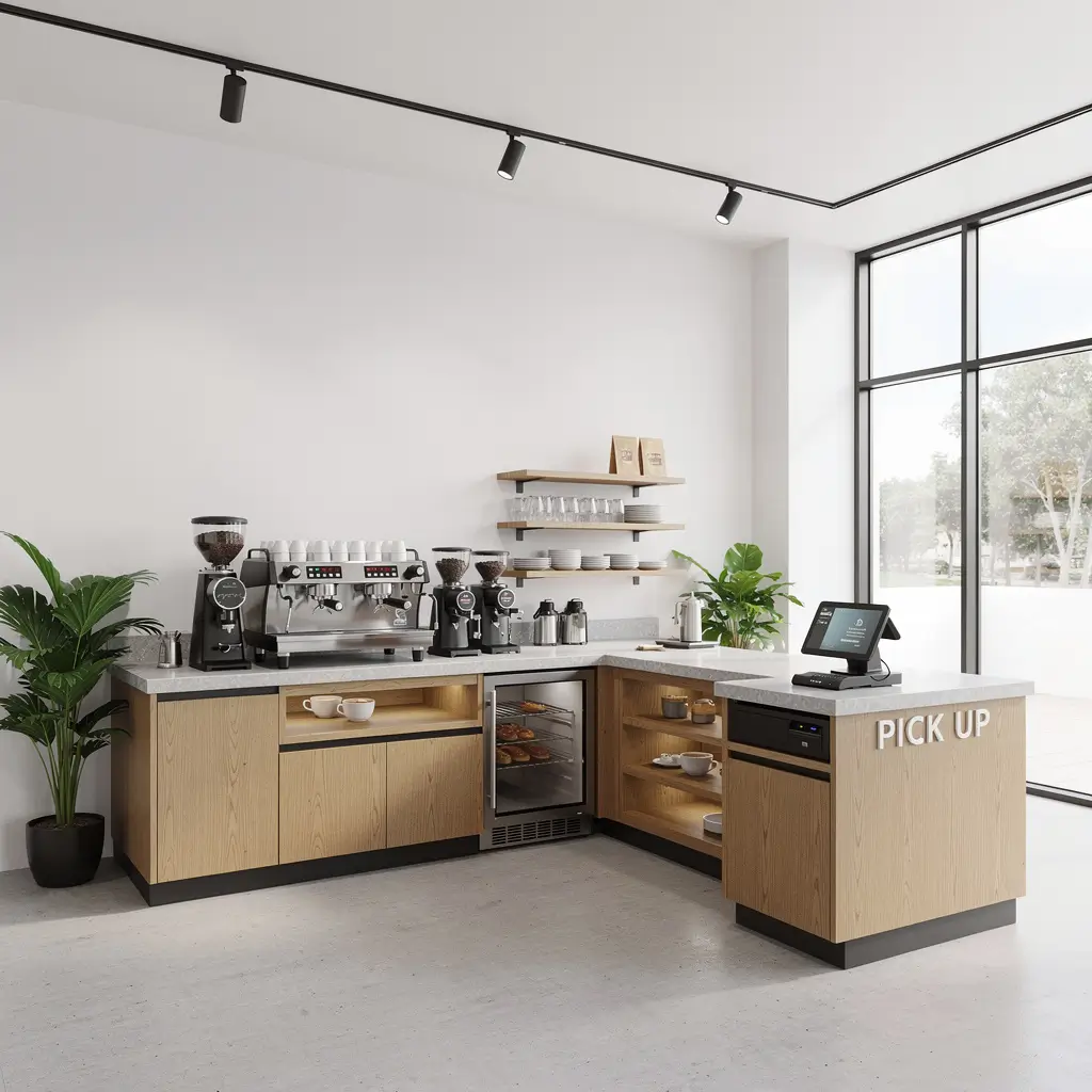
Workflow efficiency meets customer interaction – that’s what you get with a smart L-shaped counter design. This layout is pure genius for busy cafes because it separates the order/payment area from the pickup area, reducing congestion and confusion.
The L-shape creates natural zones within your space. Customers order at one end, move along to wait at the other, and staff can work efficiently without constantly dodging around each other.
L-shaped layout advantages:
• Separate ordering and pickup zones to manage customer flow
• Corner positioning maximizes available space utilization
• Multiple work stations for different tasks and equipment
• Clear sight lines between staff and customers
I’ve watched cafes struggle with linear counter designs during rush periods – it’s chaos. The L-shape eliminates bottlenecks by giving people clear direction and purpose for where they should be standing.
Equipment placement becomes crucial with this design. Position your espresso machine and grinders at the corner where both counter sections meet. This gives your baristas access to everything they need without excessive movement.
The corner area can become a feature element – maybe a beautiful espresso machine display or a small seating nook that makes use of what could otherwise be dead space.
9. Eco-Friendly Green Plant Integrated Cafe Counter
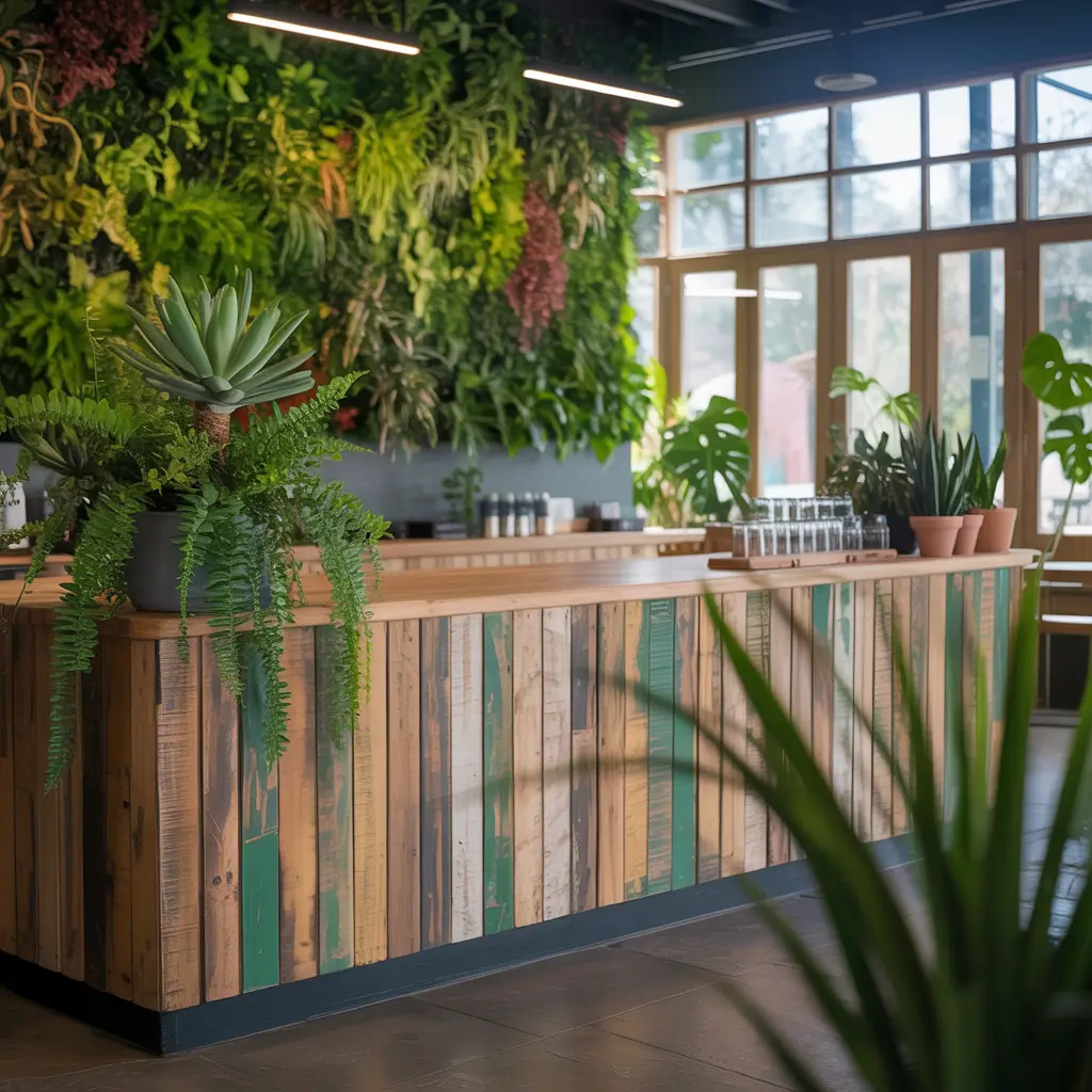
Living walls and integrated planters aren’t just pretty – they’re practical. Plants improve air quality, reduce noise, and create that biophilic connection that makes spaces feel more natural and calming.
The trick is choosing the right plants for a food service environment. You need species that can handle varying humidity levels, don’t shed leaves constantly, and won’t harbor pests or require messy maintenance during business hours.
Eco-friendly design elements:
• Reclaimed wood surfaces with certified sustainable sourcing
• Living plant walls or integrated planter boxes
• Natural fiber stools made from bamboo or cork
• Energy-efficient LED lighting that works for both plants and ambiance
Plant selection matters. Pothos, snake plants, and ZZ plants are nearly bulletproof and look great in coffee shop settings. Avoid anything too exotic or high-maintenance – dead plants are worse than no plants.
Maintenance reality check: Plants require daily attention. Watering, pruning, and general care add to your operational tasks. But customers love the natural element, and it supports the growing trend toward sustainable, environmentally conscious businesses.
I’ve seen cafes integrate herb gardens into their counter designs – not just for show, but actually using the herbs in their drinks and food. Fresh mint for mojito-style coffee drinks? Genius and practical.
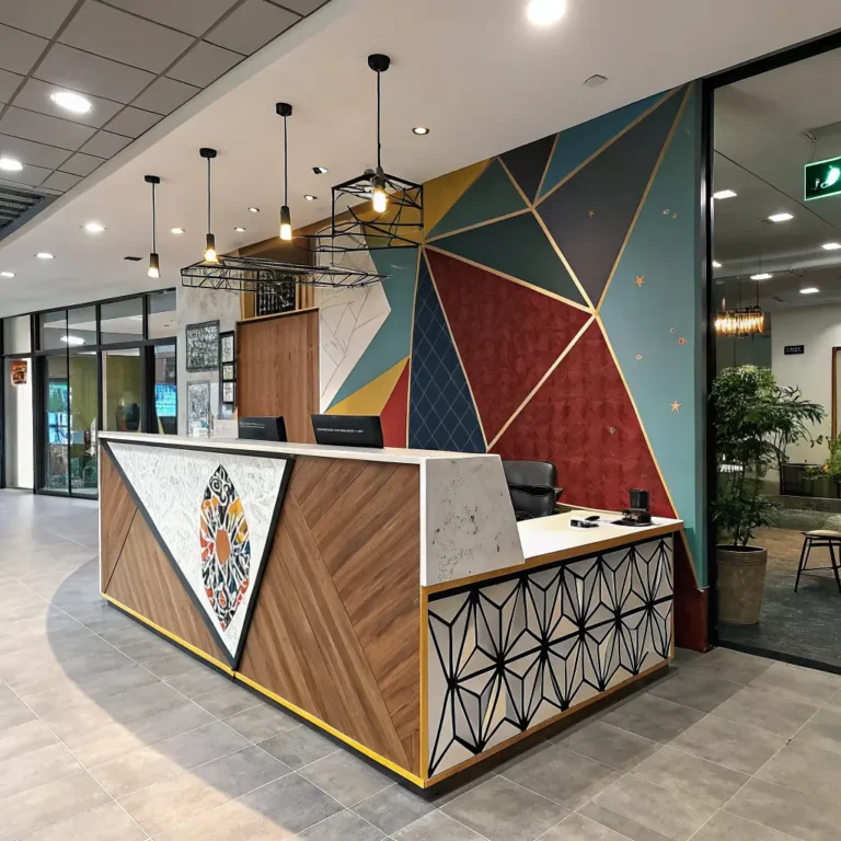
Also Read: 10 Stunning Reception Counter Design Ideas for Modern Spaces
10. High-End Black Matte Coffee Shop Counter Design
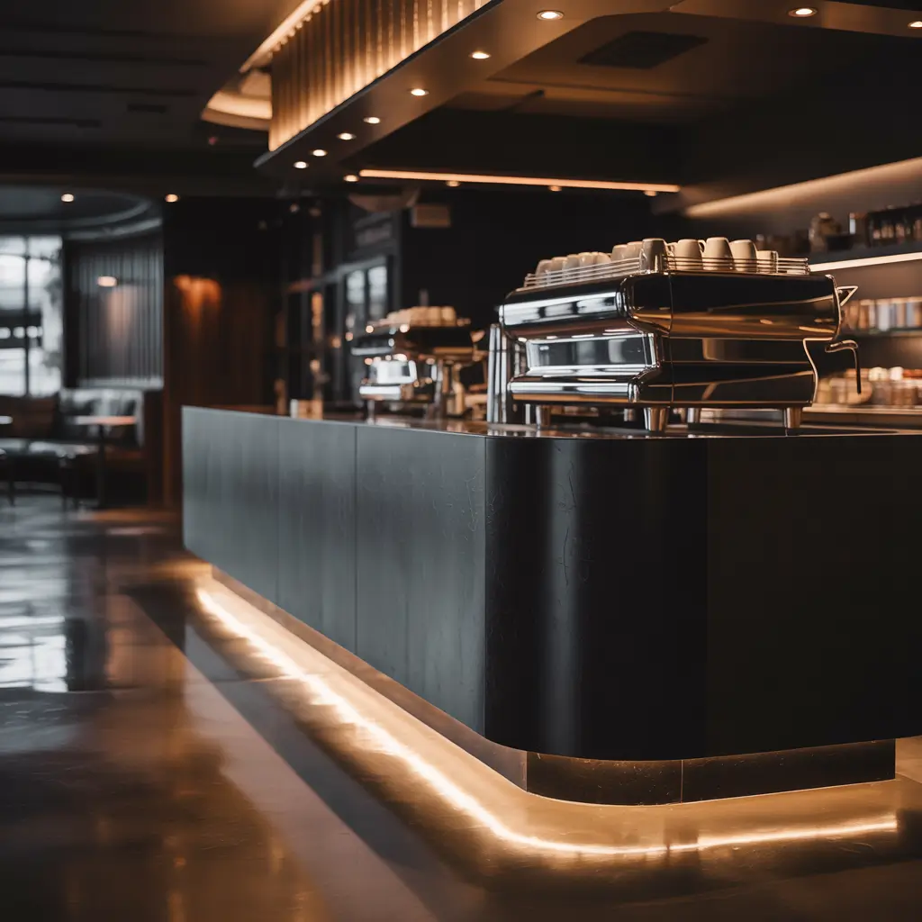
Sophisticated, modern, and undeniably sleek – black matte finishes create an upscale atmosphere that works particularly well in urban settings or anywhere you want to project premium quality.
Black matte surfaces are having a major moment, and for good reason. They’re sophisticated without being shiny, hide fingerprints better than glossy surfaces, and create amazing contrast with metallic accents or colorful elements.
Black matte design essentials:
• Matte black laminate or painted surfaces that resist fingerprints
• Brass or copper accent hardware for warmth and contrast
• Strategic lighting to prevent the space from feeling too dark
• Textural elements to add visual interest to the monochromatic scheme
The biggest challenge with black surfaces is lighting. Get it wrong, and your beautiful counter disappears into shadows. You need multiple light sources at different levels to create depth and prevent the space from feeling cave-like.
Color psychology is real – black suggests premium quality and sophistication. But it can also feel cold or intimidating if not balanced properly. Add warmth through lighting, wood accents, or metallic finishes.
I’ve noticed that black matte counters photograph incredibly well, especially with good lighting. If you’re building a brand that relies heavily on social media presence, this design choice practically markets itself.
Practical note: While black matte hides fingerprints better than gloss, it still shows dust and water spots. Factor in the maintenance requirements, but know that the visual impact often justifies the extra cleaning effort.
Bringing It All Together
Choosing the right counter design isn’t just about following trends (though let’s be honest, trends matter). It’s about understanding your customer base, space constraints, and operational needs. A design that works beautifully in a spacious suburban location might feel completely wrong in a cramped urban storefront.
Budget realistically and think beyond the initial installation. Some designs require more maintenance, others need special equipment or lighting. Factor in the ongoing costs, not just the upfront investment.
Most importantly, your counter design should tell your story. Are you the neighborhood’s cozy hangout spot? The efficient grab-and-go option for busy professionals? The Instagram-worthy destination for coffee aficionados? Let your design communicate that message clearly.
Remember, trends come and go, but good design principles are timeless. Focus on functionality first, aesthetics second, and you’ll create a counter that serves you well for years to come. Your customers will notice the difference, your staff will thank you for the thoughtful workflow, and your Instagram feed will never look better 🙂
Now get out there and build something amazing – your perfect cup of coffee deserves the perfect setting to go with it.