10 Brilliant Mobile Shop Design Ideas To Boost Sales
Setting up a mobile shop that actually draws customers in? Yeah, it’s trickier than you’d think. I’ve seen way too many phone stores that look like they’re stuck in 2010 – fluorescent lights buzzing overhead, phones scattered on random tables, and zero personality.
But here’s the thing: your shop design isn’t just about looking pretty (though that helps). It’s about creating an experience that makes people want to hang around, touch those shiny devices, and ultimately, swipe their cards.
After checking out hundreds of mobile shops across different cities and talking to store owners who’ve cracked the code, I’ve put together these 10 design ideas that actually work.
Some are budget-friendly, others might make your wallet cry a little, but all of them have one thing in common – they turn browsers into buyers.
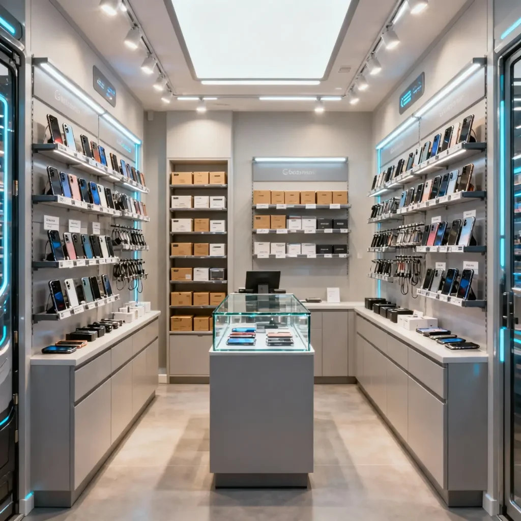
1. Modern Minimalist Mobile Shop Interior Layout
Less really is more when it comes to mobile retail.
The minimalist approach isn’t just some trendy design fad – it’s psychology at work. When customers walk into a cluttered space, their brains go into overload mode. Too many choices, too much visual noise, and suddenly they’re walking out empty-handed.
I visited this incredible minimalist mobile shop in downtown last month, and honestly? It was like stepping into a tech sanctuary. Clean white walls, strategic negative space, and just enough products displayed to create desire without overwhelming choice paralysis. The owner told me his sales actually increased by 30% after the redesign.
Here’s what makes minimalist mobile shops work:
• Limited color palette – stick to 2-3 colors max
• Strategic product placement – showcase your bestsellers, hide the rest
• Clean lines and geometric displays – think Apple store vibes but achievable
• Plenty of breathing room between display units
The trick is knowing what to leave out. You don’t need every single phone case variant on display. Pick your top performers and let them shine. Trust me, customers appreciate the curated approach – it makes decision-making way less stressful.
Pro tip: Use hidden storage solutions to keep backup inventory close but invisible. Nothing ruins minimalist aesthetics like boxes stacked in corners!
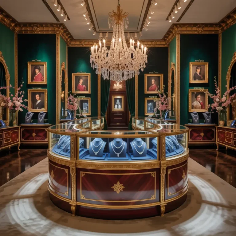
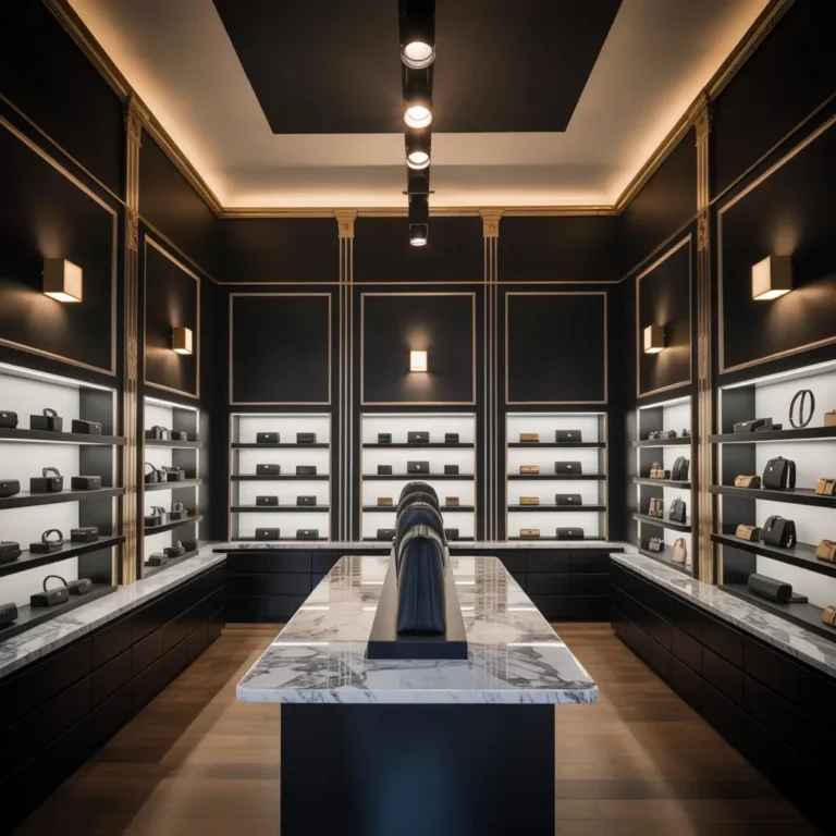
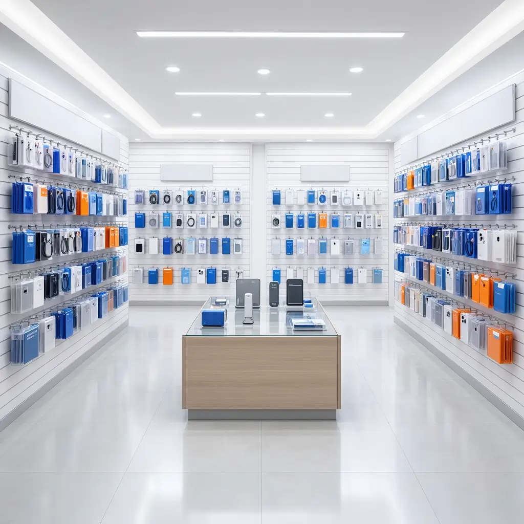
2. Luxury Glass Display Mobile Store Design
Want to make budget phones look like premium devices? Glass displays are your secret weapon.
There’s something magical about how glass elevates everything it touches. I remember walking into this high-end mobile boutique where every device sat in its own glass shrine – suddenly, that $200 Android looked like it belonged in a jewelry store.
Glass displays work because they create perceived value. When customers see phones protected behind crystal-clear barriers, their brains automatically assume these devices are precious and worth protecting. It’s retail psychology 101, and it works like crazy.
Key elements for luxury glass displays:
• Tempered glass cases with LED backlighting – makes phones glow like gems
• Individual pedestals for flagship devices – each phone gets VIP treatment
• Anti-fingerprint coating – because smudgy glass kills the luxury vibe
• Remote-controlled access – adds exclusivity while maintaining security
The investment might seem steep initially, but here’s the kicker – customers are willing to pay premium prices when they perceive premium value. One store owner I know increased his average sale price by 40% just by switching to glass displays.
Does it require more maintenance? Absolutely. Will you spend more time cleaning? You bet. But the sales boost makes it totally worth it 🙂
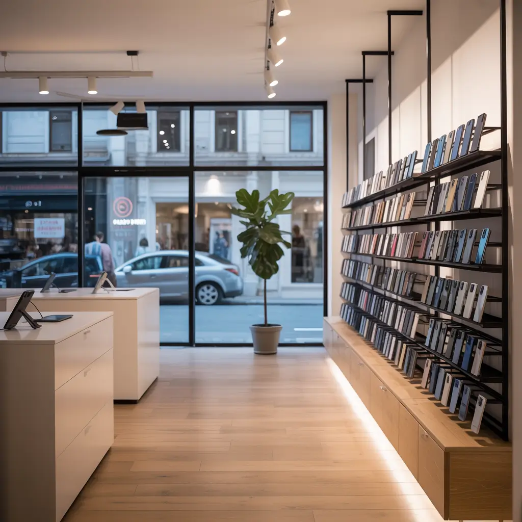
3. Small Space Smart Mobile Shop Setup
Got a tiny space? Time to get creative with vertical thinking.
Small mobile shops face a unique challenge – how do you display enough inventory to seem legitimate without creating a cramped mess? I’ve seen 200-square-foot shops that feel more spacious than 1000-square-foot stores, and it all comes down to smart space utilization.
The secret sauce is vertical displays and multi-functional furniture. Think tall, narrow display units that draw the eye upward, making your ceiling seem higher and your space feel larger.
Small space solutions that actually work:
• Wall-mounted rotating displays – maximize your wall real estate
• Fold-down demo stations – space-saving customer interaction areas
• Under-counter storage with pull-out drawers – hidden inventory access
• Corner-mounted displays – every square inch counts
• Ceiling-hung promotional banners – draw eyes up and expand perceived space
I know this shop owner who transformed his cramped 180-square-foot space using these techniques. Now customers comment on how “spacious” his store feels – meanwhile, he’s got more inventory on display than shops twice his size.
The key is creating clear pathways and avoiding the maze effect. Customers should never feel trapped or crowded, even in compact spaces.
Also Read: 10 Beautiful Bakery Shop Design Ideas for Modern Cafés
4. LED Light Premium Mobile Showroom Design
Lighting can make or break your mobile shop – literally.
Here’s something most mobile shop owners get wrong: they think any bright light will do. Wrong! Harsh fluorescent lighting makes everything look cheap and gives customers headaches. But strategic LED lighting? That’s pure magic.
I spent an afternoon in this premium mobile showroom that had nailed their lighting game. Every phone screen looked crisp and vibrant, colors popped naturally, and the whole space felt warm and inviting. The owner’s secret? Layered LED lighting with different color temperatures for different purposes.
LED lighting strategy breakdown:
• Warm white LEDs (3000K) for ambient lighting – creates welcoming atmosphere
• Cool white LEDs (5000K) for product displays – makes screens look amazing
• RGB accent strips – adds personality and brand identity
• Adjustable spotlights – highlight featured products dynamically
• Under-cabinet strips – eliminates shadows in display cases
The cool thing about modern LED systems is you can control everything from your phone. Dim the lights for a cozy evening vibe, pump up the brightness during busy hours, or switch to brand colors for special promotions.
FYI, energy savings are huge too – this same store owner cut his electricity bill by 60% after switching from traditional lighting.
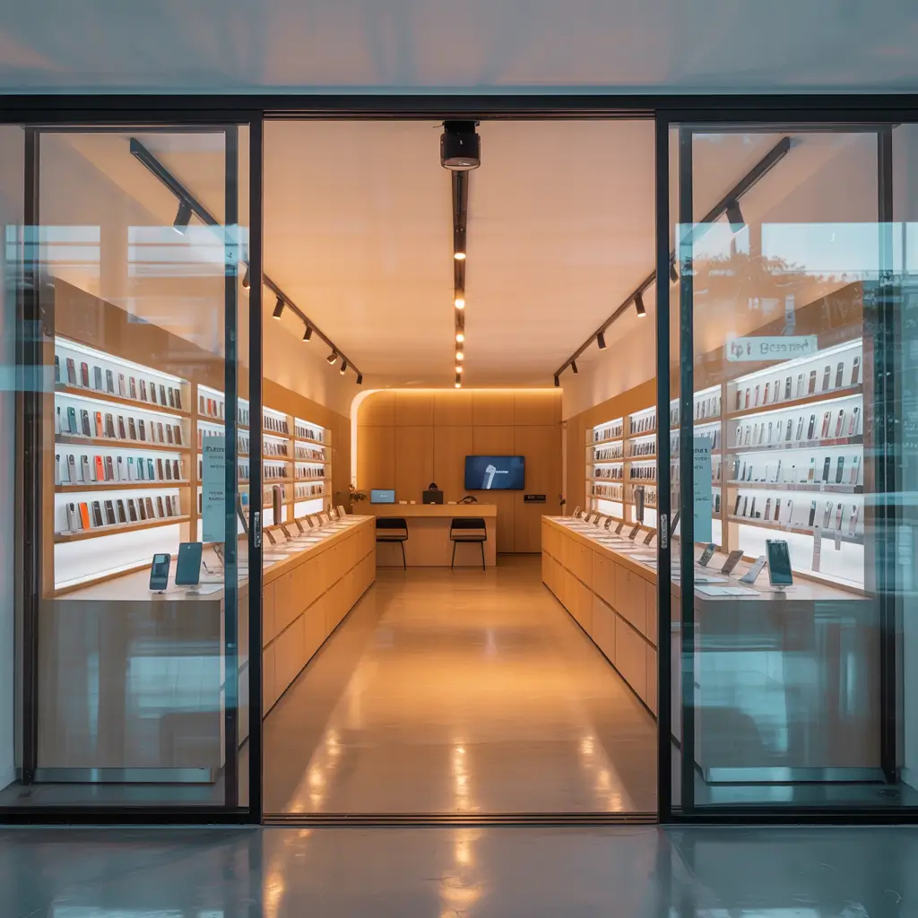
5. Wooden Finishing Mobile Shop Interior Concept
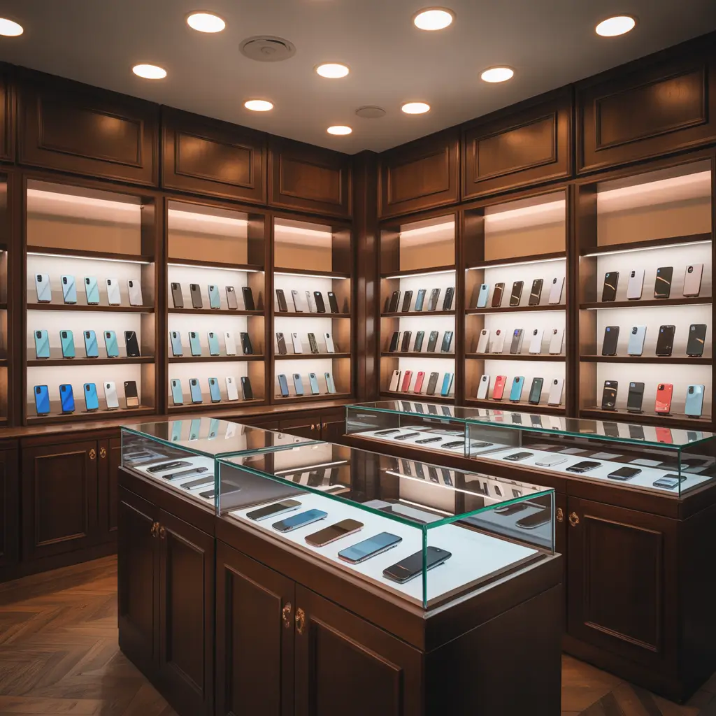
Nothing says “quality and craftsmanship” like beautiful wood elements.
Okay, I’ll admit it – I’m a total sucker for well-executed wood finishes in retail spaces. There’s something about natural materials that instantly makes a space feel more premium and trustworthy. Plus, wood provides this perfect contrast to all the sleek metal and glass of modern phones.
The wooden finish approach works especially well for mobile shops targeting slightly older demographics or positioning themselves as premium, service-focused retailers. It says “we’ve been around, we know our stuff, and we care about quality.”
Wooden elements that work beautifully:
• Reclaimed wood accent walls – adds character and sustainability story
• Live-edge wooden display shelves – organic shapes soften tech’s hard edges
• Wood-grain laminate countertops – budget-friendly but convincing alternative
• Wooden phone stands and accessories – creates cohesive product ecosystem
• Bamboo charging stations – eco-friendly and on-brand
I visited this mobile shop that combined warm oak finishes with white walls and strategic lighting – it felt more like an upscale electronics boutique than your typical phone store. Customers lingered longer, asked more questions, and seemed genuinely comfortable exploring products.
The maintenance factor is real though – wood requires more care than synthetic materials. But honestly? The atmosphere it creates is worth the extra effort.
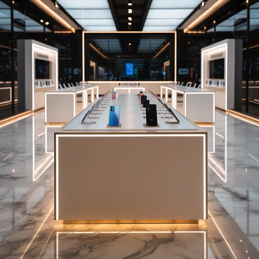
6. High-End Apple Style Mobile Store Design
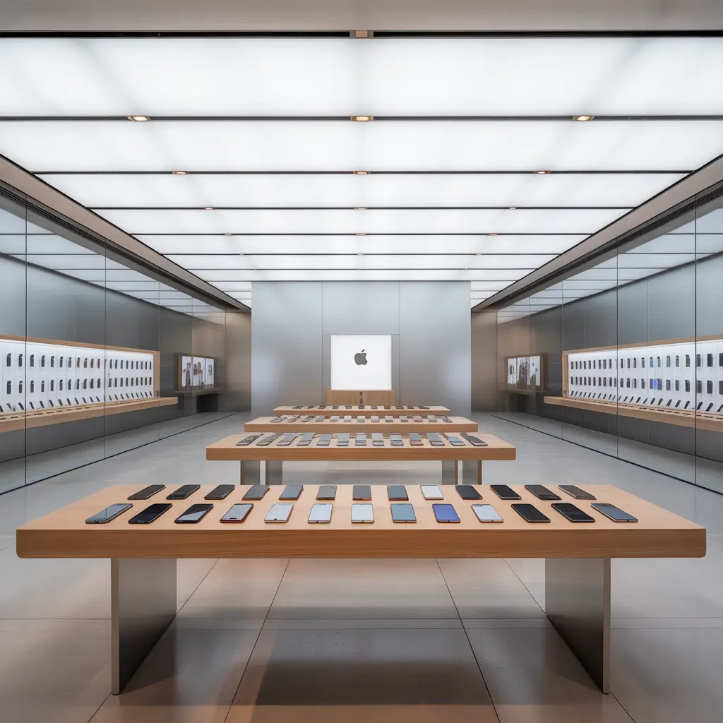
Why reinvent the wheel when Apple already perfected mobile retail?
Let’s be honest here – Apple stores are the gold standard for mobile retail design. They’ve spent billions figuring out exactly how to make people want to buy expensive electronics, so why not learn from their playbook?
But here’s the thing: you don’t need Apple’s massive budget to capture their design essence. It’s about the principles, not the price tag.
The Apple approach focuses on creating an experience rather than just selling products. Customers don’t feel pressured; they feel inspired to explore and discover.
Apple-inspired design elements:
• Large wooden tables for hands-on testing – encourages interaction
• Bright, even lighting throughout – no dark corners or harsh shadows
• Minimal signage and pricing – products speak for themselves
• Open floor plan with clear sightlines – no barriers between customer and product
• Genius Bar-style consultation area – positions staff as experts, not salespeople
I know a mobile shop owner who redesigned his space using these principles. He replaced traditional display cases with open tables, trained his staff to be consultative rather than pushy, and created dedicated areas for different customer needs.
The results? Average transaction value increased by 50%. Customers started referring friends, and his Google reviews went through the roof.
Also Read: 10 Elegant Jewellery Shop Design Ideas For Premium Style
7. Budget Friendly Mobile Shop Design Idea
Great design doesn’t require a great budget – just great creativity.
Let me tell you about this mobile shop I discovered in a busy market area. The owner had maybe $2,000 total for his initial setup, but his store looked like he’d spent ten times that amount. How? Smart shopping, DIY skills, and strategic priorities.
Budget-conscious design is all about maximizing impact while minimizing cost. Focus your money on elements customers notice first and fake the expensive stuff with clever alternatives.
Budget-friendly design hacks that work:
• DIY wooden crates as display units – rustic charm at fraction of retail cost
• Vinyl wall decals instead of custom signage – professional look, amateur price
• Thrift store furniture with fresh paint – unique pieces with personal character
• String lights for ambient lighting – Instagram-worthy atmosphere on a shoestring
• Printed foam boards for product information – clean, professional, replaceable
The secret is investing your limited budget in areas that directly impact sales – good lighting, secure displays, and comfortable customer areas – while getting creative with everything else.
This same shop owner told me he reinvests profits into gradual upgrades. Started with basic setups, then slowly added premium elements as business grew. Smart approach, IMO.
Remember: customers care more about feeling welcome and finding what they need than expensive finishes. Nail the basics first, pretty up later.
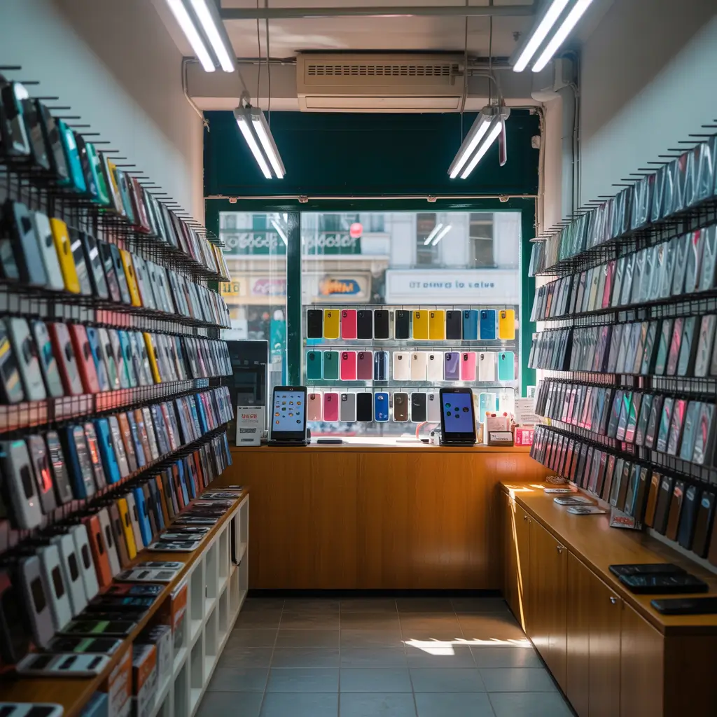
8. Wall Mounted Display Mobile Accessories Shop Layout
When floor space is premium, walls become your best friend.
Wall-mounted displays are criminally underused in mobile retail. I’ve seen shops waste massive amounts of vertical real estate while cramming everything onto overcrowded tables. Your walls can hold way more inventory than you think, and organized properly, wall displays actually improve the shopping experience.
The psychology here is interesting – wall-mounted products feel more organized and intentional. Customers can browse without bending over or digging through piles, and you can fit exponentially more accessories in the same footprint.
Wall display strategies that maximize space:
• Pegboard systems with adjustable hooks – infinitely customizable and budget-friendly
• Floating shelves at eye level – premium cases and featured accessories
• Clear acrylic pocket displays – perfect for phone cases and small accessories
• Magnetic strips for metal accessories – keeps items secure but accessible
• Rotating wall panels – double your display space in the same footprint
I visited an accessories-focused mobile shop that had transformed their walls into this incredible product showcase. Every square inch was optimized, but it never felt cluttered or overwhelming. Customers could easily compare options, and restocking took minutes instead of hours.
The owner mentioned that wall displays also improved his inventory management – everything had a designated spot, making stock counts and reordering much simpler.
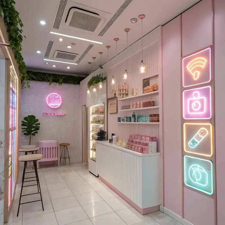
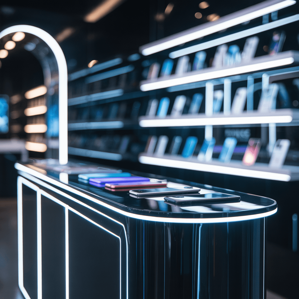
9. Neon Glow Futuristic Mobile Shop Interior Design
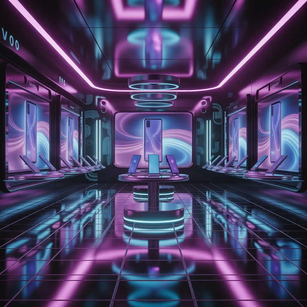
Sometimes you need to embrace the future to sell future technology.
Neon and LED accent lighting creates this incredible sci-fi atmosphere that perfectly matches the high-tech nature of modern smartphones. It’s bold, it’s Instagram-worthy, and it definitely makes your shop memorable.
The futuristic approach works especially well in areas with younger demographics or shops focusing on gaming phones and cutting-edge accessories. It signals that you’re on the cutting edge of technology trends.
Futuristic design elements that pop:
• RGB LED strips with color-changing capabilities – customizable mood lighting
• Neon accent lines on display cases – creates product boundaries without barriers
• Black walls with strategic lighting – makes phones and accessories glow dramatically
• Holographic or metallic accent pieces – reinforces the high-tech theme
• Digital displays for product information – interactive and easily updatable
I checked out this gaming-focused mobile shop that went all-in on the neon aesthetic. The moment you walked in, you knew this wasn’t your typical phone store. They specialized in gaming accessories and high-performance devices, and the atmosphere perfectly matched their product focus.
The challenge with neon designs is avoiding the “cheap club” look. Quality matters more than quantity – one well-executed neon element beats ten tacky ones every time.
Does it appeal to everyone? Definitely not. But for the right target market, it creates an unforgettable brand experience that drives repeat visits and social media shares.
10. Open Counter Customer Friendly Mobile Store Setup
Breaking down barriers between customers and staff creates magic.
Traditional mobile shops often feel like fortresses – high counters, displays behind glass, staff separated from customers by physical and psychological barriers. The open counter approach flips this completely, creating collaborative shopping experiences instead of transactional ones.
This design philosophy treats customers as partners in the selection process rather than potential threats to inventory security. It requires more trust but delivers significantly better customer relationships and higher satisfaction scores.
Open counter design principles:
• Low, accessible counters – staff and customers interact at eye level
• Demonstration areas on customer side – hands-on testing without barriers
• Shared workspace for phone setup and data transfer – collaborative problem-solving
• Comfortable seating during service – makes waiting feel less like waiting
• Open sight lines throughout the store – transparency builds trust
I spent time observing an open counter mobile shop during their busy Saturday afternoon rush. The difference in customer behavior was striking – people relaxed, asked more questions, and seemed genuinely comfortable exploring options. Staff could read customer needs better and provide more personalized recommendations.
Sales conversion rates were noticeably higher, but more importantly, customer satisfaction scores were through the roof. Happy customers become repeat customers and referral sources.
The security concern is real, but modern alarm systems and strategic camera placement can handle loss prevention without recreating fortress mentality.
Conclusion
Here’s the bottom line: Your mobile shop design isn’t just about aesthetics – it’s about creating an environment where customers feel comfortable spending money. Whether you go minimalist or futuristic, budget-friendly or luxury, the key is consistency with your brand identity and target market needs.
I’ve seen $500 design makeovers double sales and $50,000 renovations flop completely. The difference isn’t the budget; it’s understanding your customers and creating spaces that serve their needs while reflecting their aspirations.
Start with one approach that resonates with your vision and market, execute it well, then evolve based on customer feedback and business growth. Your mobile shop should feel like a natural extension of your brand story – authentic, welcoming, and focused on making the mobile buying experience as smooth as those devices you’re selling 🙂
Remember, the best design is one that makes customers forget they’re in a store and feel like they’re discovering solutions to problems they didn’t even know they had. That’s when browsers become buyers, and buyers become advocates.