10 Stunning Coffee Shop Menu Design Ideas That Boost Sales
You know that feeling when you walk into a coffee shop and the menu looks like it was designed by someone’s cousin who “knows Photoshop”? Yeah, we’ve all been there. Y
our menu isn’t just a list of drinks—it’s basically your silent salesperson working 24/7. Get it wrong, and you’re losing money faster than milk goes bad in summer.
I’ve spent way too many hours (and dollars) analyzing coffee shop menus, and trust me, the difference between a thoughtful design and a hot mess is huge.
Today we’re breaking down 10 menu design ideas that actually work, from sleek minimalism to Instagram-worthy displays that’ll have customers snapping pics before they even order.
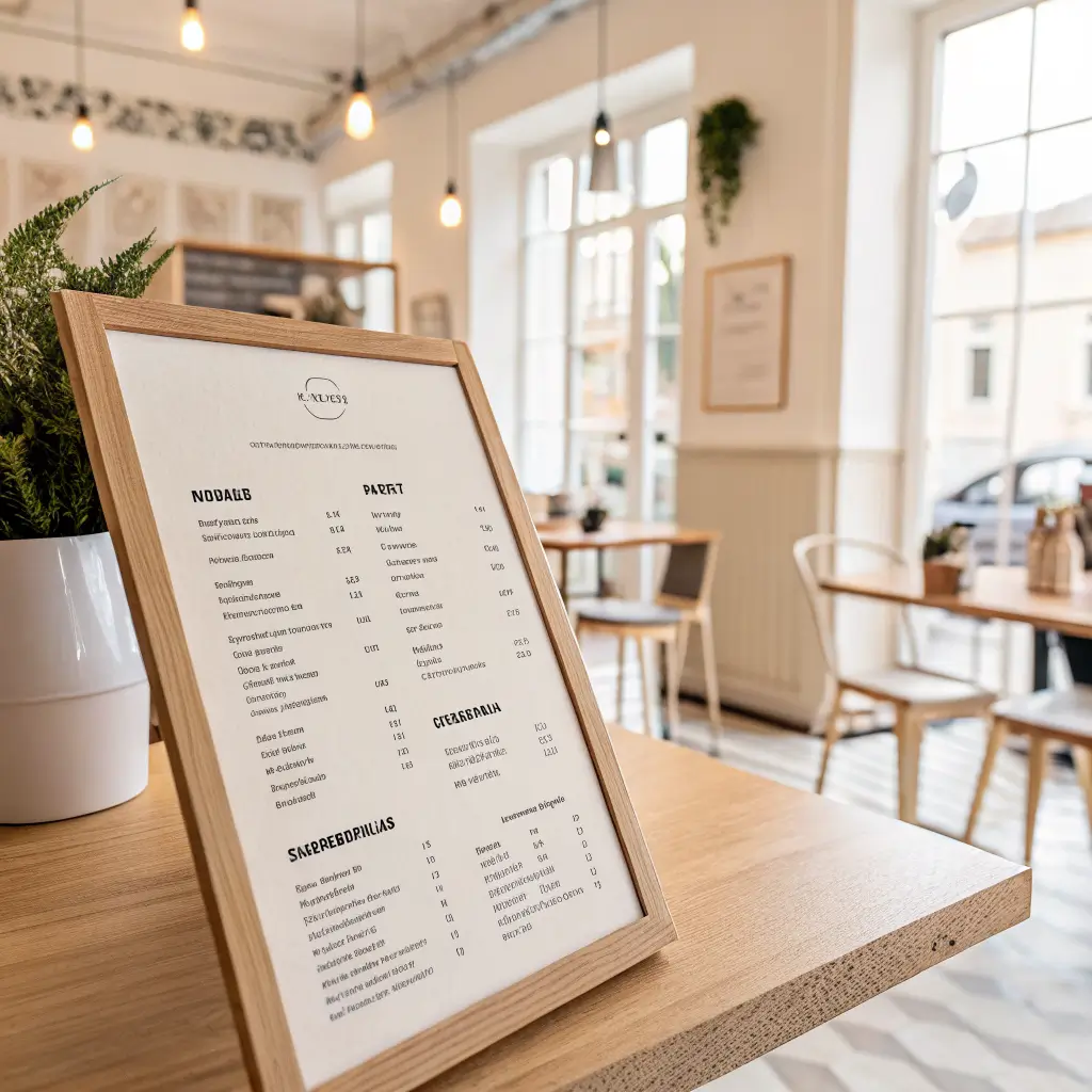
Minimal Black & White Coffee Menu Board Design
Less really is more when it comes to minimal black and white designs. This isn’t about being boring—it’s about being smart. When you strip away all the unnecessary colors and graphics, your customers can actually focus on what matters: your coffee.
The beauty of minimal design lies in its clean typography and strategic white space. Think about Apple’s marketing materials—they don’t overwhelm you with information, and neither should your menu. A simple black text on white background (or vice versa) creates that premium, sophisticated vibe that makes people think your coffee must be as refined as your design choices.
Here’s what makes minimal designs work so well:
• Easy scanning – customers can find what they want in seconds
• Timeless appeal – won’t look dated in two years
• Cost-effective – cheaper to print and update
• Versatile – works on boards, prints, and digital displays
The key is choosing the right font. Skip Comic Sans (please, for the love of good coffee) and go for something clean like Helvetica, Futura, or Proxima Nova. Bold your section headers like “Espresso Drinks” or “Seasonal Favorites” to create visual hierarchy without adding clutter.
One thing I’ve noticed? Minimal designs actually make customers spend more time reading the descriptions. When there aren’t flashy graphics competing for attention, people naturally focus on your carefully crafted drink descriptions.
Rustic Wooden Coffee Shop Menu Layout
Want to create that cozy, “I could work here all day” atmosphere? Rustic wooden menus hit different. There’s something about natural wood textures that screams authenticity in a world of plastic everything.
Wood grain backgrounds paired with vintage-style fonts create an instant connection to traditional craftsmanship. It’s like telling your customers, “We take our time with things that matter”—which hopefully includes your espresso shots 🙂
The rustic approach works especially well for:
• Independent coffee shops trying to differentiate from chains
• Farm-to-cup concepts emphasizing natural ingredients
• Locations in historic buildings or artsy neighborhoods
• Shops targeting remote workers who appreciate authentic spaces
But here’s the catch—rustic doesn’t mean messy. Your typography still needs to be readable and well-organized. I’ve seen too many wooden menus where the text gets lost in busy wood grain patterns. The trick is using high contrast between your text and background, even if you’re going for that weathered look.
Consider laser-engraving directly onto wood boards for a premium feel, or printing on wood-textured paper for a budget-friendly alternative. Either way, make sure your drink prices are crystal clear—nobody wants to play guessing games when they need their morning caffeine fix.
Modern Digital Coffee Menu Screen Design
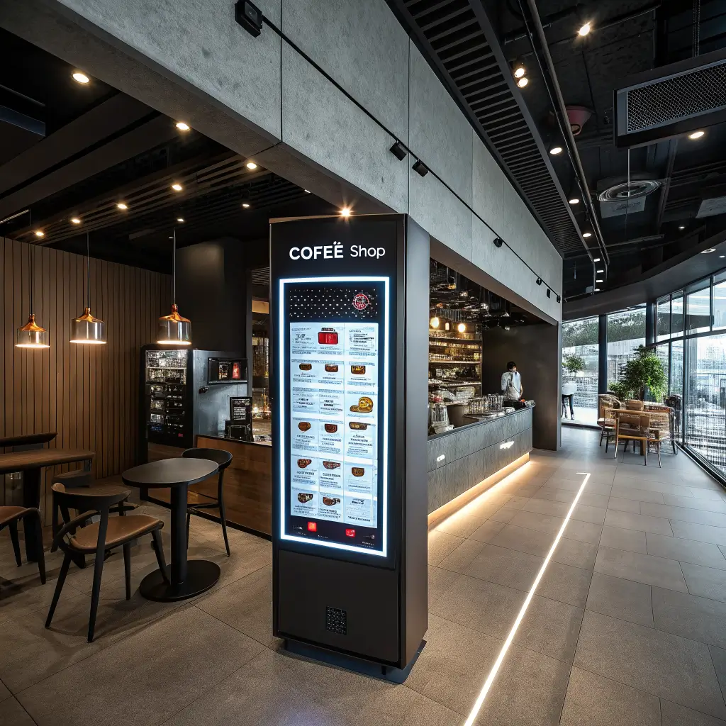
Digital menus are everywhere now, and for good reason. They’re flexible, eye-catching, and perfect for showcasing those drool-worthy latte art photos. Plus, you can update prices without reprinting anything (inflation-era win!).
Motion graphics and rotating content keep things fresh and grab attention in ways static menus simply can’t. Think subtle animations highlighting daily specials or seasonal drinks cycling through beautiful imagery. Just don’t go overboard—we’re making a menu, not a Vegas casino display.
Digital menus excel at:
• Real-time updates for sold-out items or daily specials
• Visual storytelling with high-quality drink photography
• Upselling opportunities through strategic placement and timing
• Multilingual options for diverse customer bases
The biggest mistake I see with digital menus? Information overload. Just because you have unlimited space doesn’t mean you should use it all. Stick to clear sections, readable fonts, and give each element room to breathe. Remember, people are usually deciding quickly, often while standing in line behind other impatient caffeine addicts.
Pro tip: Include wait times for specialty drinks. Nothing’s worse than ordering a complex beverage thinking it takes two minutes, then standing around for ten while your Uber driver gets increasingly passive-aggressive.
Also Read: 10 Elegant Coffee Shop Design Outdoor Ideas for Stylish Spaces
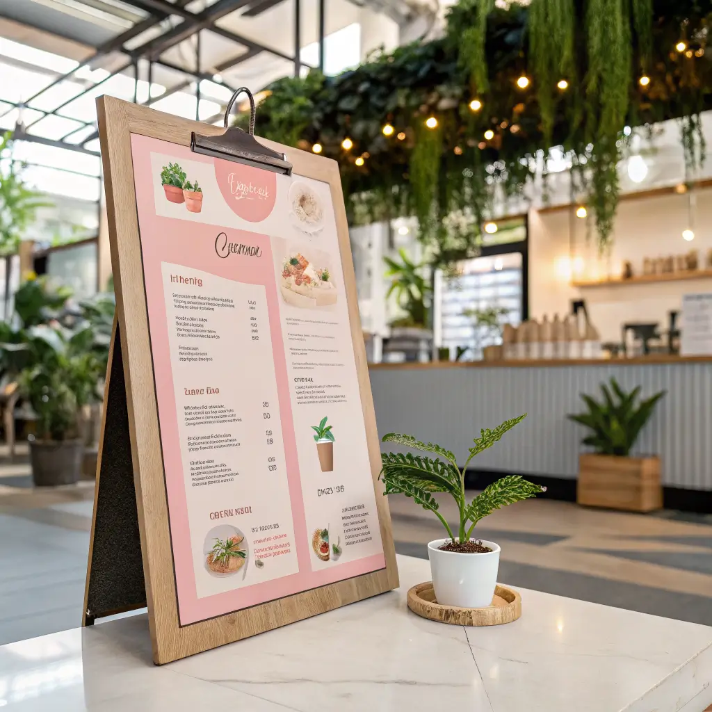
Vintage Café Handwritten Menu Style
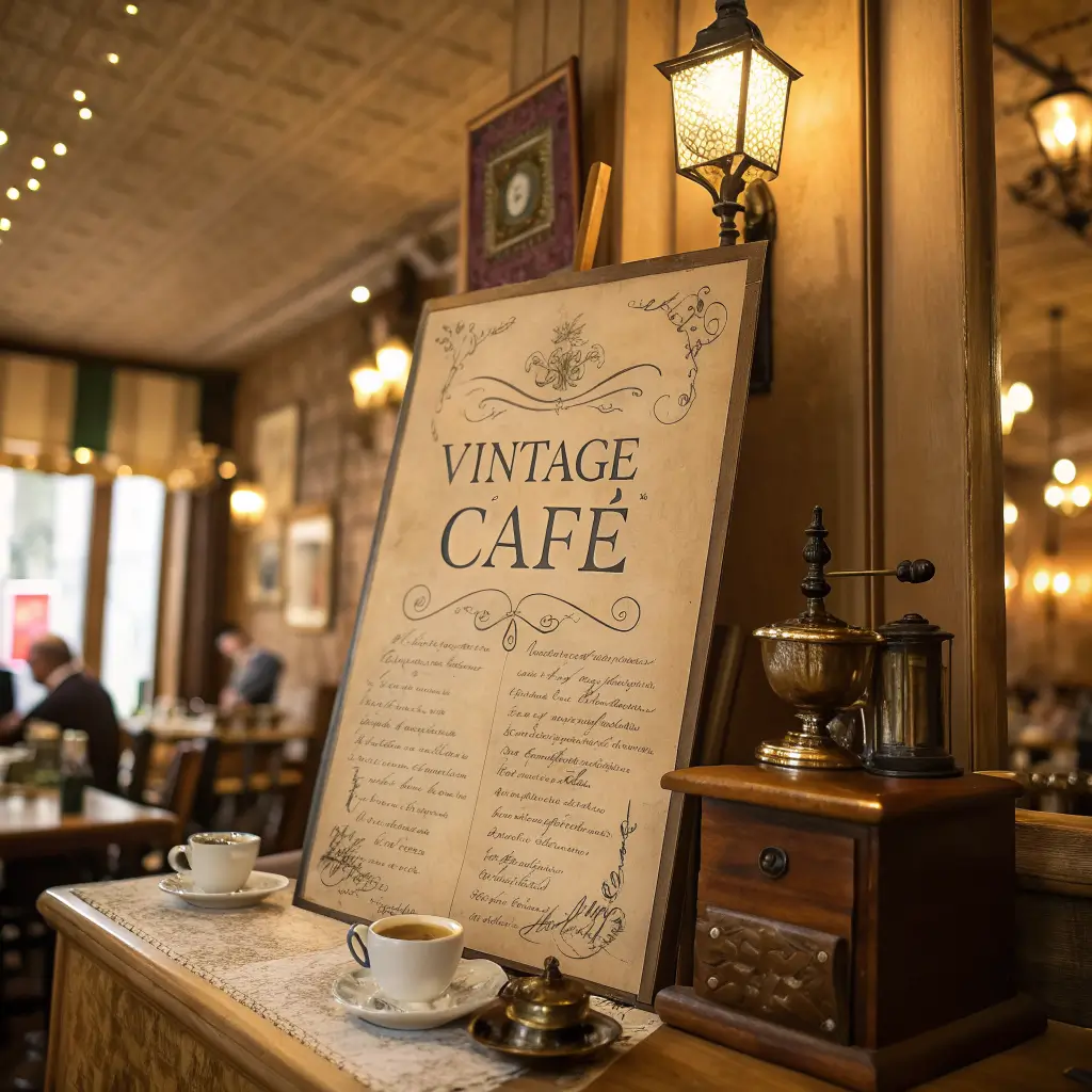
There’s something magical about handwritten menus that makes everything feel more personal and artisanal. It’s like getting a love letter from your barista, except instead of poetry, it’s filled with coffee descriptions that make you inexplicably hungry.
Hand-lettered fonts and vintage color palettes transport customers to a different era—when coffee shops were neighborhood gathering spots, not just caffeine dispensaries. This style works beautifully for shops emphasizing tradition, quality, and personal touch.
The handwritten approach shines when you:
• Rotate seasonal specials with actual chalk or markers
• Include personal notes from the owner or head barista
• Showcase unique drink names that reflect local culture
• Create Instagram-worthy backgrounds for customer photos
But let’s be real—not everyone has gorgeous handwriting. If your natural script looks like a doctor’s prescription written during an earthquake, consider hiring a local artist or investing in quality hand-lettered fonts. Readability always trumps authenticity when people are trying to order their morning fuel.
I’ve seen vintage menus that perfectly capture the cozy café vibe while still being functional. The secret sauce? Consistent lettering size and spacing, even when going for that “imperfect” handmade feel.
Luxury Gold Accent Coffee Menu Design
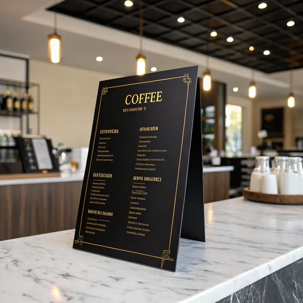
Sometimes you want your coffee shop to feel like a premium experience worth Instagram bragging rights. Gold accents instantly elevate any design, making customers feel like they’re treating themselves to something special rather than just grabbing quick caffeine.
Metallic gold details combined with elegant typography create that high-end boutique feeling. We’re talking about subtle gold borders, accent lines, or highlighting for premium drinks and limited editions. It’s psychological magic—people literally perceive higher value when they see gold elements.
Luxury design elements that work:
• Gold foil accents on printed menus (yes, it costs more, but the perceived value increase is worth it)
• Elegant serif fonts like Didot or Playfair Display
• Strategic white space to let premium items breathe
• High-quality paper stocks that feel substantial
The key is restraint. Too much gold and you’ll look like a Vegas hotel lobby instead of a sophisticated café. I recommend using gold for highlighting premium offerings like single-origin pour-overs or signature specialty drinks that command higher prices.
FYI, this approach works incredibly well for coffee shops in upscale neighborhoods or business districts where customers expect (and can afford) premium experiences. Your $6 cortado better be amazing, but the gold-accented menu helps justify that price point before they even taste it.
Chalkboard Aesthetic Coffee Menu Ideas
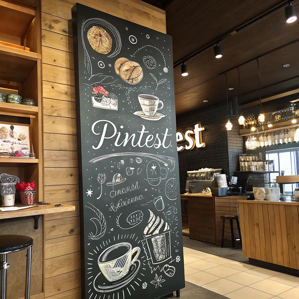
Chalkboard menus hit that sweet spot between casual and crafted. They’re flexible enough for daily changes but artistic enough to make your space feel curated. Plus, there’s something satisfying about the tactile nature of chalk on slate that digital displays just can’t replicate.
Hand-drawn elements and chalk typography give your menu personality and character. No two chalkboard menus look identical, which reinforces the artisanal, small-batch identity many independent coffee shops cultivate.
Chalkboard designs excel because they:
• Encourage daily creativity with featured drinks and specials
• Create photo opportunities for social media content
• Feel authentic and handmade in an increasingly digital world
• Allow for seasonal decorations like coffee bean borders or weather-themed doodles
The biggest challenge? Maintaining readability while keeping that artistic flair. I’ve squinted at too many chalkboard menus where artistic ambition exceeded legible execution. Your barista’s beautiful script means nothing if customers can’t figure out what you’re actually selling.
Weather can be brutal on outdoor chalkboard signs, so invest in quality chalk markers for outdoor displays, or stick with traditional chalk for protected indoor boards. Either way, designate someone with decent handwriting as your official menu artist—consistency matters more than perfection.
Also Read: 10 Creative Small Coffee Shop Design Ideas for Stylish Vibes
Scandinavian Minimal Coffee Menu Layout
Scandinavian design isn’t just about furniture—it translates beautifully to coffee shop menus. Think clean lines, muted colors, and functional beauty that makes ordering feel effortless and zen-like.
The Scandi approach emphasizes negative space and purposeful design choices. Every element serves a function, and nothing feels excessive or overwhelming. It’s minimalism with warmth—like hygge for your eyeballs.
Nordic-inspired menu elements include:
• Soft, natural color palettes (whites, grays, muted blues)
• Sans-serif fonts that feel modern but approachable
• Geometric shapes for section dividers or accent elements
• Plenty of white space that doesn’t feel empty, just organized
This style works particularly well for third-wave coffee shops focused on craft and quality over quantity. It appeals to customers who appreciate thoughtful design and artisanal products—the kind of people who Instagram their flat whites and actually read origin stories for their beans.
The beauty of Scandinavian design is its versatility across different formats. Whether you’re creating a wall-mounted board, table tent cards, or digital displays, the clean aesthetic translates seamlessly. Just remember—simple doesn’t mean boring, and functional doesn’t mean cold.
Color-Coded Coffee Category Menu Design
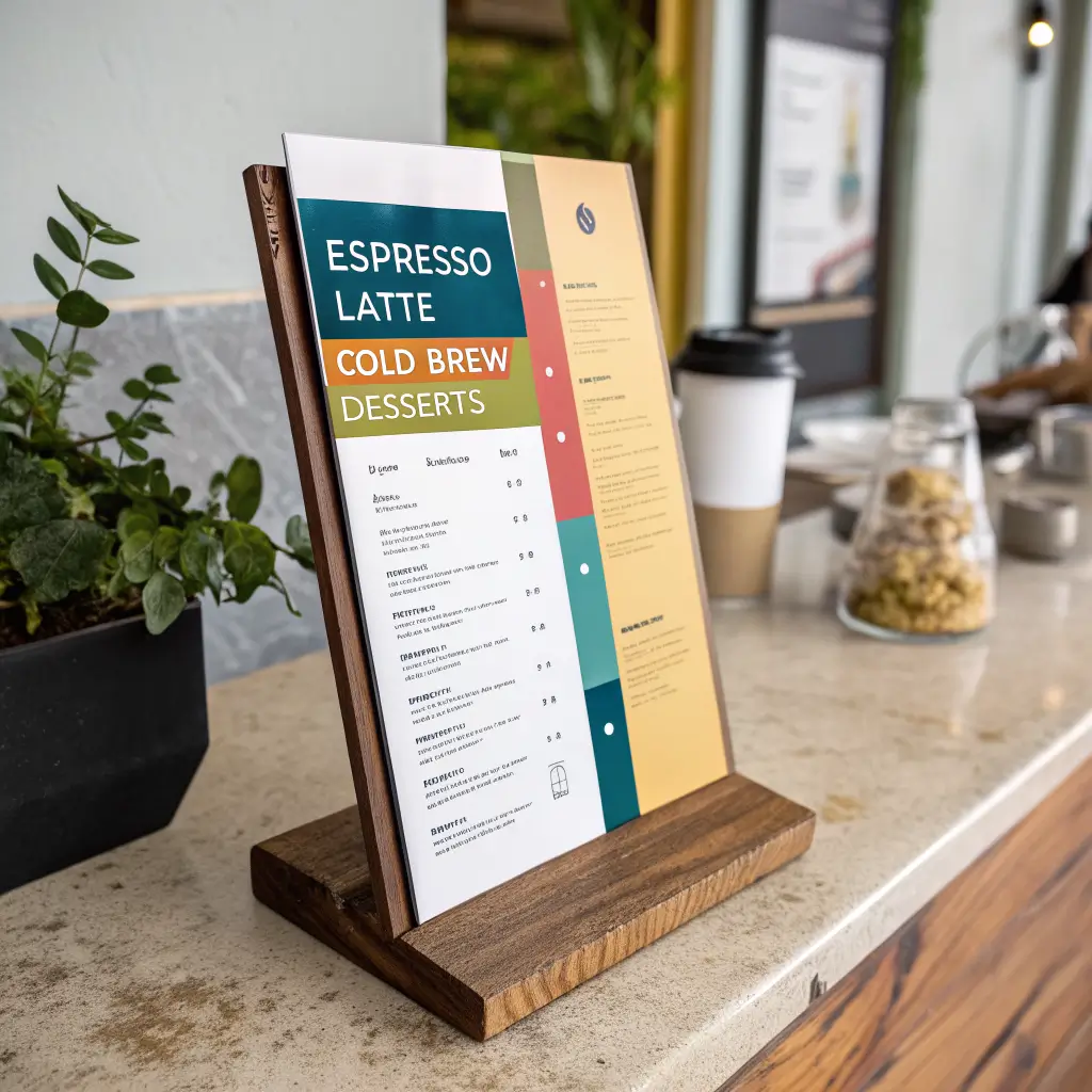
Ever watch someone stare at a menu for five minutes trying to find iced drinks? Color-coding solves that problem instantly. Strategic use of colors for different categories turns your menu into an intuitive navigation system that reduces decision fatigue and speeds up ordering.
Think traffic light psychology applied to coffee culture. Hot drinks in warm reds and oranges, cold beverages in cool blues, pastries in appetizing yellows—it’s visual organization that works subconsciously.
Effective color-coding strategies:
• Consistent color families for related items (all espresso drinks in one color family)
• High contrast combinations ensuring text remains readable
• Cultural color associations (green for healthy options, brown for chocolate-based drinks)
• Seasonal adaptations that can shift throughout the year
The trick is balancing organization with aesthetics. Your menu shouldn’t look like a rainbow exploded, but subtle color cues can guide customers naturally through their options. I’ve seen this work brilliantly in busy locations where quick decision-making is crucial.
Just avoid going overboard with neon brights that strain the eyes or color combinations that make text hard to read. Remember, accessibility matters—what works for someone with perfect vision might be illegible for customers with color vision differences.
Typographic Bold Coffee Menu Board Style
Sometimes the message IS the design. Typography-focused menus rely entirely on font choices, sizing, and arrangement to create visual impact without additional graphics or colors. When done right, it’s incredibly striking and memorably clean.
Bold typography creates hierarchy through contrast in font weights and sizes. Your shop name might be massive and bold, drink categories slightly smaller but still prominent, and individual items in clean, readable text. It’s like visual music—rhythm created through typographic choices.
Typography-driven designs work because they:
• Create strong brand identity through consistent font choices
• Improve readability by prioritizing clear text over decorative elements
• Scale perfectly across different sizes and formats
• Stay timeless without trendy design elements that might date quickly
The challenge is choosing fonts that work together harmoniously. Mixing too many typefaces creates chaos, but using just one can feel monotonous. A classic approach pairs a bold sans-serif for headings with a clean serif or different weight of the same family for body text.
IMO, the best typographic menus feel confident and authoritative. They’re saying, “We’re so sure about our coffee quality, we don’t need fancy graphics to convince you.” That’s powerful messaging when executed well.
Also Read: 10 Beautiful Coffee Shop Interior Design Ideas for Cozy Vibes
Instagram-Inspired Coffee Menu Display Design
Let’s be honest—if it’s not Insta-worthy, did it even happen? Instagram-inspired menu designs recognize that your menu will probably end up in customer photos, so why not make it camera-ready from the start?
This approach emphasizes visual elements that photograph beautifully: perfect lighting considerations, photogenic color schemes, and layouts that look amazing in square crop format. You’re not just designing for in-person customers—you’re creating content that markets your shop through customer social sharing.
Instagram-friendly menu features:
• High contrast elements that pop in photos
• Interesting textures or backgrounds that add visual depth
• Strategic lighting considerations for optimal photography
• Branded hashtags or handles subtly incorporated into the design
The key is balancing photogenic appeal with functional readability. Your menu still needs to work for customers who just want to order coffee without taking pictures, but adding those Instagram-worthy touches extends your marketing reach organically.
Consider creating designated photo spots near your menu displays. Good lighting and uncluttered backgrounds encourage customers to share, turning every order into potential social media marketing. Just don’t sacrifice readability for aesthetics—even the prettiest menu fails if customers can’t figure out what to order.
Bringing It All Together
After analyzing all these design approaches, here’s what really matters: your menu should reflect your brand personality while making ordering effortless. Whether you go minimal or maximal, rustic or modern, the best menu design serves your specific customers in your unique space.
Consider your target audience, location, and brand identity when choosing your approach. A minimal Scandinavian design might feel out of place in a quirky neighborhood joint, while elaborate vintage styling could overwhelm busy commuters grabbing quick morning coffee.
The most successful coffee shop menus I’ve encountered share common elements regardless of style: clear organization, readable typography, accurate pricing, and authentic personality. Everything else is just dressing on the espresso.
Remember, your menu will probably evolve over time as you learn what works for your customers and space. Start with solid fundamentals—clear categories, readable fonts, and logical organization—then add personality through your chosen design approach.
Now stop overthinking it and go create a menu that makes people excited to try your coffee. Trust me, when someone spends an extra minute reading your thoughtfully designed menu instead of defaulting to “medium coffee,” that’s when you know you’ve nailed it 🙂